Input Fields
Adopting Core Components
We have added new React components to the Audi CI to ensure a uniform appearance on the web. All existing React components can be found in the Audi React Library. Audi will continue to develop and add to this library.
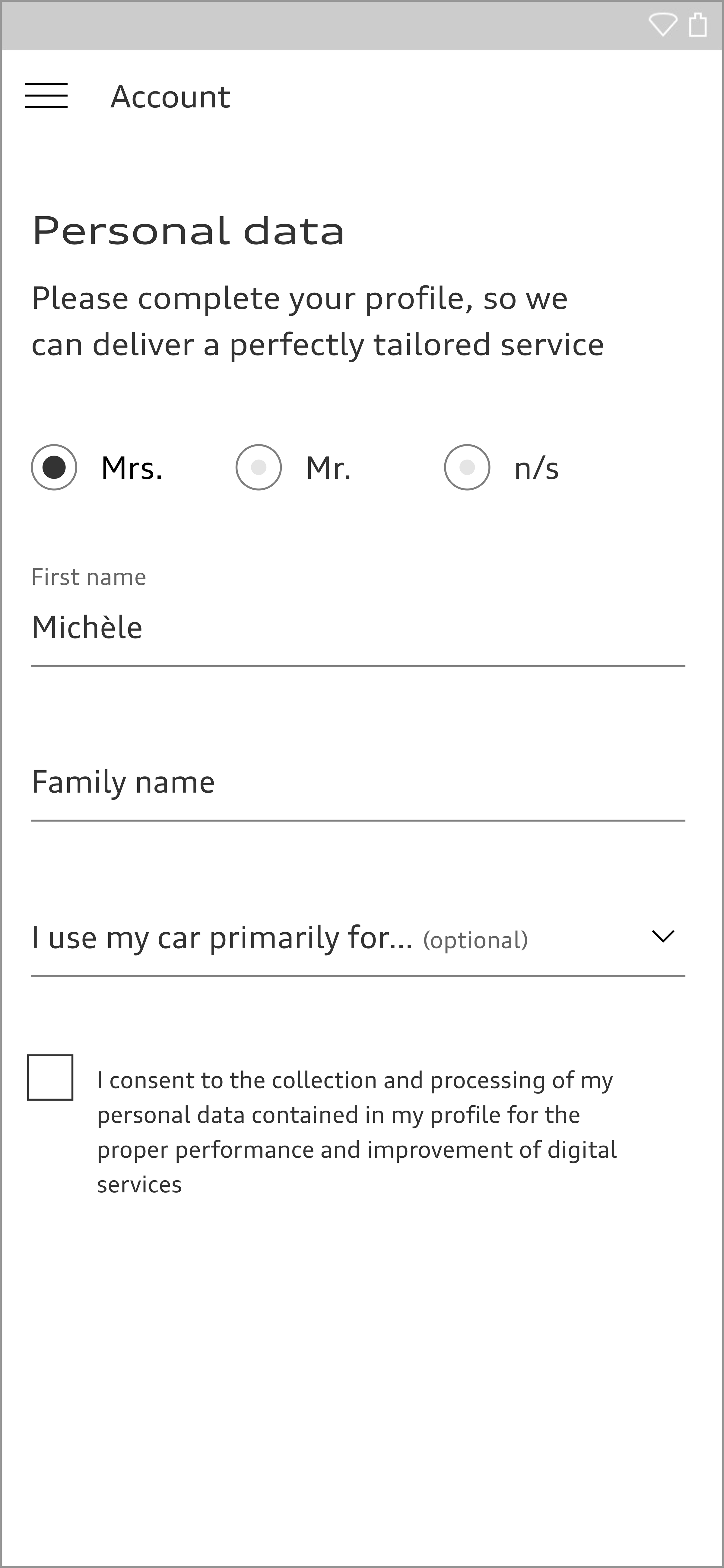
Forms are a particularly important interface between the user and Audi applications. They often appear at critical points in the user journey. For this reason, forms should be designed so that they can be easily understood and as few information points should be requested as possible. Optional questions bear a special marking in the form if they are unavoidable. The existing components are combined and grouped as required to create a form structure.
The size of the form element depends on the basic type size used, which can adapt to the viewport width in question. As such, it is flexible in size. The form elements are available in black and white.
Text Field
Text fields consist of a label and a line. They can vary in width. When the user activates a text field, the label moves upwards, is reduced in size and leaves space for entry.
Text fields requiring certain data formats such as numbers, e-mail addresses or passwords are declared accordingly. This makes it easier for the user to enter information using a virtual keyboard.
Text fields can be combined with an icon.
<div class="aui-textfield aui-js-textfield aui-textfield--floating-label">
  <div class="aui-textfield__field">
    <input class="aui-textfield__input" type="text" id="sample-textfield" />
    <label class="aui-textfield__label" for="sample-textfield">Label<span class="aui-textfield__label-optional">(optional)</span></label>
  </div>
  <span class="aui-textfield__description">If the customer doesn’t understand the label itself or is just unsure of its meaning, an additional description can help squash any uncertainty.</span>
</div>
Search Field
In a search field, a search icon is combined with a label. Unlike a standard text field, the label is overwritten on entry and does not move upwards. After a few characters have been entered, a dropdown can appear with autosuggest entries.
<div class="aui-textfield aui-js-textfield aui-textfield--icon">
  <div class="aui-textfield__field">
    <svg class="audiicon">
      <use xlink:href="#aui-icon-search-small"></use>
    </svg>
    <input class="aui-textfield__input" type="text" id="sample-textfield-icon" />
    <label class="aui-textfield__label" for="sample-textfield-icon">Search</label>
  </div>
  <span class="aui-textfield__description">If the customer doesn’t understand the label itself or is just unsure of its meaning, an additional description can help squash any uncertainty.</span>
</div>
<div class="icon-sprite">
	<?xml version="1.0" encoding="utf-8"?><svg xmlns="http://www.w3.org/2000/svg" xmlns:xlink="http://www.w3.org/1999/xlink"><symbol viewBox="0 0 24 24" id="aui-icon-search-small" xmlns="http://www.w3.org/2000/svg"><title>search-small</title><path d="M22 22l-8.3-8.3L22 22zM15.5 9c.1 3.5-2.6 6.4-6.1 6.5H9c-3.6 0-6.5-2.9-6.5-6.5S5.4 2.5 9 2.5s6.5 2.9 6.5 6.5z" stroke="currentColor" fill="none"/></symbol></svg>
</div>
<style media="screen">
	body {
		background-color: #f2f2f2;
		padding: 50px;
	}
	.icon-sprite {
		width: 0;
		height: 0;
		visibility: hidden;
	}
</style>
Multiple-line Text Field
Multiple-line text fields can hold any amount of text and in doing so grow in height ahead of the user’s entries. The text quantity can be limited to a maximum number of characters if necessary and displayed by means of a countdown. Unlike other text fields, the label and entry text appear in a finely drawn frame.
<div class="aui-textfield aui-js-textfield aui-textfield--multiline" data-autosize="">
  <div class="aui-textfield__field">
    <textarea class="aui-textfield__input" id="sample-textfield-multiline" name="name" rows="3"></textarea>
    <label class="aui-textfield__label" for="sample-textfield-multiline">Label</label>
  </div>
  <span class="aui-textfield__description">If the customer doesn’t understand the label itself or is just unsure of its meaning, an additional description can help squash any uncertainty.</span>
</div>
Selection Field
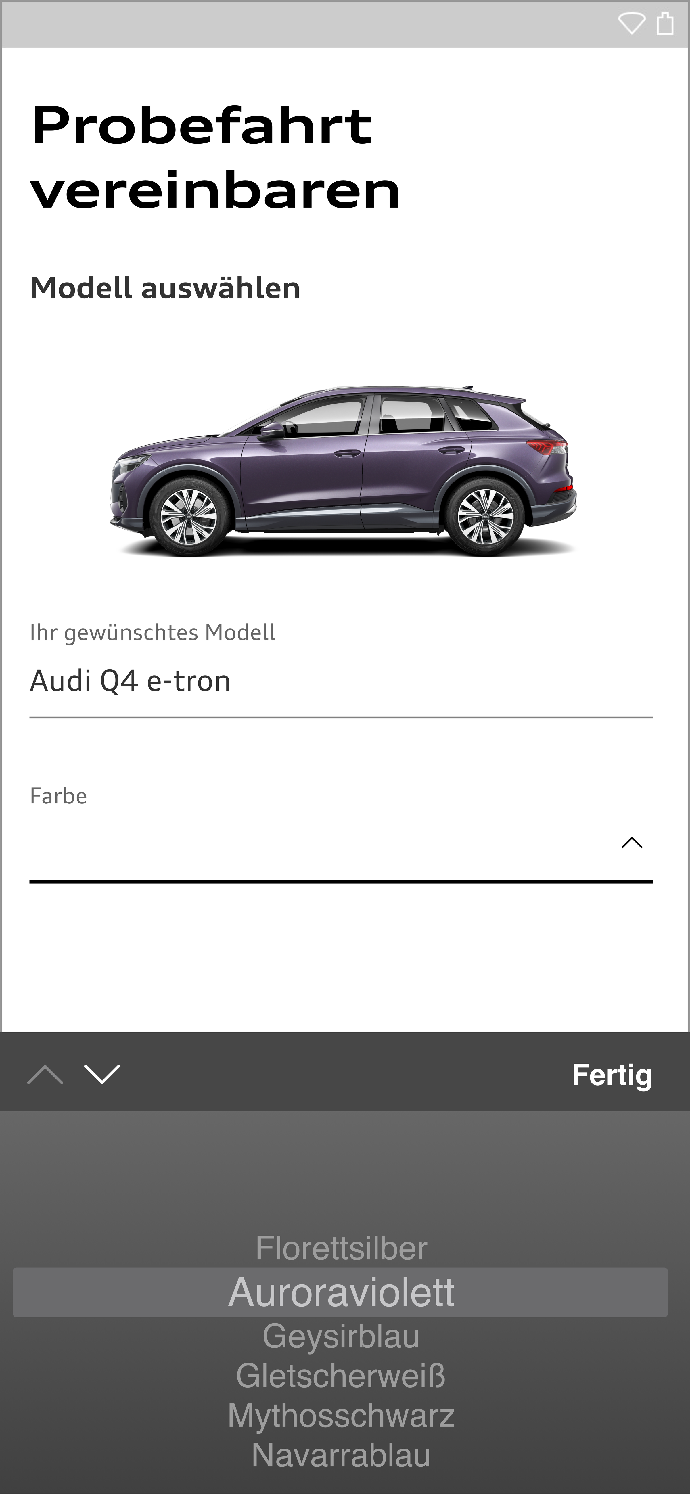
When activated, selection fields show any number of selection options in a dropdown. They can be grouped by means of labels.
If necessary, a checkbox can be provided to allow multiple selection. Multiple options are separated by commas after selection. If the list exceeds the width of the selection field, it is displayed in a shortened form. An apostrophe and a numerical display of the number of selected options indicate the options no longer displayed.
<div class="aui-select aui-js-select aui-select--floating-label">
  <select class="aui-select__input" id="sample-select">
    <option selected disabled class="aui-select__input-label">Label <span class="aui-select__input-label--optional">(optional)</span></option>
    <option value="0">Audi Sport</option>
    <option value="1">Audi City</option>
    <option value="2">Audi e-tron</option>
    <option value="3">Audi quattro</option>
    <option value="4">Audi connect</option>
    <option value="5">Audi mobility</option>
    <option value="6">Audi driving experience</option>
  </select>
  <label class="aui-select__label" for="sample-select">Label</label>
  <span class="aui-select__description">If the customer doesn’t understand the label itself or is just unsure of its meaning, an additional description can help squash any uncertainty.</span>
</div>
Structuring and Grouping
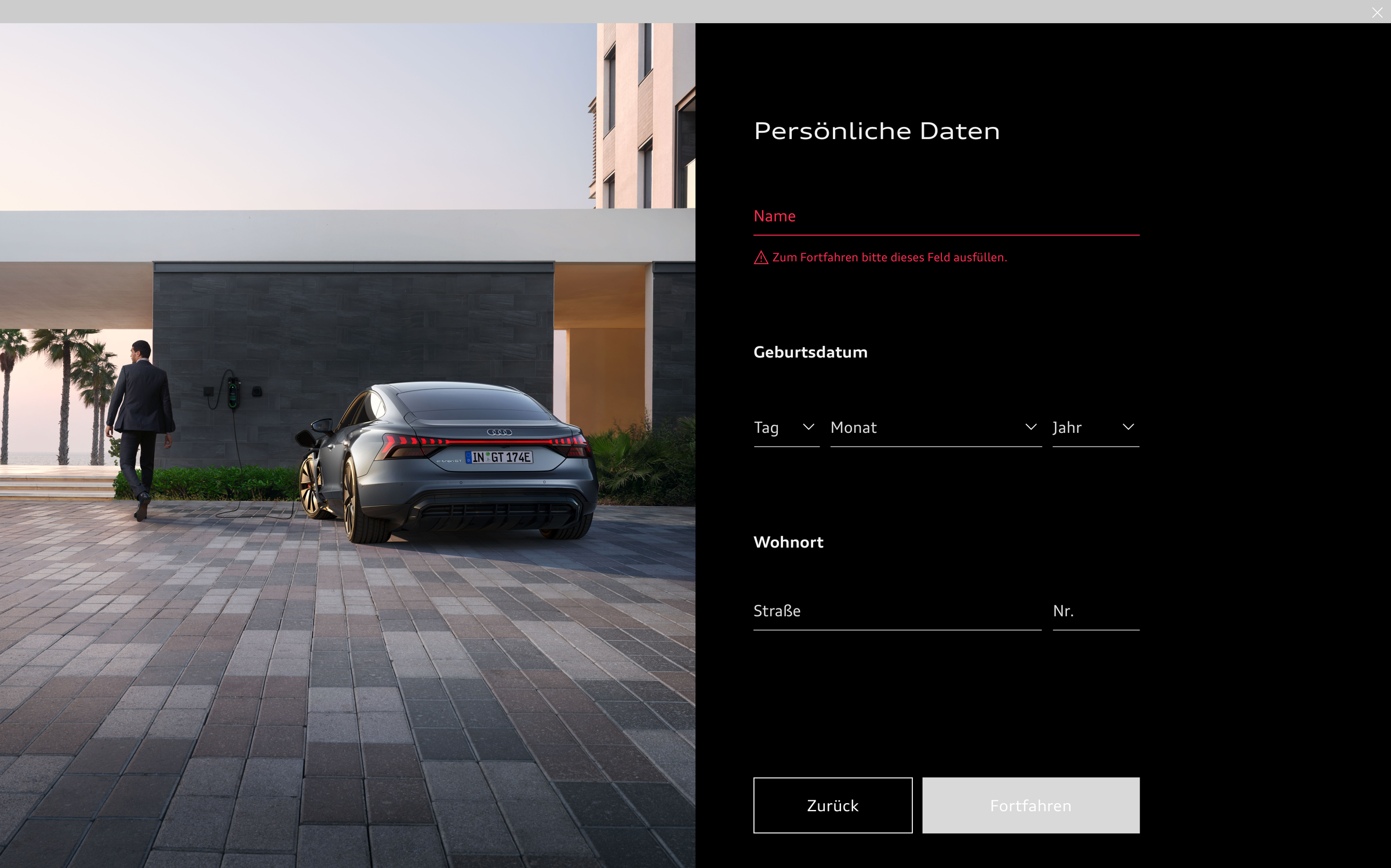
Form elements can be structured and grouped by means of interim headlines, white space, separation lines and blocks. Lengthier data requests should be subdivided into several stages so as to avoid potential data loss and in order to appear less daunting.
<fieldset class="aui-fieldset aui-fieldset--textfields">
  <legend class="aui-fieldset__legend aui-fieldset__legend">Title</legend>
  <div class="aui-fieldset__fields">
    <div class="aui-fieldset__field">
      <div class="aui-textfield aui-js-textfield aui-textfield--floating-label">
        <div class="aui-textfield__field">
          <input class="aui-textfield__input" type="text" id="sample-textfield-1">
          <label class="aui-textfield__label" for="sample-textfield-1">Text</label></span>
        </div>
      </div>
    </div>
    <div class="aui-fieldset__field">
      <div class="aui-textfield aui-js-textfield aui-textfield--floating-label">
        <div class="aui-textfield__field">
          <input class="aui-textfield__input" type="text" id="sample-textfield-2">
          <label class="aui-textfield__label" for="sample-textfield-2">Text</label></span>
        </div>
      </div>
    </div>
  </div>
</fieldset><div class="aui-textfield aui-js-textfield aui-textfield--floating-label">
<div class="aui-textfield__field">
<input class="aui-textfield__input" type="text" id="sample-textfield" />
<label class="aui-textfield__label" for="sample-textfield">Label</label>
</div>
<span class="aui-textfield__description">If the customer doesn’t understand the label itself or is just unsure of its meaning, an additional description can help squash any uncertainty. <small class="aui-small">(optional)</small></span>
</div><div class="aui-textfield aui-js-textfield aui-textfield--floating-label">
<div class="aui-textfield__field">
<input class="aui-textfield__input" type="text" id="sample-textfield" />
<label class="aui-textfield__label" for="sample-textfield">Label <small class="aui-small">(optional)</small></label>
</div>
<span class="aui-textfield__description">If the customer doesn’t understand the label itself or is just unsure of its meaning, an additional description can help squash any uncertainty.</span>
</div>Validation
Erroneous entries are indicated by means of a red line, a red label, a red error description and, in the case of a group, with a red group headline. In order to create an accessible user experience, the signal red codes are optimised for the theme used.
<div class="aui-textfield aui-js-textfield aui-textfield--floating-label is-invalid">
  <div class="aui-textfield__field">
    <input class="aui-textfield__input" type="text" id="sample-textfield" />
    <label class="aui-textfield__label" for="sample-textfield">Label</label>
  </div>
  <span class="aui-textfield__error">Error messages that reassure users can make it easy for them to correct their mistakes and continue with the form.</span>
</div>
<fieldset class="aui-fieldset aui-fieldset--textfields is-invalid">
  <legend class="aui-fieldset__legend aui-fieldset__legend">Title</legend>
  <div class="aui-fieldset__fields">
      <div class="aui-fieldset__field">
        <div class="aui-textfield aui-js-textfield aui-textfield--floating-label is-invalid">
          <div class="aui-textfield__field">
            <input class="aui-textfield__input" type="text" id="sample-textfield-1">
            <label class="aui-textfield__label" for="sample-textfield-1">Text</label><span class="aui-textfield__focus-line"></span>
          </div>
        </div>
      </div>
      <div class="aui-fieldset__field">
        <div class="aui-textfield aui-js-textfield aui-textfield--floating-label is-invalid">
          <div class="aui-textfield__field">
            <input class="aui-textfield__input" type="text" id="sample-textfield-2">
            <label class="aui-textfield__label" for="sample-textfield-2">Text</label><span class="aui-textfield__focus-line"></span>
          </div>
        </div>
      </div>
   <span class="aui-textfield__error">Error messages that reassure users can make it easy for them to correct their mistakes and continue with the form.</span>
  </div>
</fieldset>
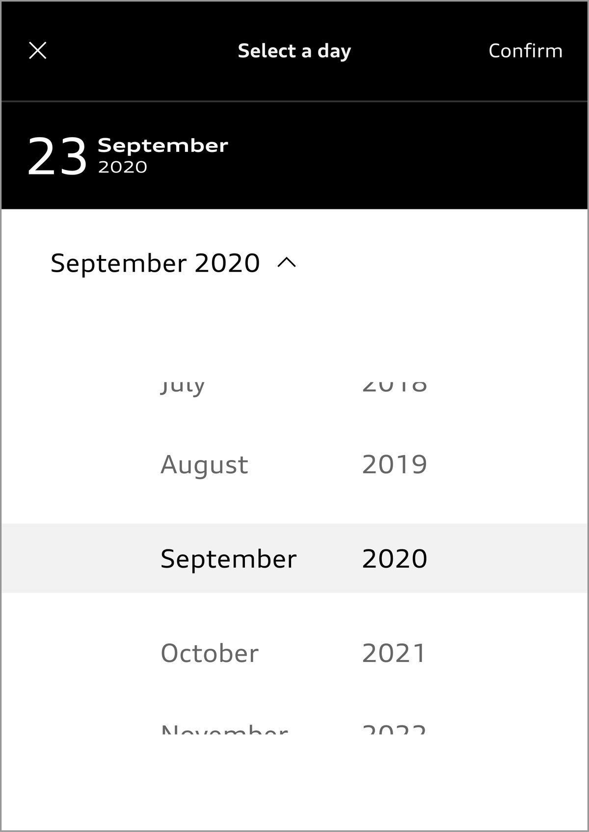
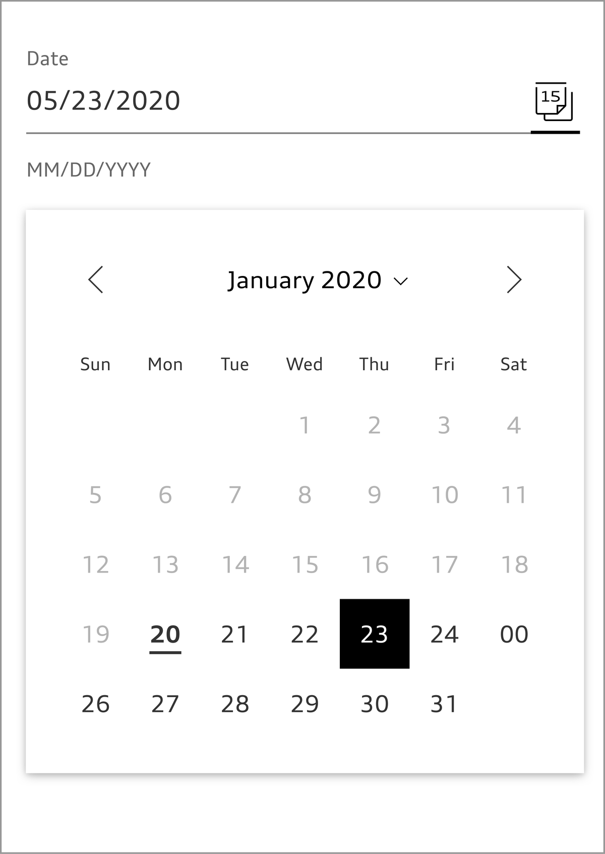
Datepicker
Known dates are entered the most easiest way by making use of numeric input fields. A select field for the month avoids misconceptions caused by differing established formats for writing dates in an international context.
A calendar is helpful especially to select previously unknown dates. It is added to an input field as an alternative input option, e.g. in form of a popover. If the period the user can choose a date from is narrow, the input field itself is not needed. On mobile devices, the operating system’s native datepicker is preferred.
Audi UI Kit – Integration into Sketch library
(supported until 30.06.2023)
To ensure designers are using the most up-to-date components and icons in their products, the Audi UI Kit was created as a sketch library. Integrate these UI Kits to get the latest Audi Sketch Libraries. Updates will be made regularly and users will be informed when new versions of the Librarys are available.
Audi UI Kit for Figma
To enable as many designers as possible to work with the Audi user interface components the UI Kit and icons is also offered for Figma. Updates are made regularly and all changes are documented for users in the changelog.
We strongly recommend to join the Audi Figma Workspace for being always up-to-date and to collaborate with others.The Audi Design Kits are already included into the Figma teams in the Audi Workspace. To get access to a team or project please reach out to us here.
In case you are not working directly in the Audi Figma workspace you find the latest version as download below.


