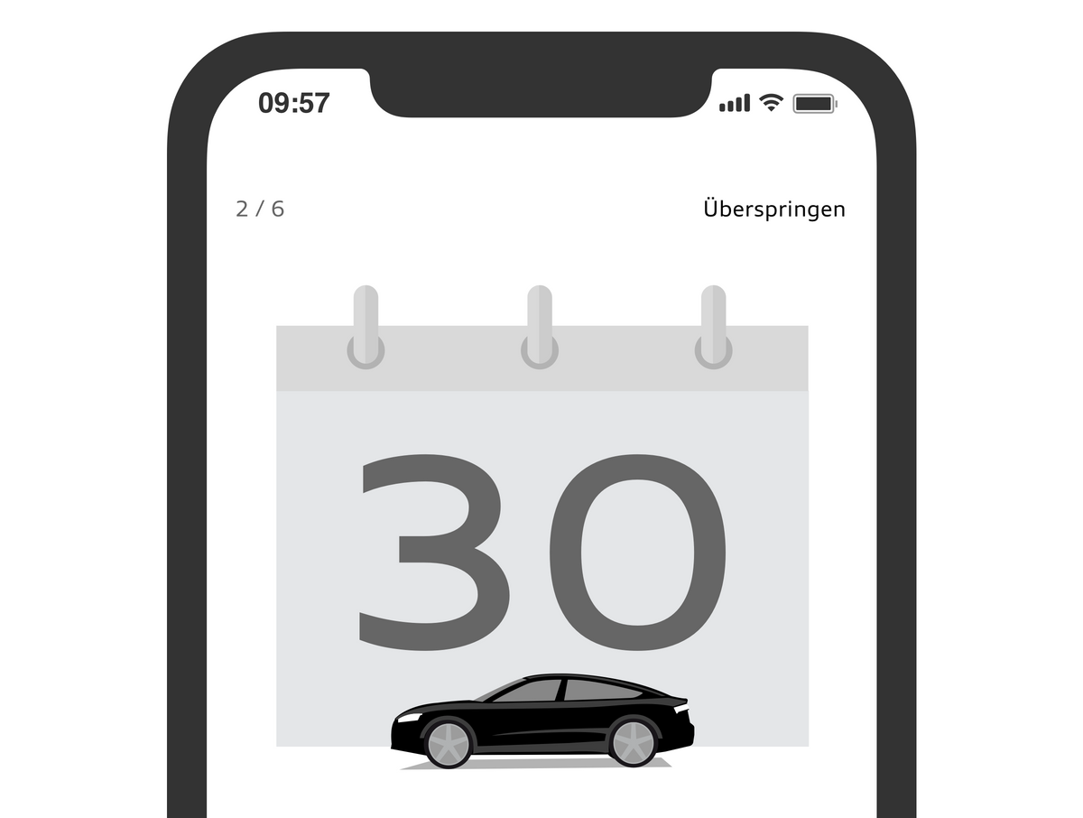
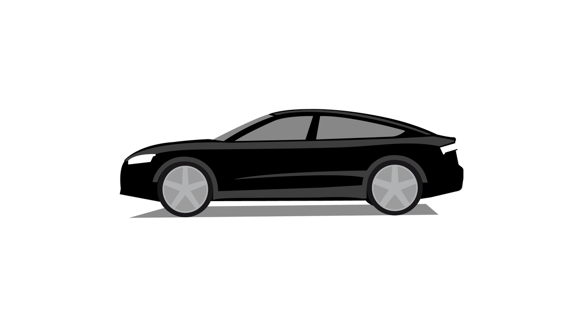
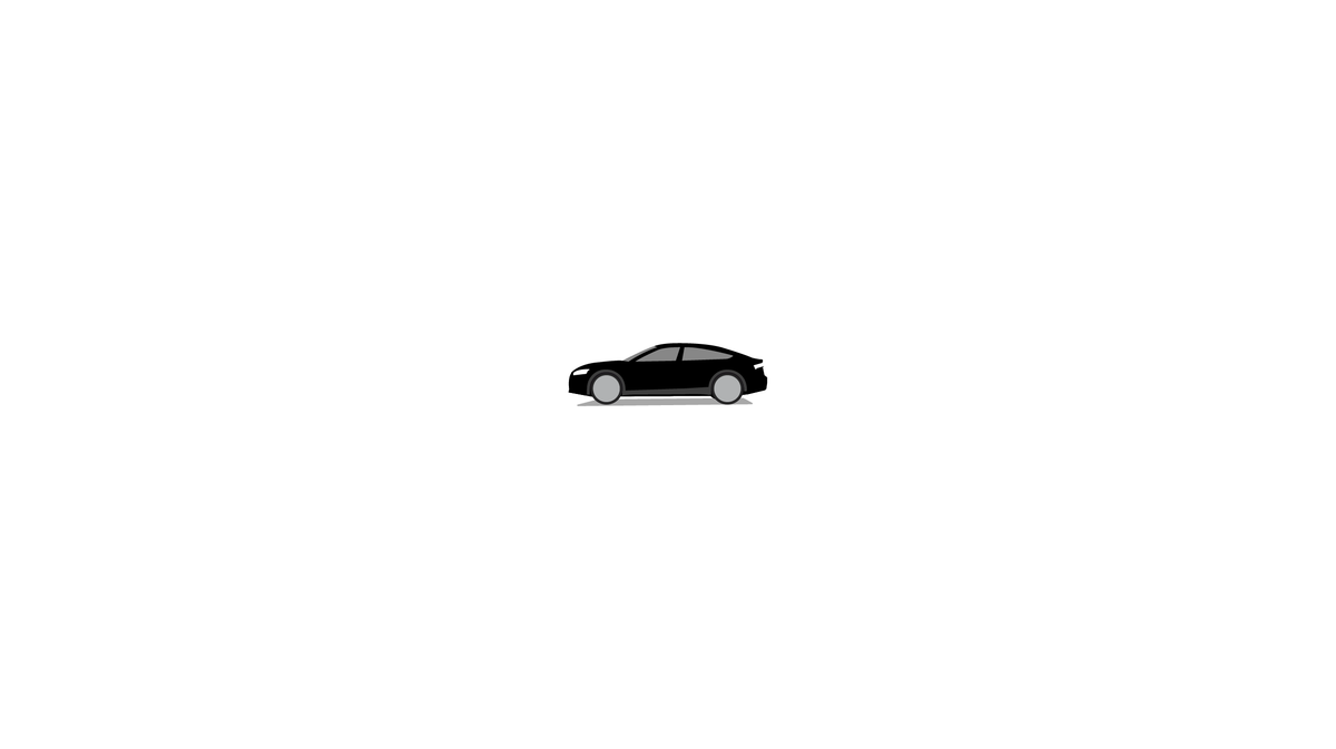
Illustration


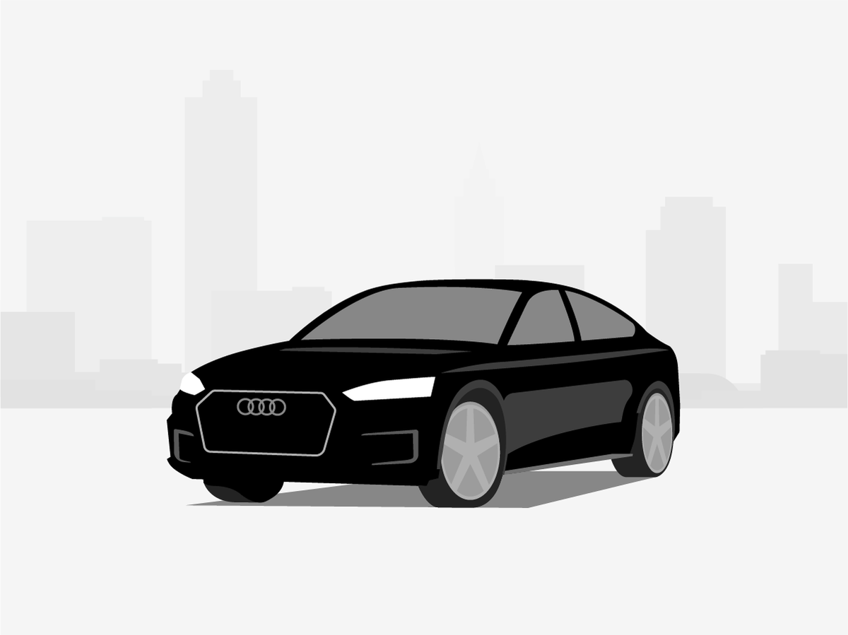

High degree of abstraction
Simple metaphors and avoidance of details that are not essential to understand the content of the illustration ensure easy and quick comprehension of the message.
Text is used to accompany illustrations rather than as an integral part of them. This ensures that the illustrations can be used in a variety of image sizes.


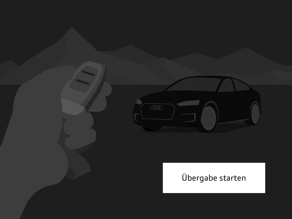
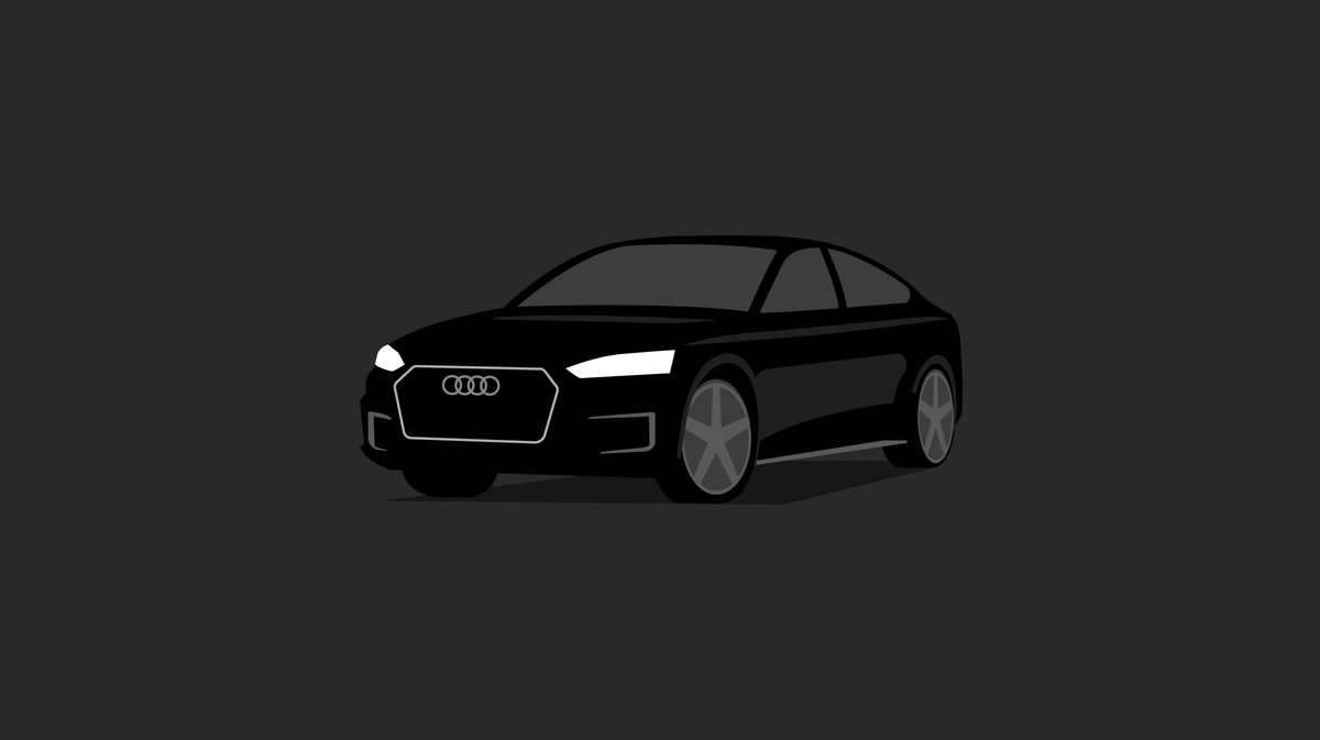
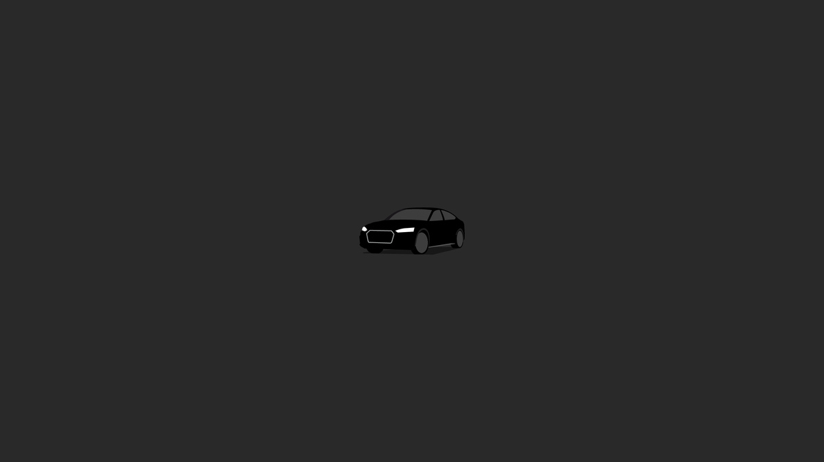


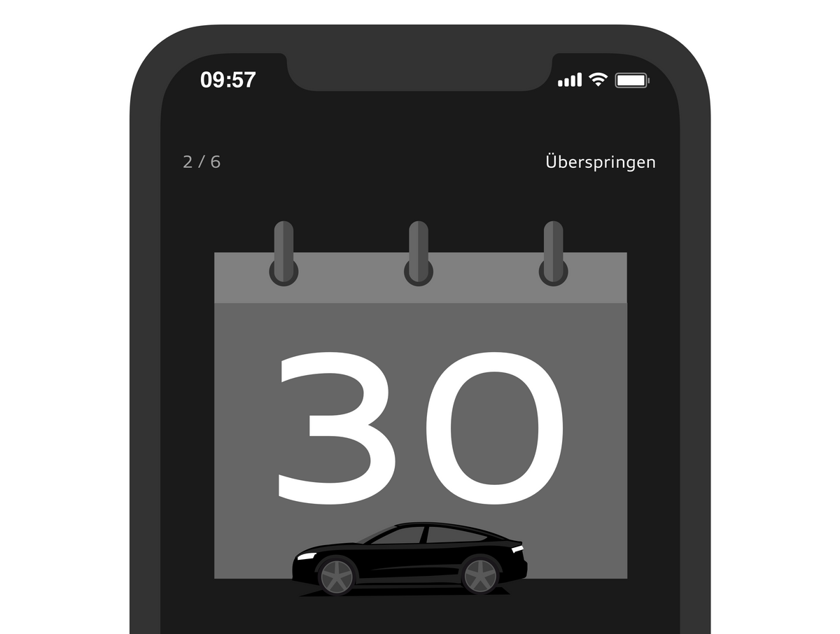
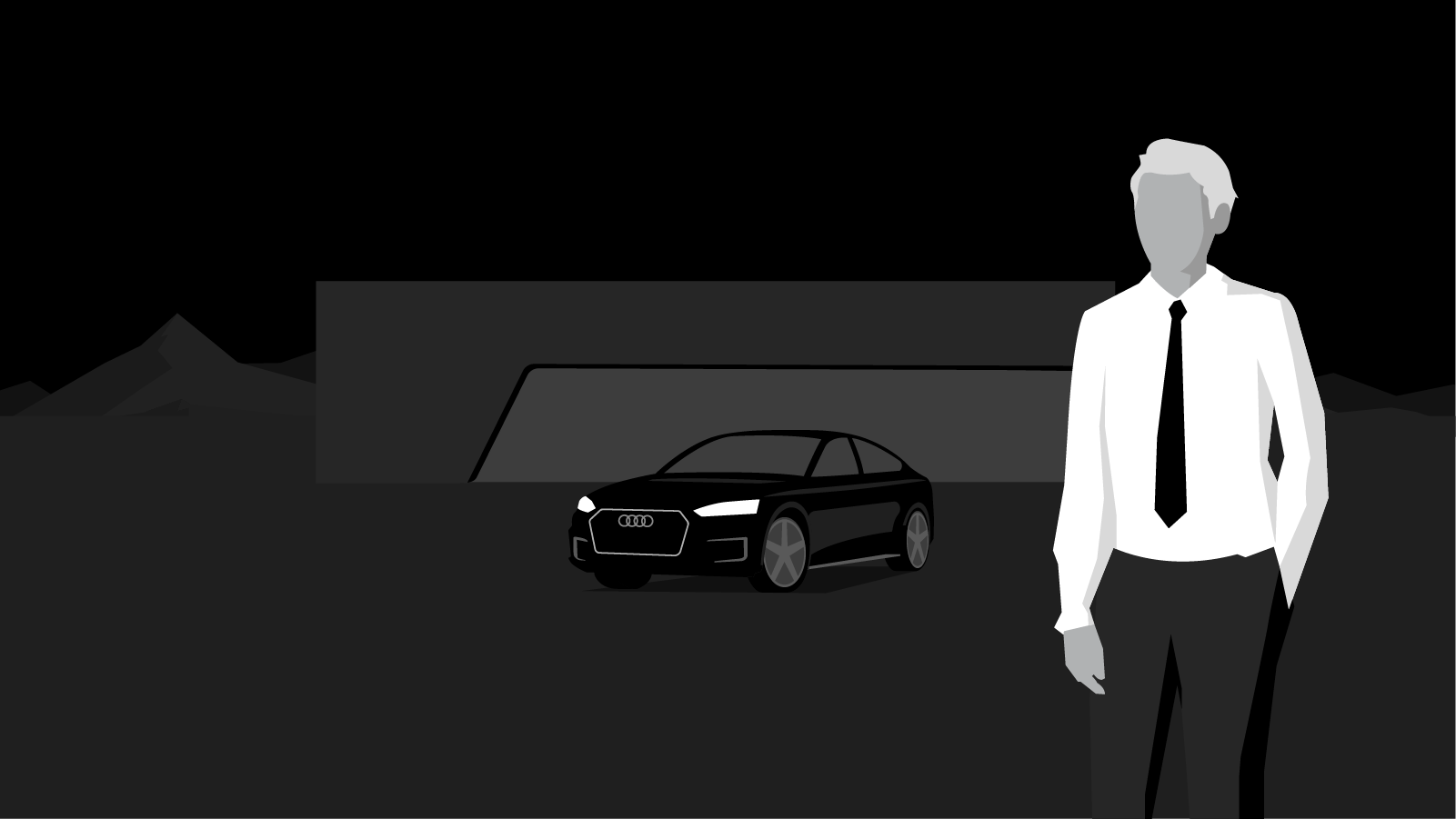
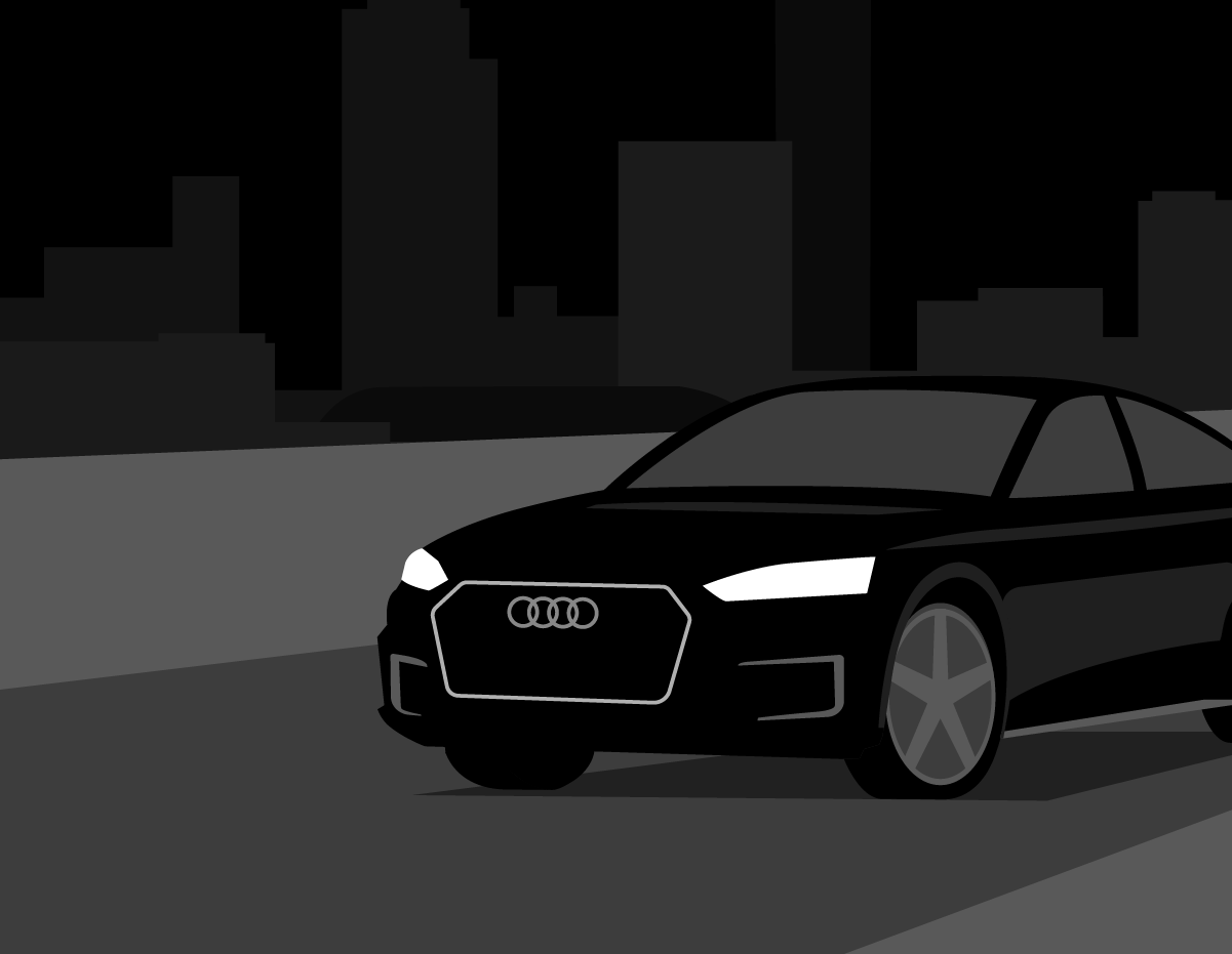
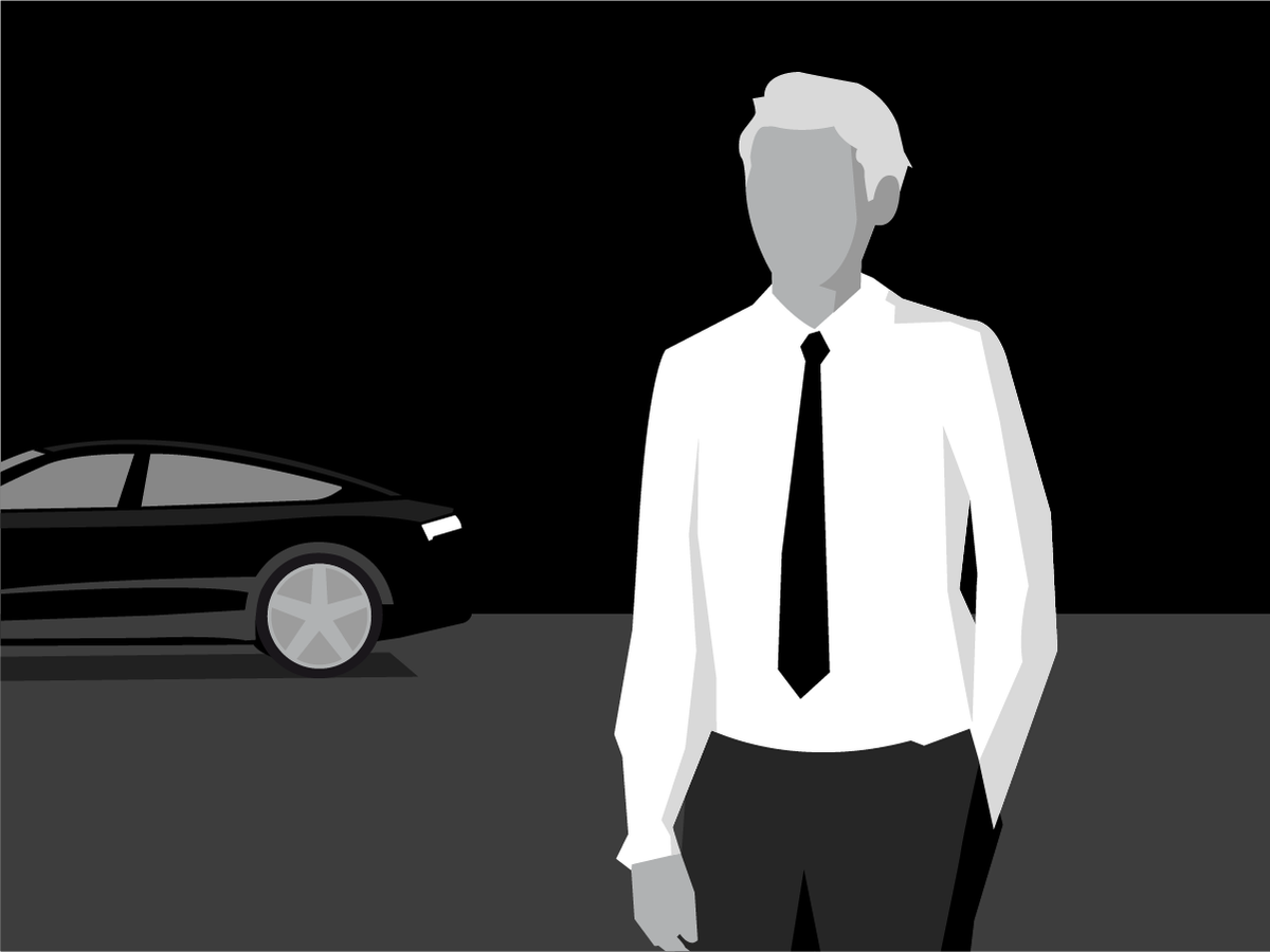
Illustrations for dark backgrounds
Two versions of illustrations are to be created if they are to be used on both light and dark backgrounds (subsequent link to Dark Theme). Light illustrations are always converted into dark ones manually, paying attention to the level hierarchy that has been defined. In order to prevent errors in presentation, such as black headlights, the original illustration is never to be recolored by simply inverting it.
Illustrations for dark backgrounds are given a minimal amount of white in order to blend harmoniously into their surroundings. This also avoids a bright, dazzling effect. As a basic principle, a flowing transition must be ensured between the background of the illustration and the background onto which it is to be placed