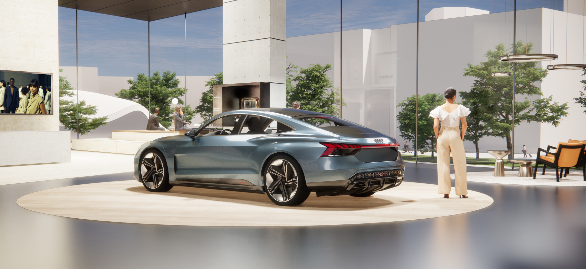
Atmosphere
»We design sophisticated and captivating spaces with a warm, inviting, harmonious and elegant atmosphere. These create an emotional bond with our visitors and showcase our products in the best possible way.«
We achieve this by coordinating a variety of colours and materials, as well as adapted lighting to optimally illuminate the content and scenery. Our spaces reflect our brave and progressive attitude and the distinctly premium nature of our brand. At the same time, they never appear ostentatious or pretentious.


Human Centric
Pure design language and a curated selection of design elements (colours, materials, light and furniture) combine to create a warm and inviting atmosphere where our visitors feel comfortable and welcome.
When selecting the design elements, every detail counts: using only a few elements, we consistently create accents that stage the respective product or theme as meaningfully as possible.
The goal is to create a reduced, open and inviting space that never appears cold.
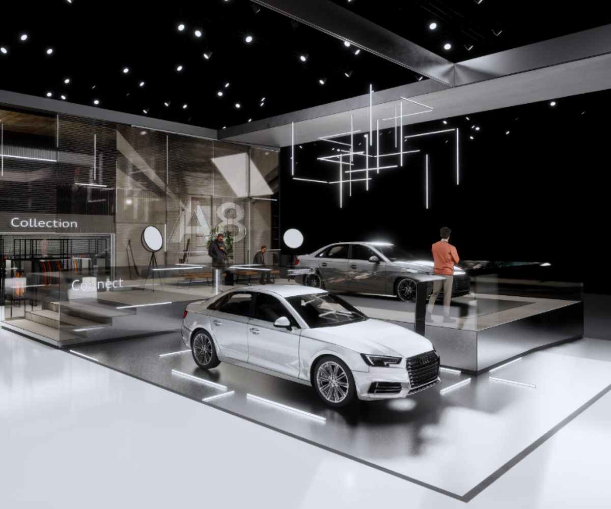
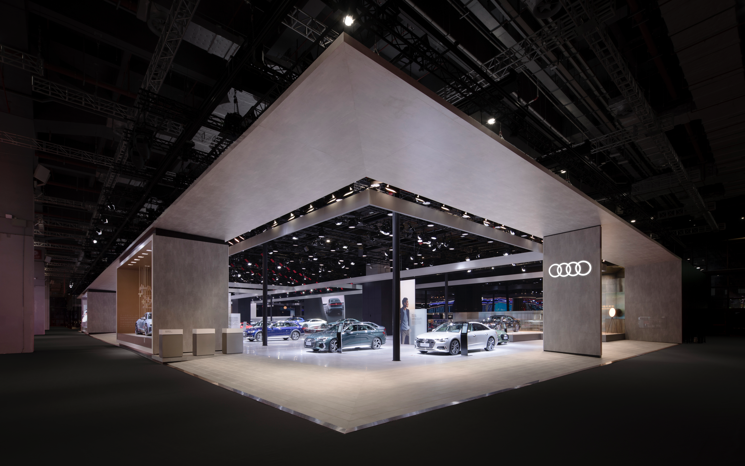
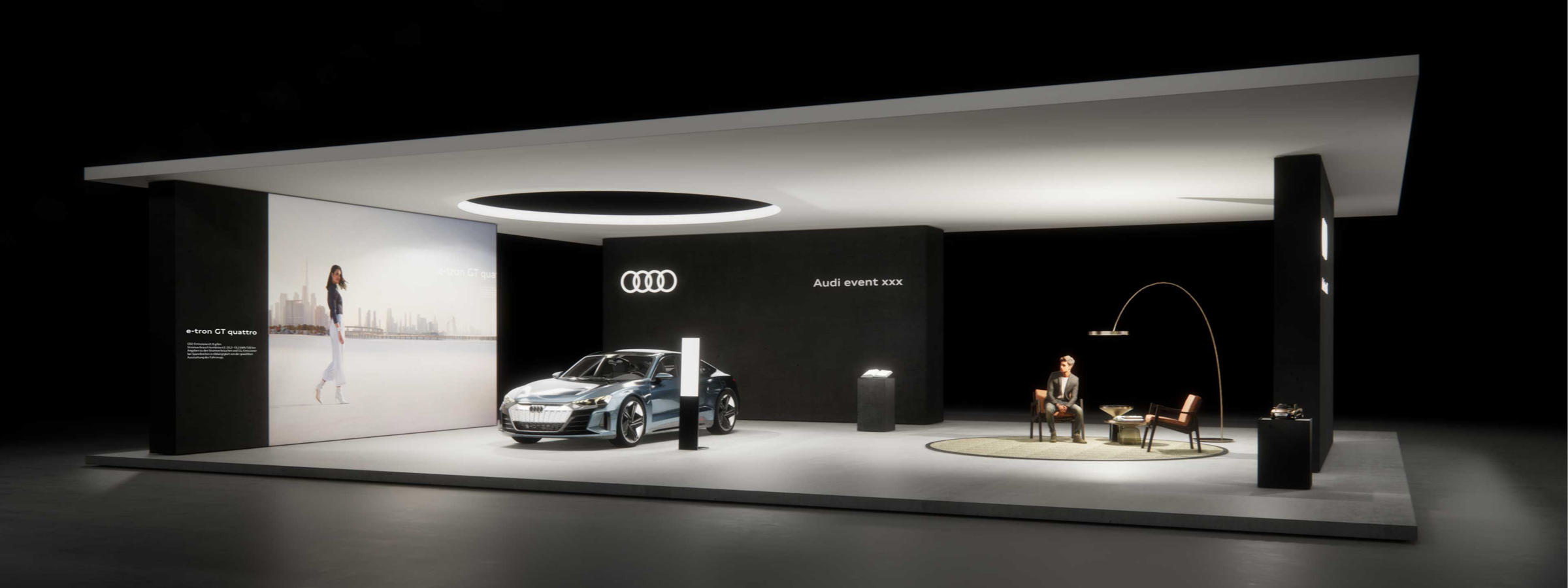
2. Space and Brand Agenda Topic
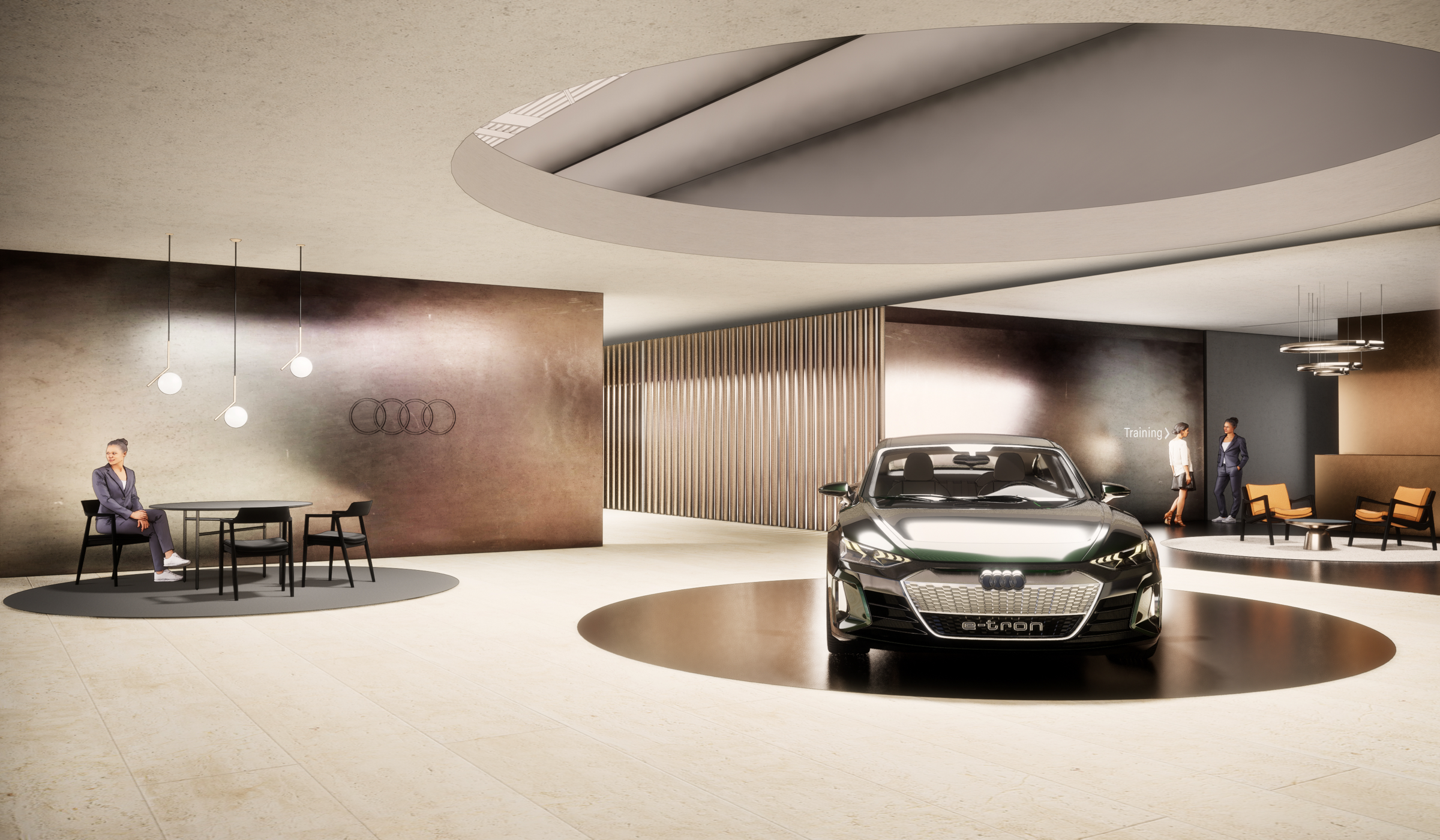
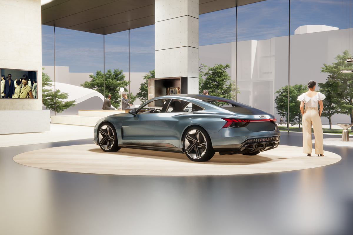
The space as a whole, appears bright and inviting. In addition, it is divided into easily recognisable and clearly zoned staged areas dedicated to our Brand Agenda Topics. Each showcase has its own lighting atmosphere, which creates an overall context rich in contrast.
Detailed descriptions of the Audi materials are available for download in the Form chapter.
The basic mood at a motor show should be pure, bright and inviting. Reduced forms, linear walkways and good visual axes are essential for intuitive orientation. The focus is clearly on showcasing the vehicles. These are illuminated shadow-free with daylight-quality lighting and stand out from their surroundings.
Large communication areas convey content and provide additional orientation within the space.
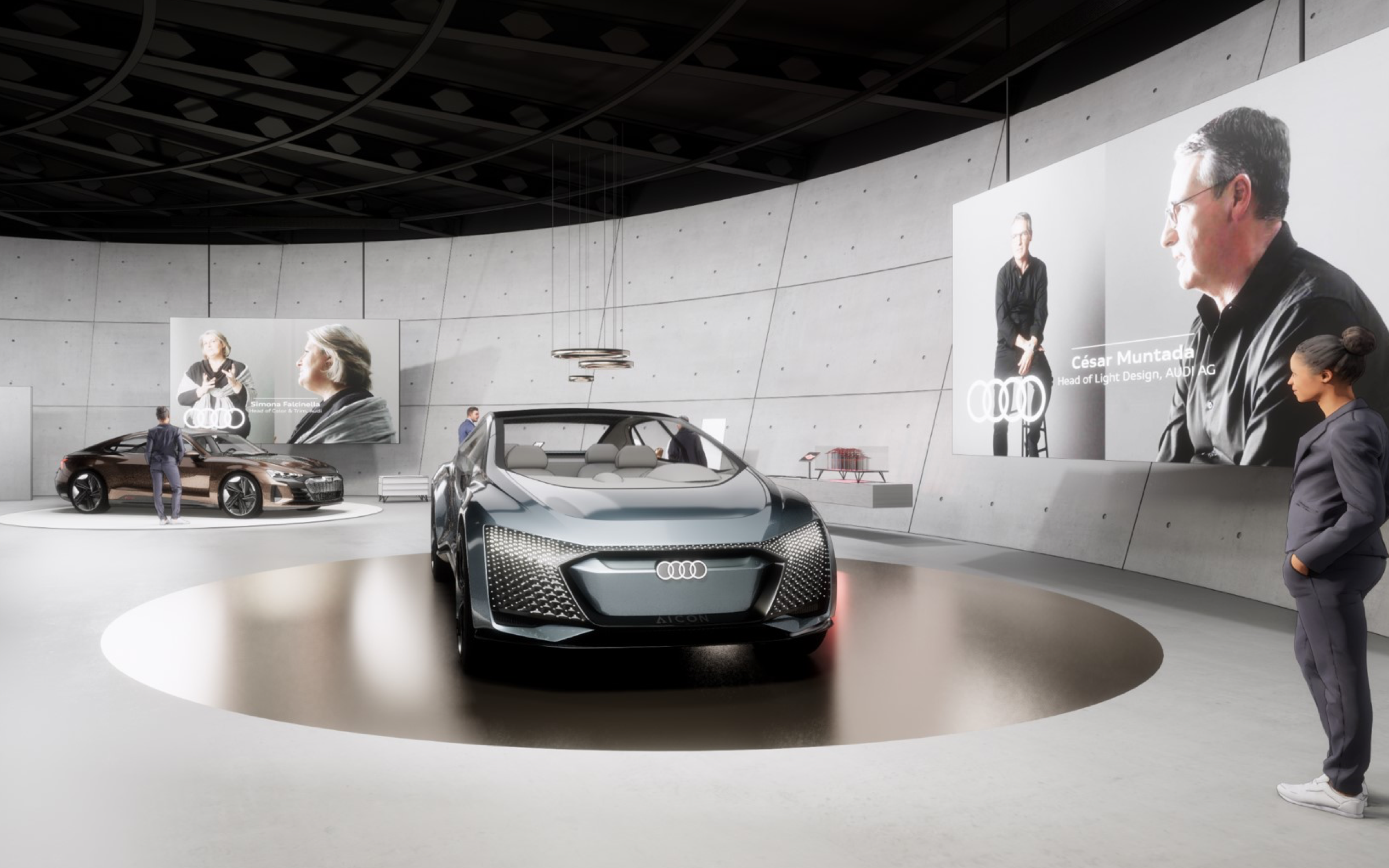
Exhibitions are designed with a calm, museum-like character. The warm, elegant and inviting atmosphere reflects our premium values. Vehicles and themes are supplemented by exhibits and graphic displays.
Creating a generous sense of space so visitors can experience our Brand Agenda Topics is the main goal.
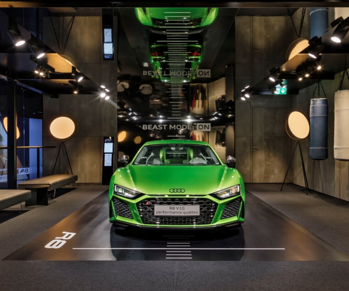
For events that are recorded, the concept emerges from the perspective of the camera. Materials are therefore adapted to the studio atmosphere, and high-contrast scenery is created.
The stage is the focus. All other areas, such as the stage’s foreground, side areas or production equipment are faded out through the use of dark, matt materials. Additionally, to hide unwanted background elements, a very dark, matt material is recommended.
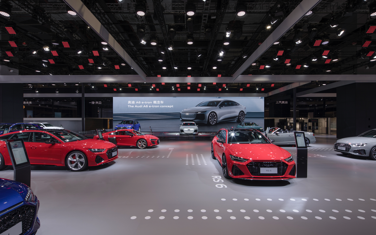
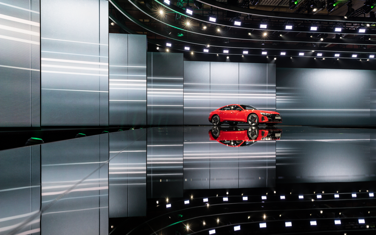
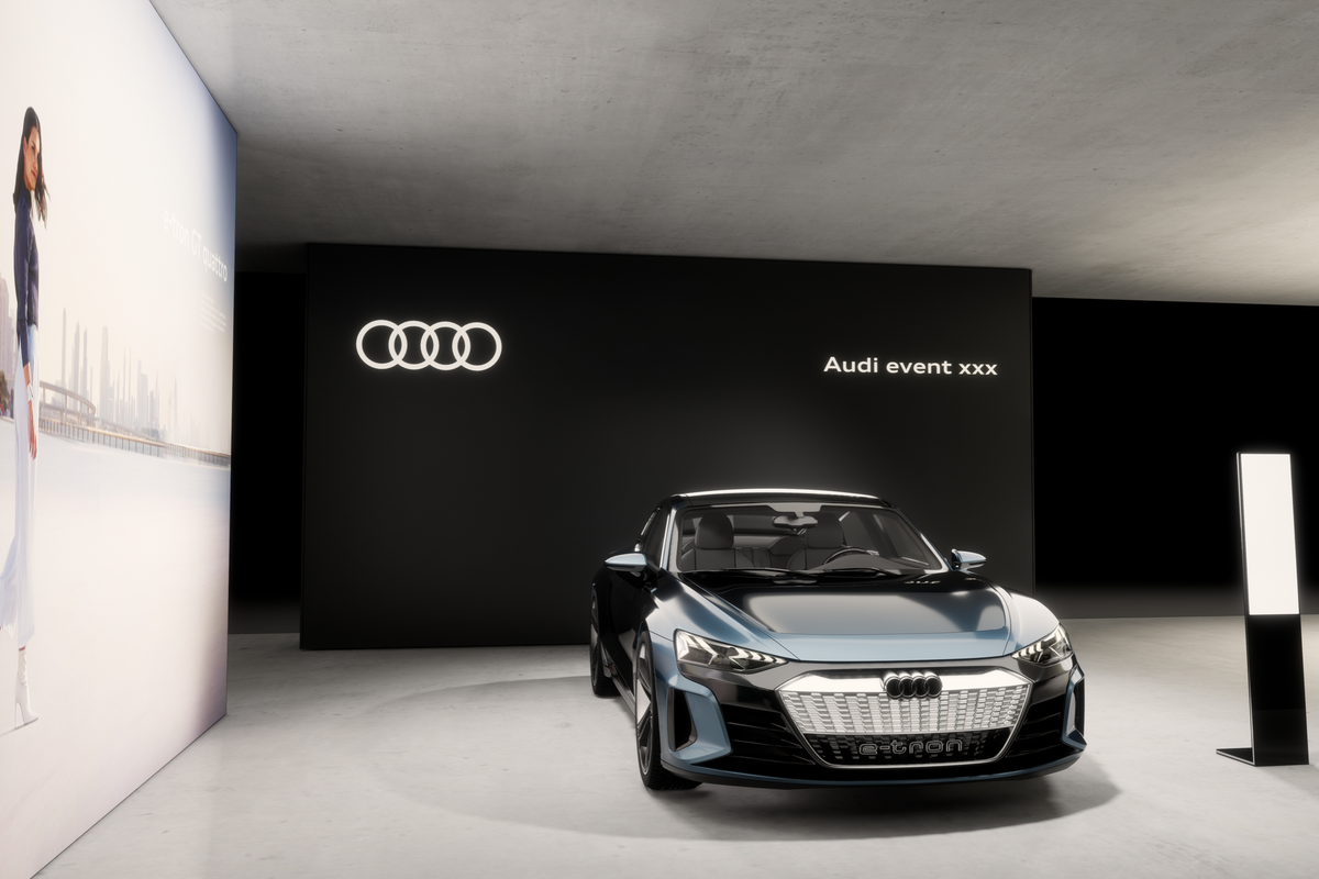
Black, high-gloss floors are particularly suitable for Progressive Premium staging of vehicles.

»Light may not weigh anything, but it nonetheless carries considerable weight. As human beings, our perception of the world is very much dependent on how light portrays it. Light is an important innovation field for Audi, it is part of our DNA.«
Design and technology combine in spaces to create an emotional experience. This relies on the interplay between light and shadow, the dynamics, the energy and the technology. The targeted use of light is central to our brand − both in terms of the products it highlights as well as the content. We use light to set the stage for vehicles and emphasise our Brand Agenda Topics. Finally, we create an atmosphere that always lives up to our own standards for Progressive Premium. On an intuitive level we promote the essence of our brand – creating experiences, emotions and excitement around it.


Vehicles in a brighter environment should be illuminated with a higher light intensity than vehicles in a darker environment:
Generally, vehicles in a motor show environment or one similar require higher light intensity than vehicles in a lounge – with standard room proportions and illuminated with architectural lighting.
For dark vehicles, we recommend increasing the light intensity.

Depending on the exhibition environment, there are different lighting categories that can be applied.
A distinction is made between architectural lighting and show lighting.
In either case, a high colour rendering value for all lighting is important: Colour Rendering Index at least CRI > 90 / light colour 4000 K for architectural light and 6000 K for show light.


The basic lighting mood on a booth is bright while the light colour is described as cold.
The focus is on the vehicles, which are illuminated with daylight-quality lighting. The light colour on booths with vehicles and visitor traffic areas is approx. 6000 K. Colour Rendering Index: at least CRI > 90. Architectural elements are to be illuminated according to the material used and according to their colour.
An important focus should be placed on the uniform lighting of architectural elements and the illumination of individual Brand Agenda Topics – where exhibits or special themes are illuminated selectively with a narrow beam angle (approx. 7° – 20°). In order to emphasise the unique character of certain architectural elements, the materials that have been used and their colours should be illuminated accordingly.

Depending on the theme, the desired spatial ambience can be created through the use of the right materials and suitable lighting. Warm materials are highlighted with a warm white light colour. While object lighting can be used atmospherically by highlighting individual features such as tables or lounges. More cold materials, such as concrete, can be amplified in their effect with cold white light. In this way, the environment can be made to feel warm and familiar or cold and technical.
A mixture of individual lighting colours and brightness within an area increases the spatial depth and three-dimensional affect of the objects in the room.

Warm materials have their appearances enhanced by a warm light source.
Within a space, it is possible to have an area comprising a combination of warm and cold lighting. This can be selected according to the surface colour.
(Cool shades: cold light / warm shades: warm light).
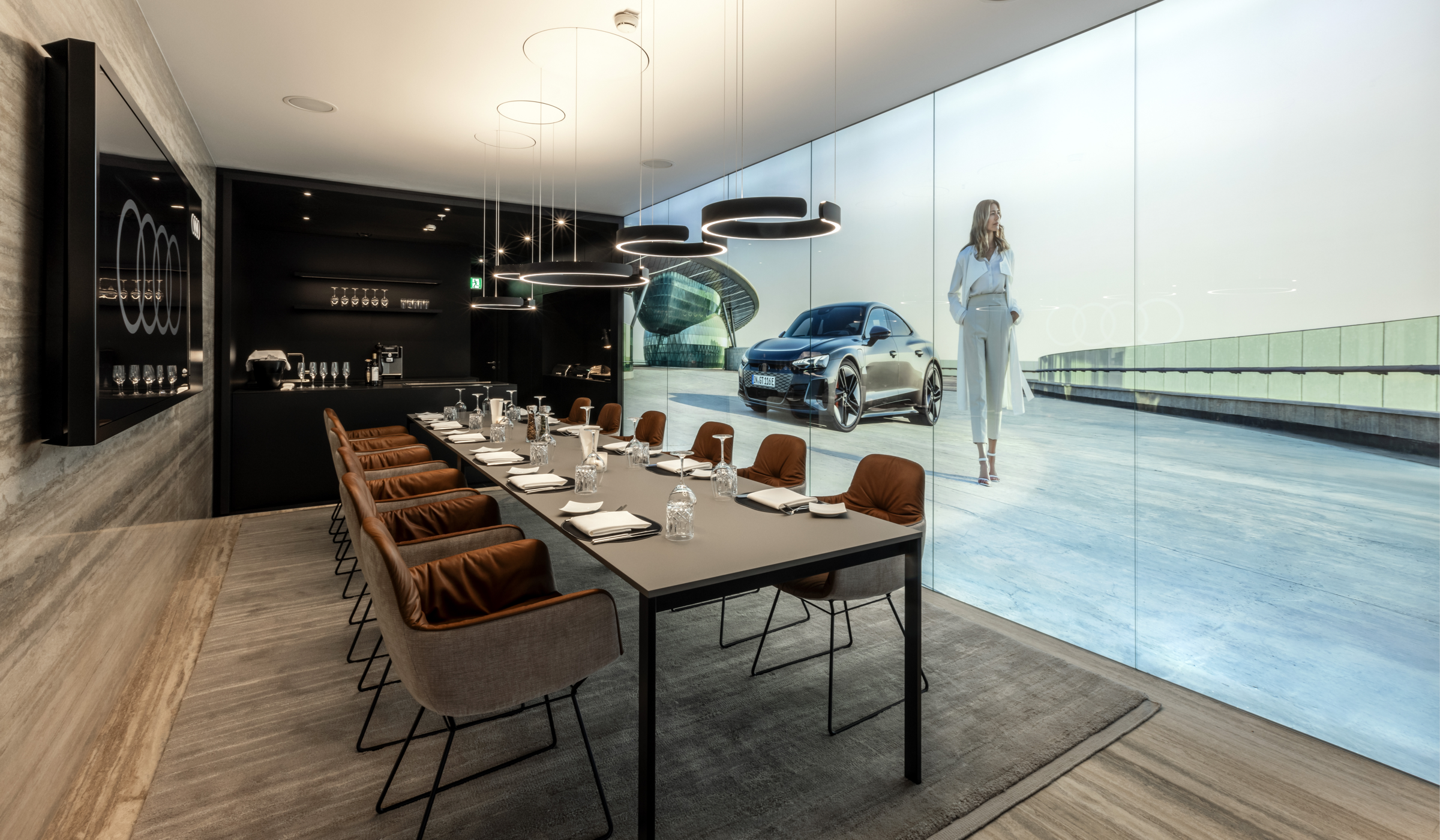
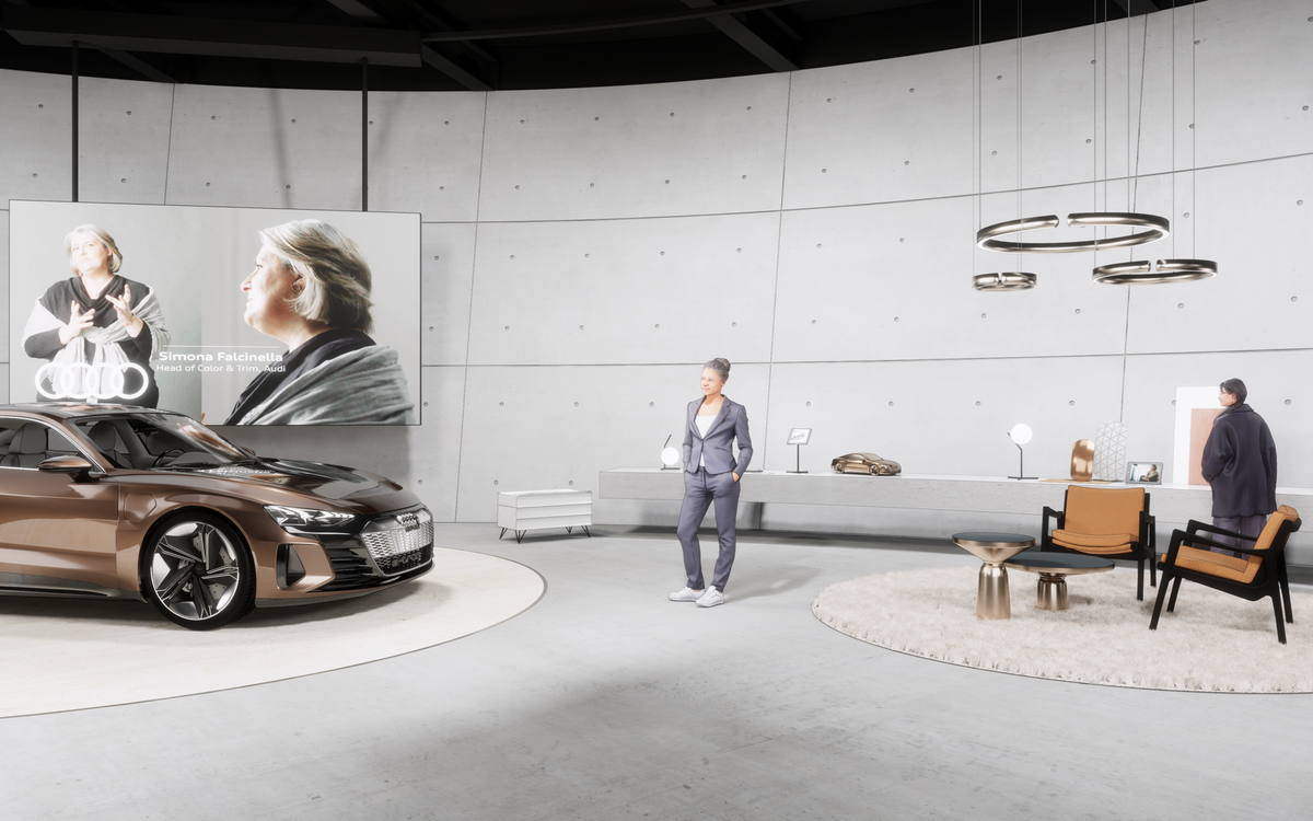
- Areas with warm materials or lounges are illuminated with warm white light. Pendant luminaires or floor luminaires emphasise the high-quality character. CRI > 90 / light temperature approx. 3000 K.
- Exhibits or material collages are given neutral lighting. Here, attention should be paid to a high Colour Rendering Index CRI > 90 / light temperature 4000 – 6000 K. A cool light temperature emphasises technical characteristics.
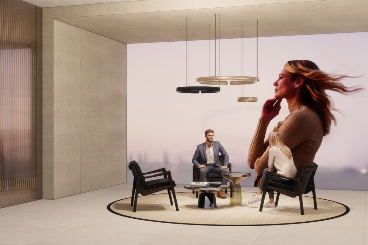
To create a hospitable environment, lounge areas should generally be illuminated with warm light. To create a glare-free environment for guests, care should be taken not to illuminate people directly, but rather the immediate surroundings, such as objects and table surfaces.
A warm light with a light temperature of up to 3000 K should be selected.
Free-standing, pendant or suspended luminaires enhance the lighting mood and set a lounge apart from other zones.
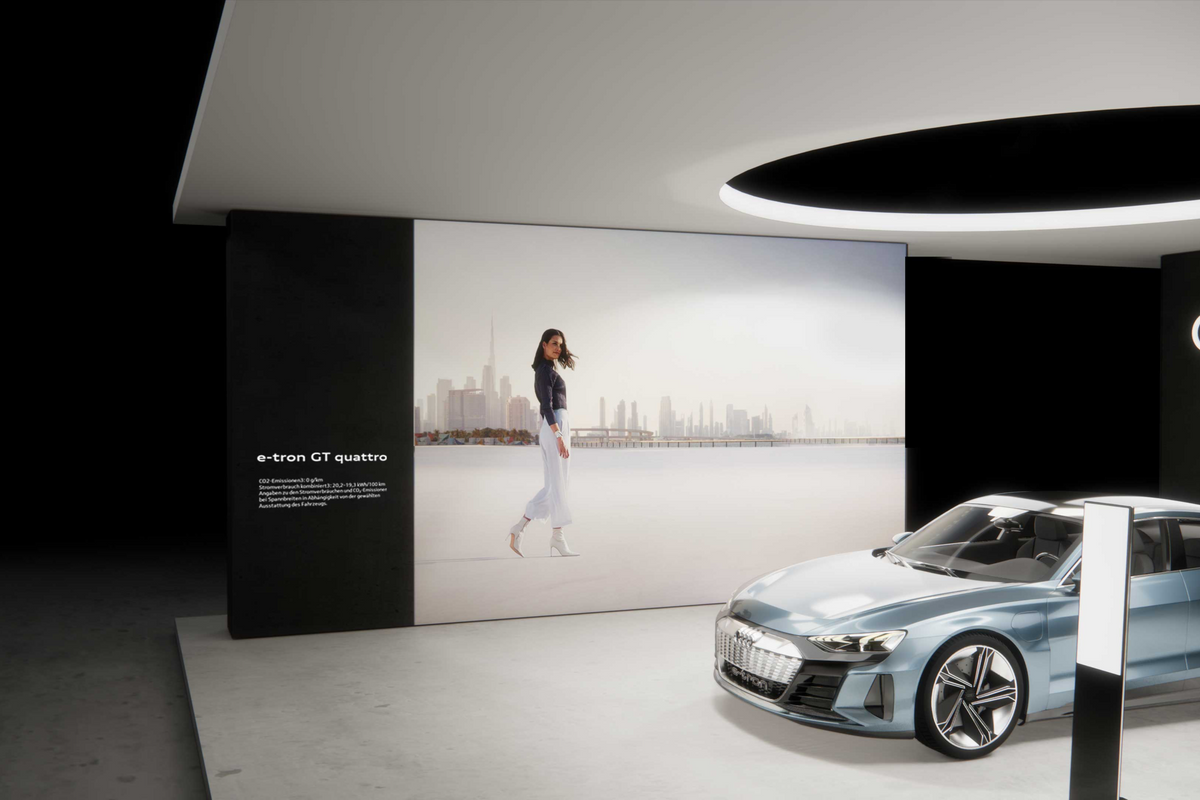
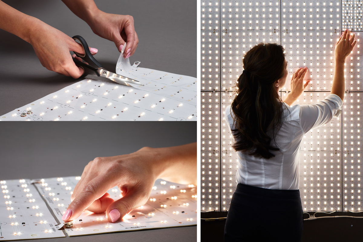
Communication areas can be designed to function like media surfaces (using assembled LED modules) or host backlit graphic displays.
All graphic displays should be illuminated consistently.
The colour temperature applied to the backlighting should be determined individually based on the graphic and must appear coherent within its overall setting.
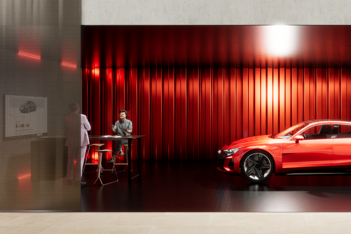
For the ‘Performance’ Brand Agenda Topic, light colour and type can be selected very specifically and may even be partially highlighted through the use of red light.
Importantly, however, the vehicle should always be illuminated with a white light and classic luminaires. Colour Rendering Index: at least CRI > 90 / light colour 6000 K. The light intensity for staging should be adapted accordingly.

»Furniture and accessories reinforce the stylistic confidence of our brand. Timeless and sophisticated, they create accents in the space that round off the look.«
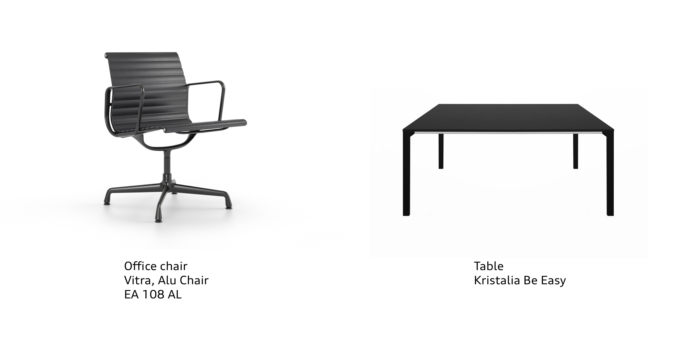
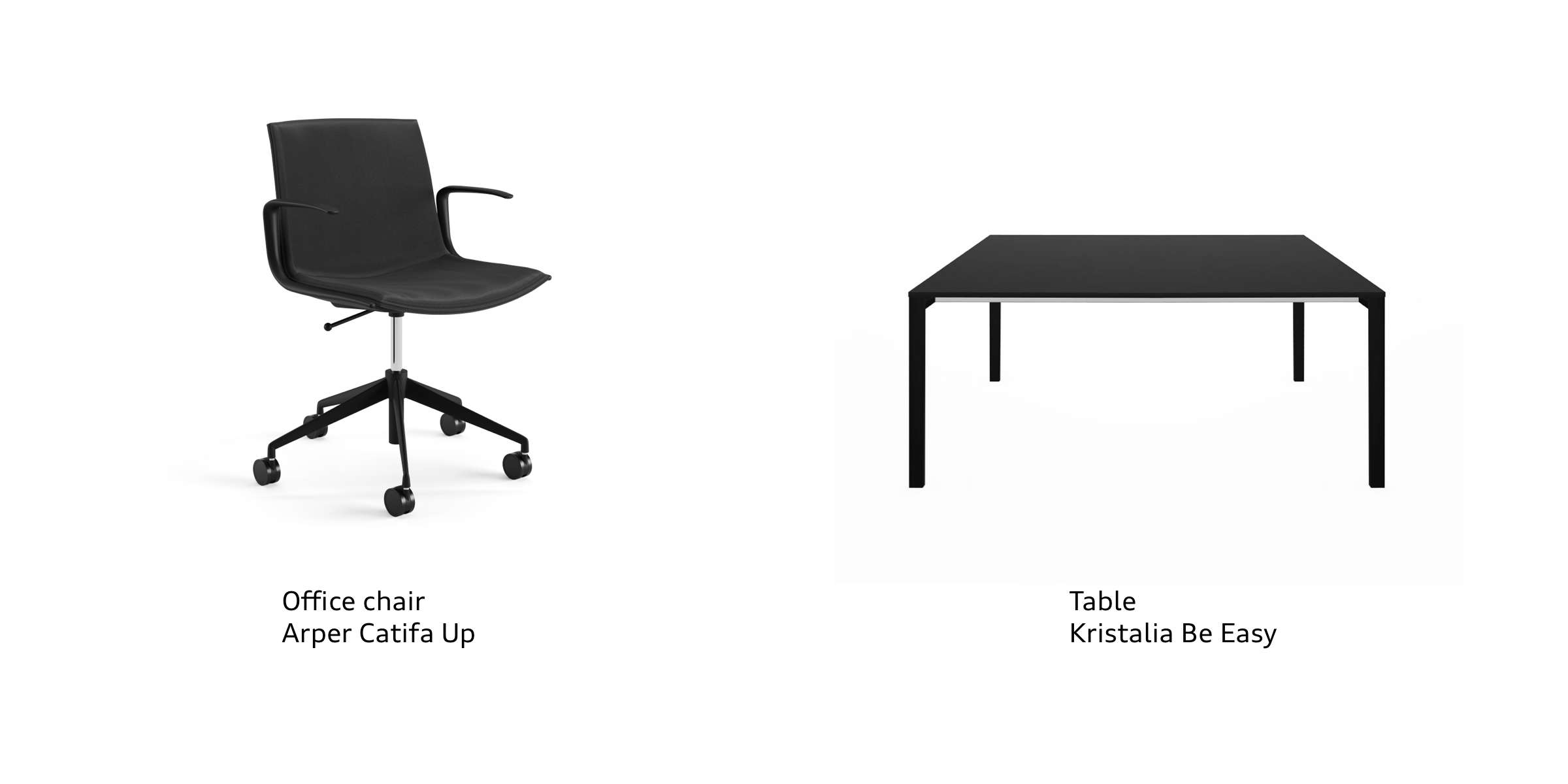
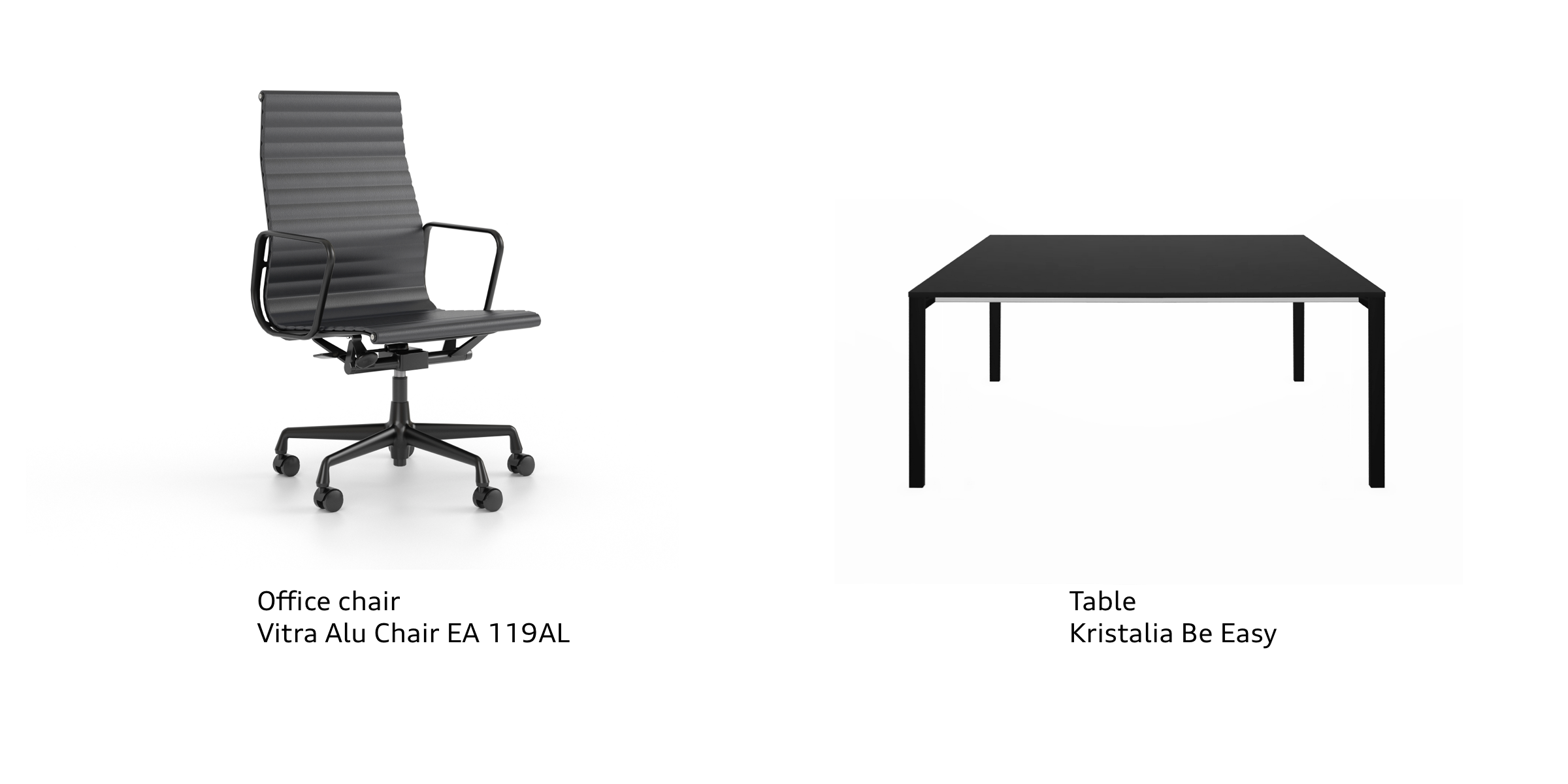
Sophistication, elegance and timelessness − these attributes apply just as much to the furniture we use. Accessories and furniture are chosen consciously with a focus on sustainability. They highlight the corresponding Brand Agenda Topics or the occasion of the event.
Pre-defined Furniture Combinations
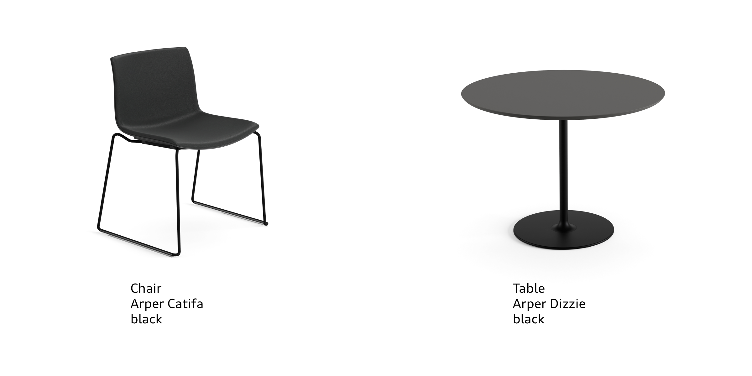
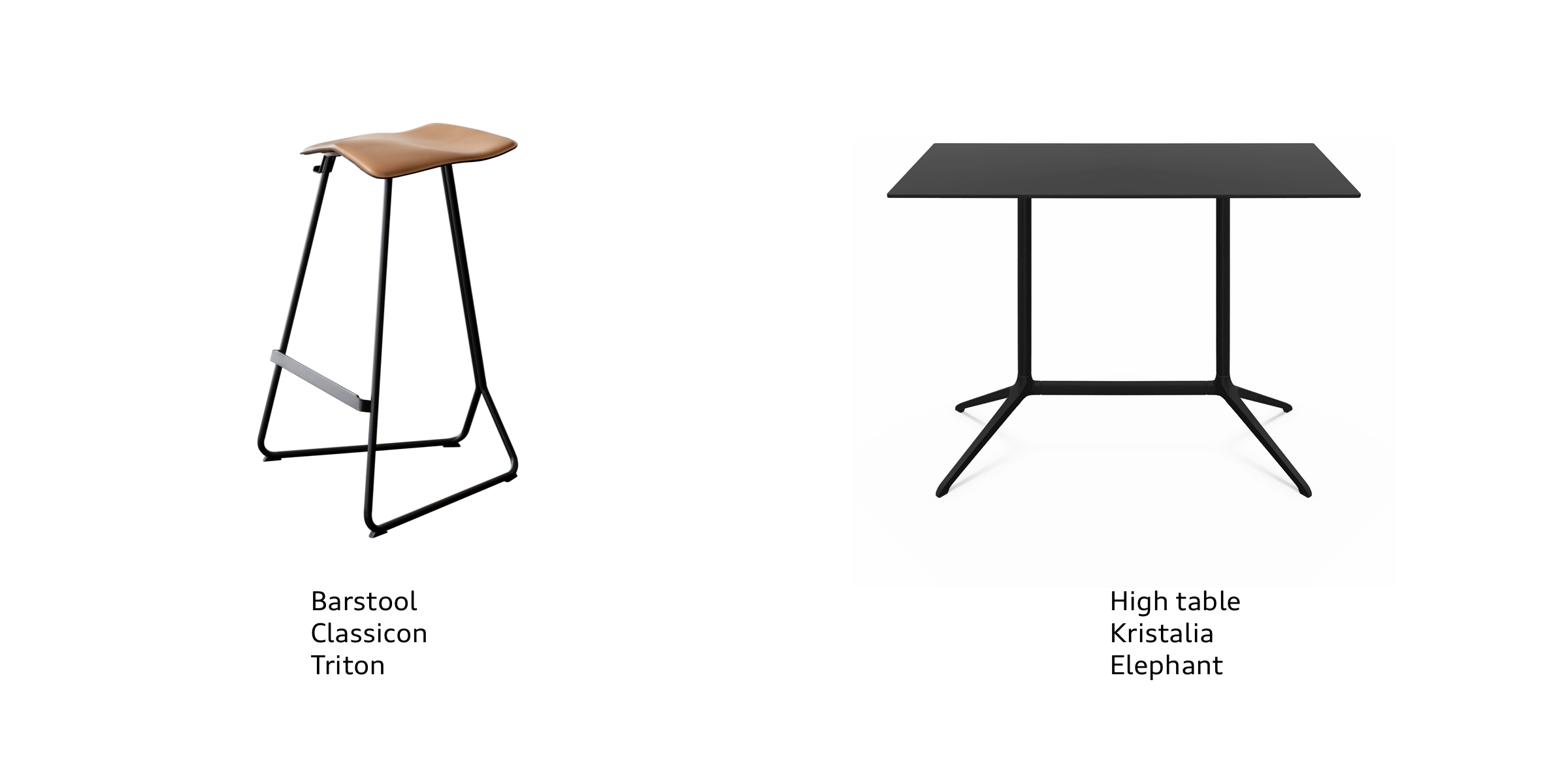
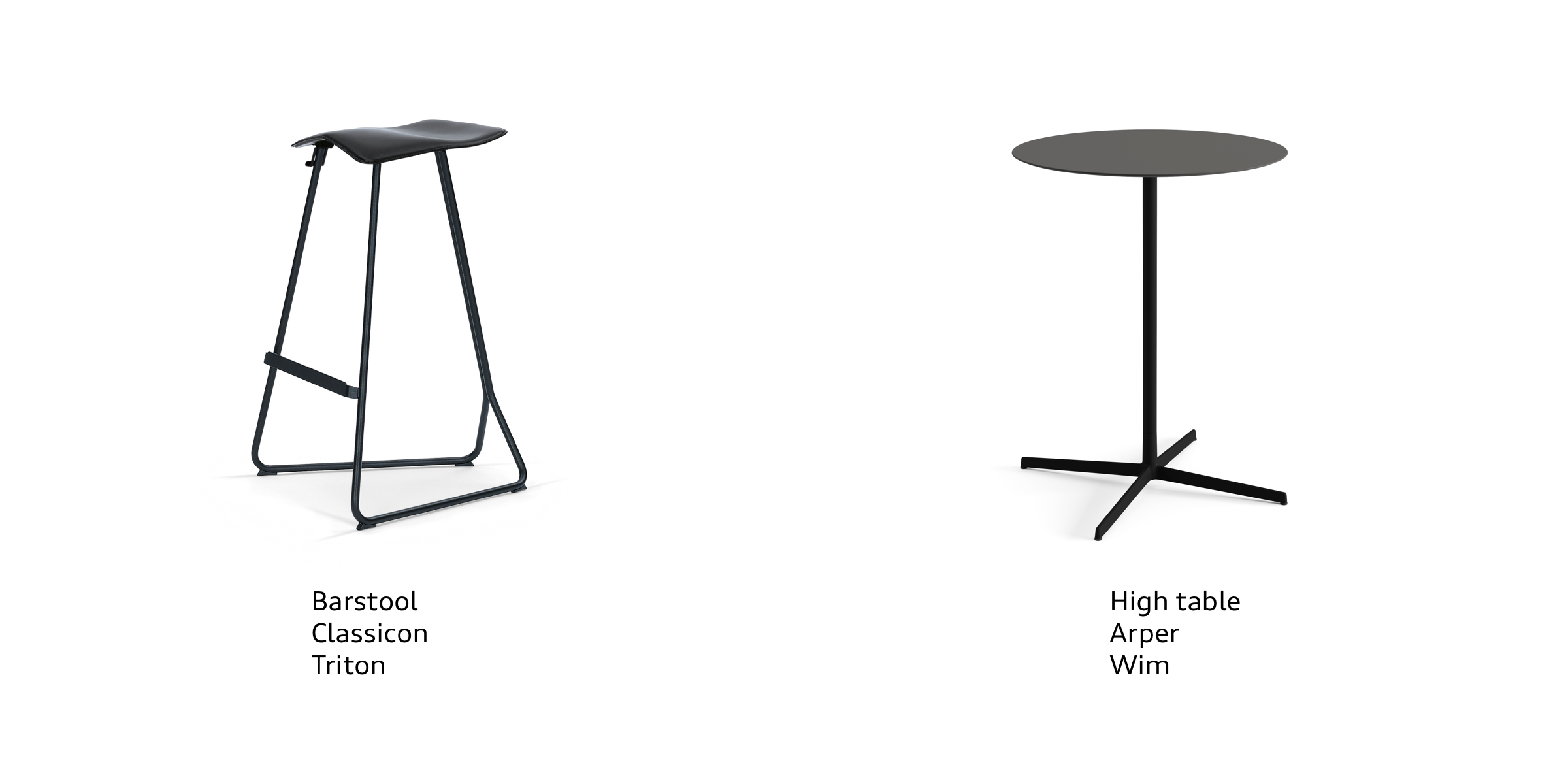
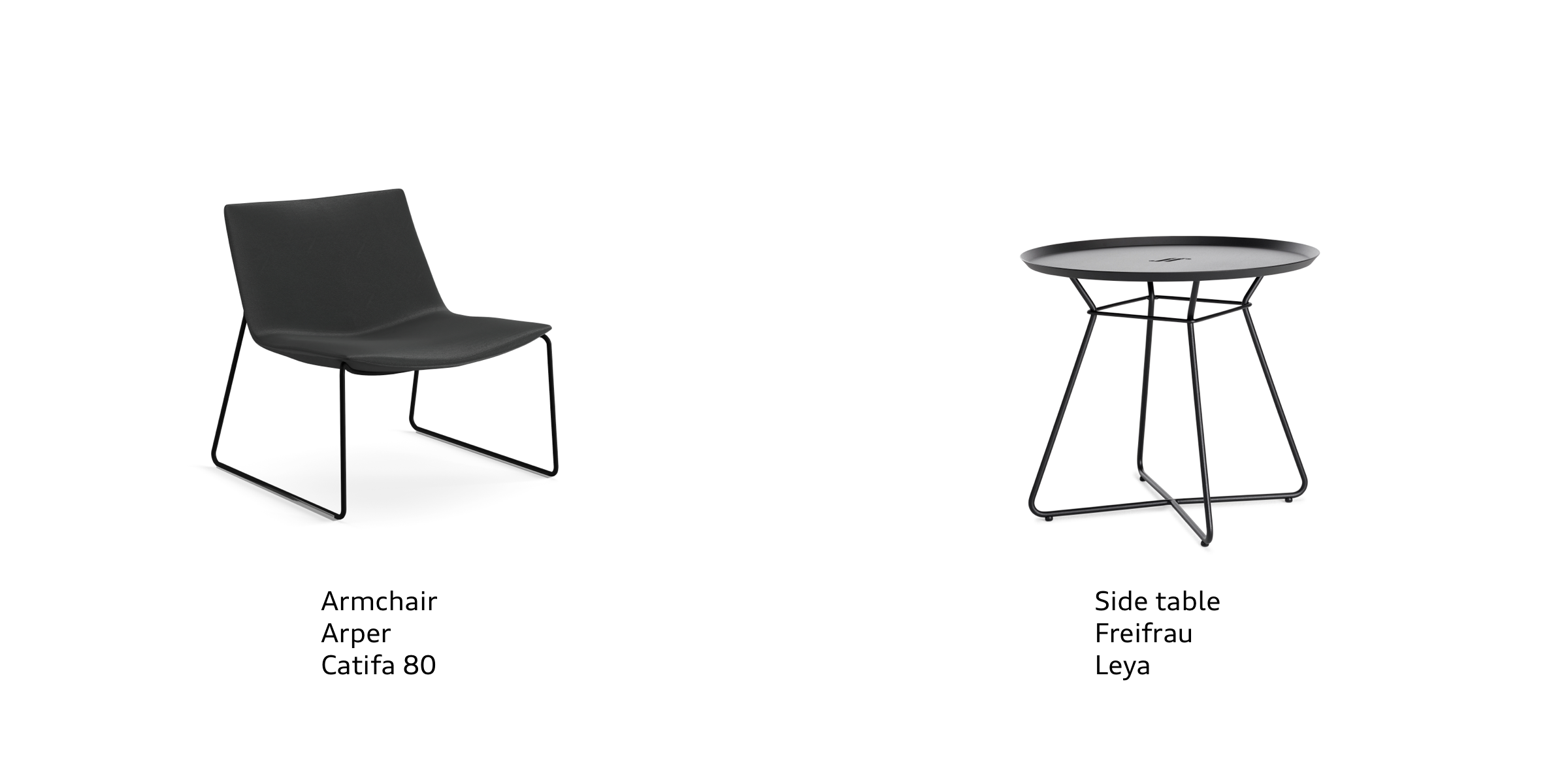
Catering lounges
The furniture in catering lounges is classic, high-quality, comfortable and follows a clear, simple design language. The colour scheme is kept simple in black. Originals should always be used, not copies. Furniture combinations should not be mixed.
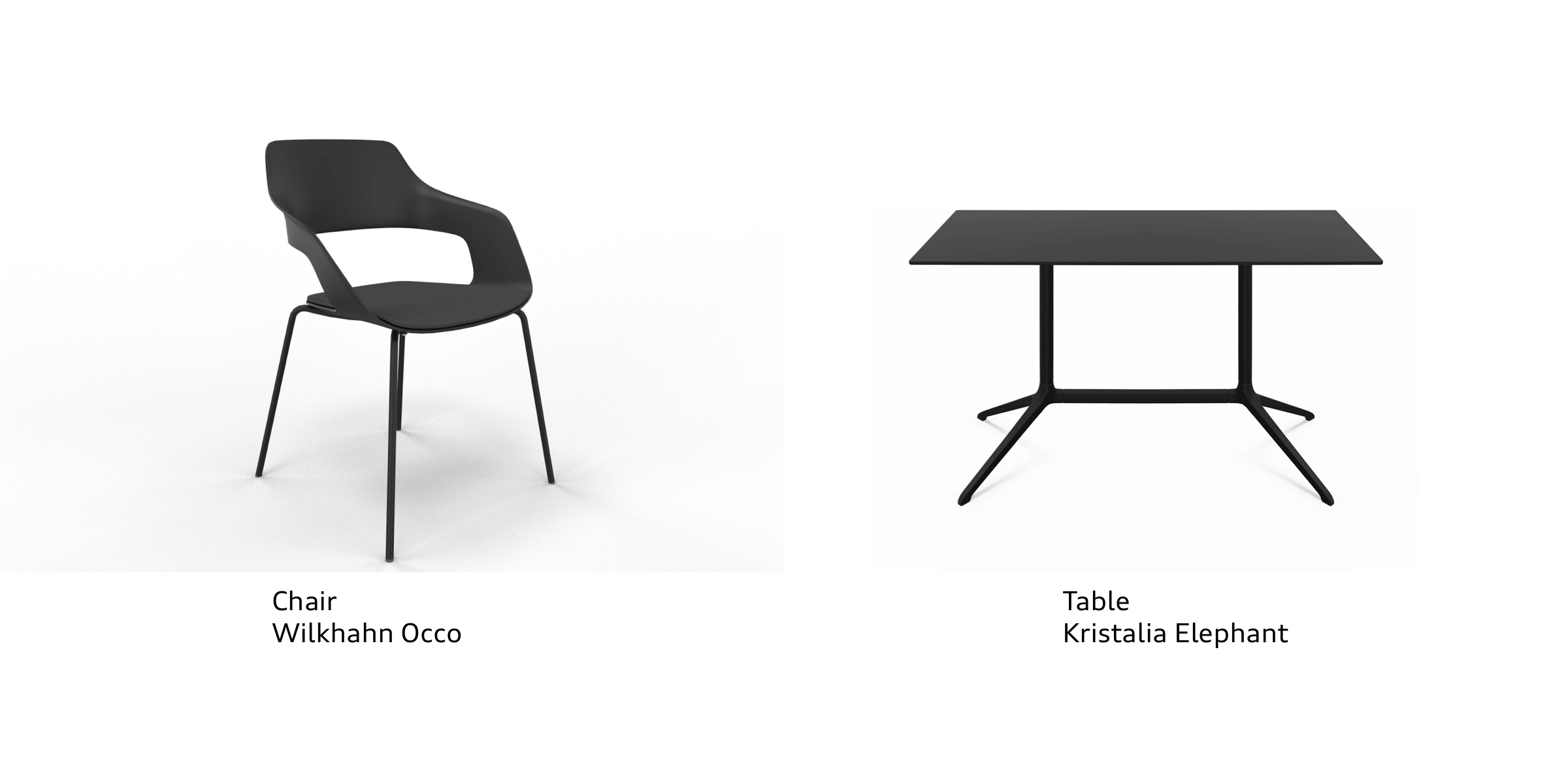
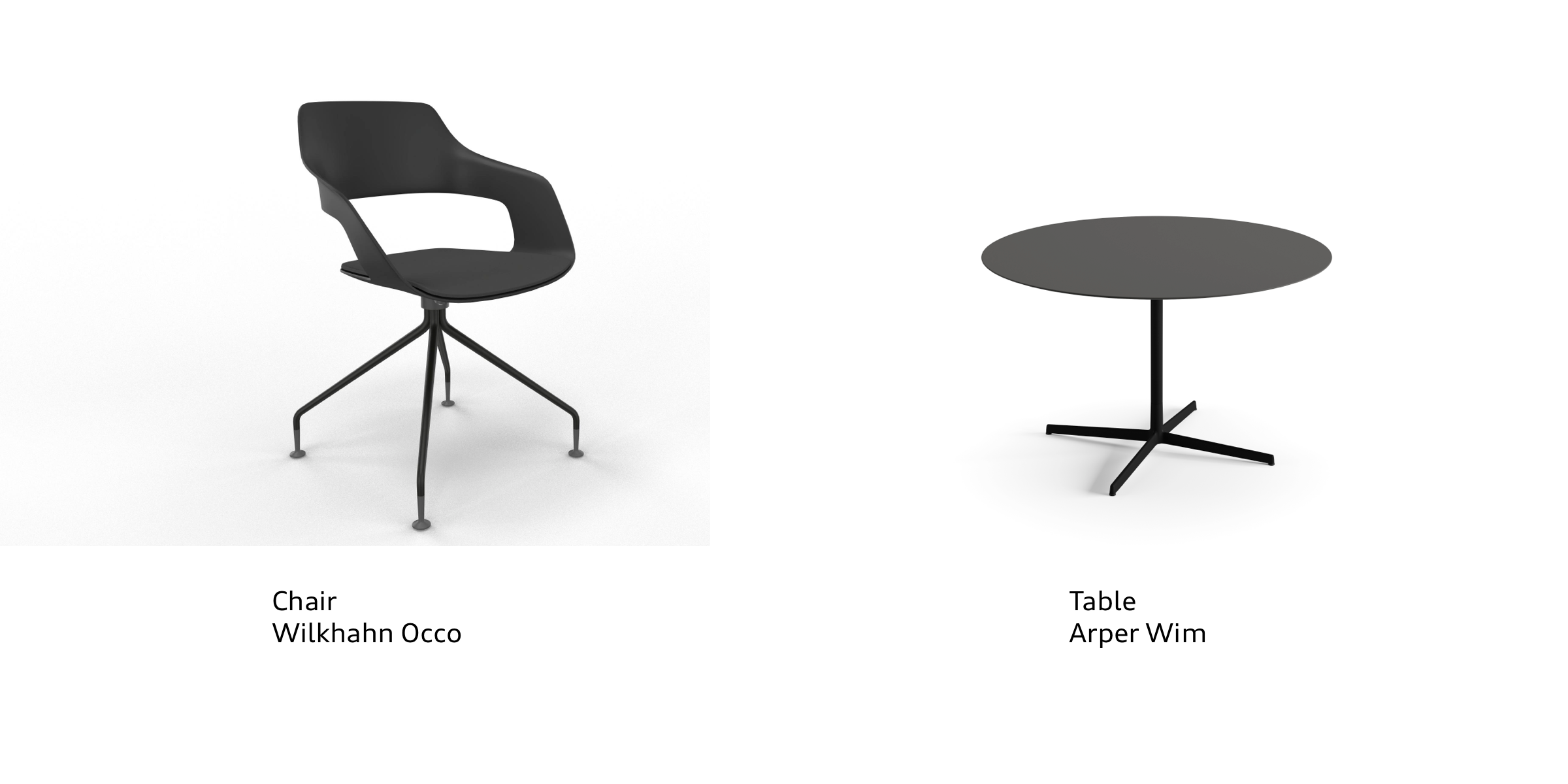

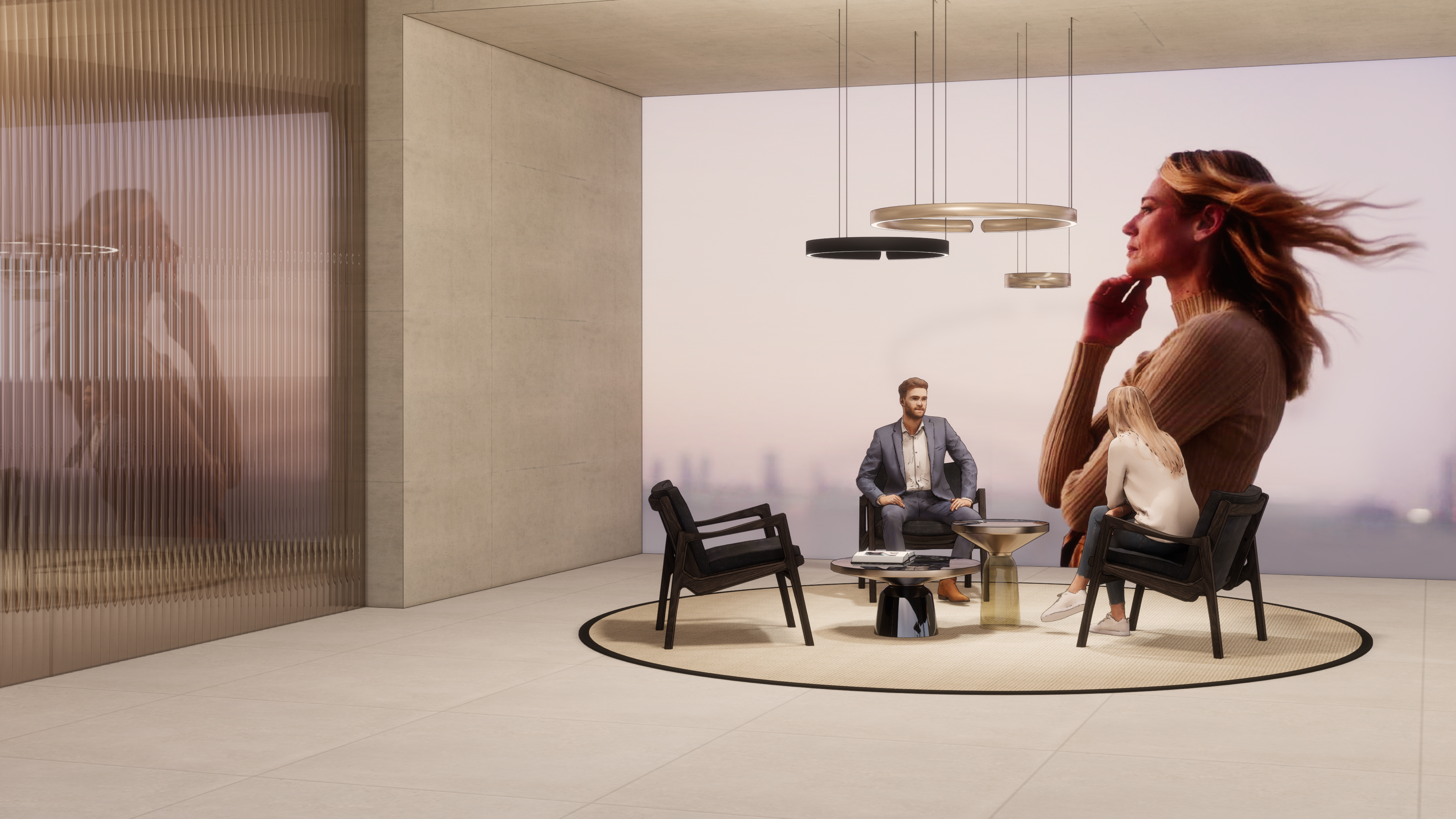
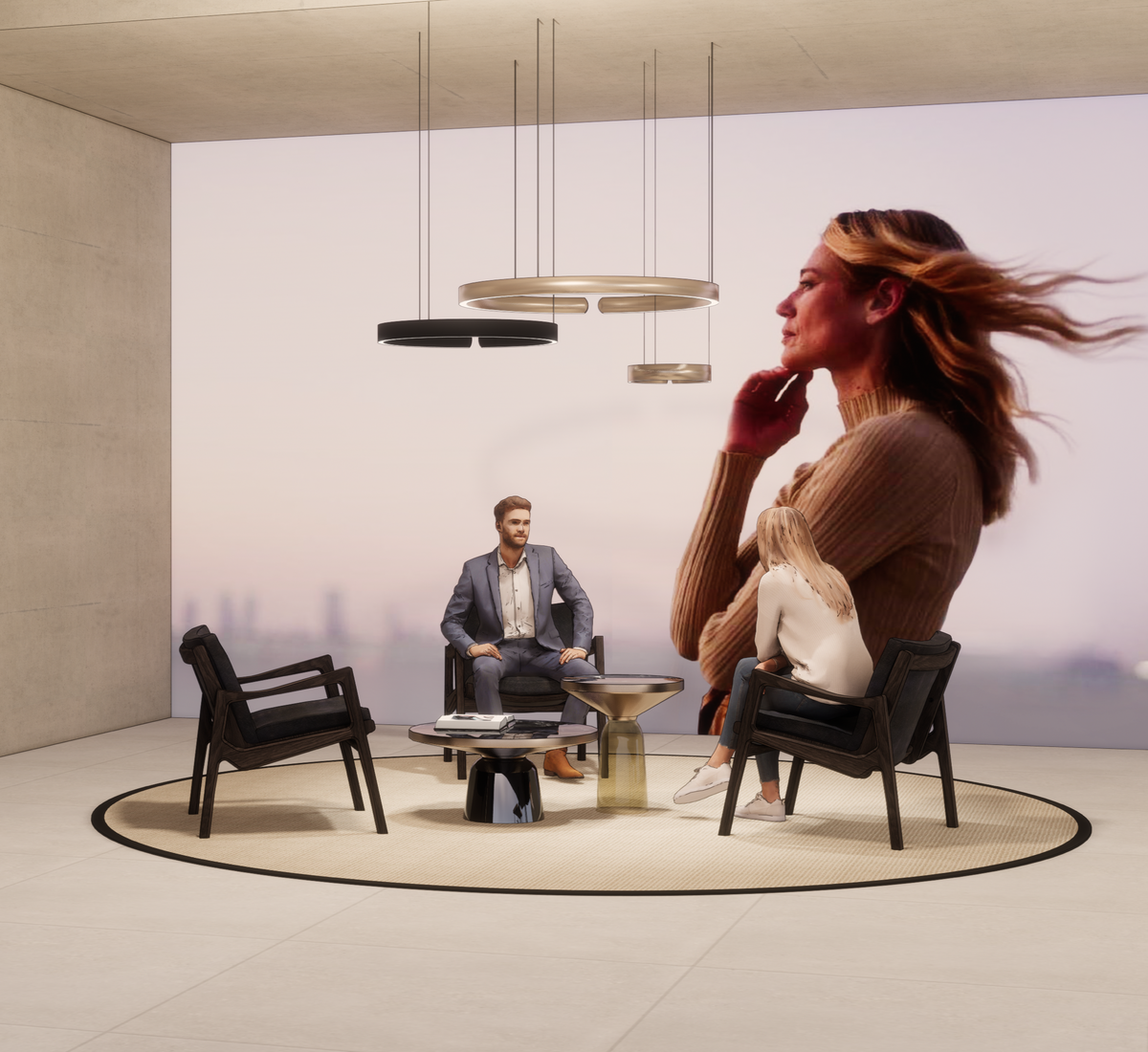
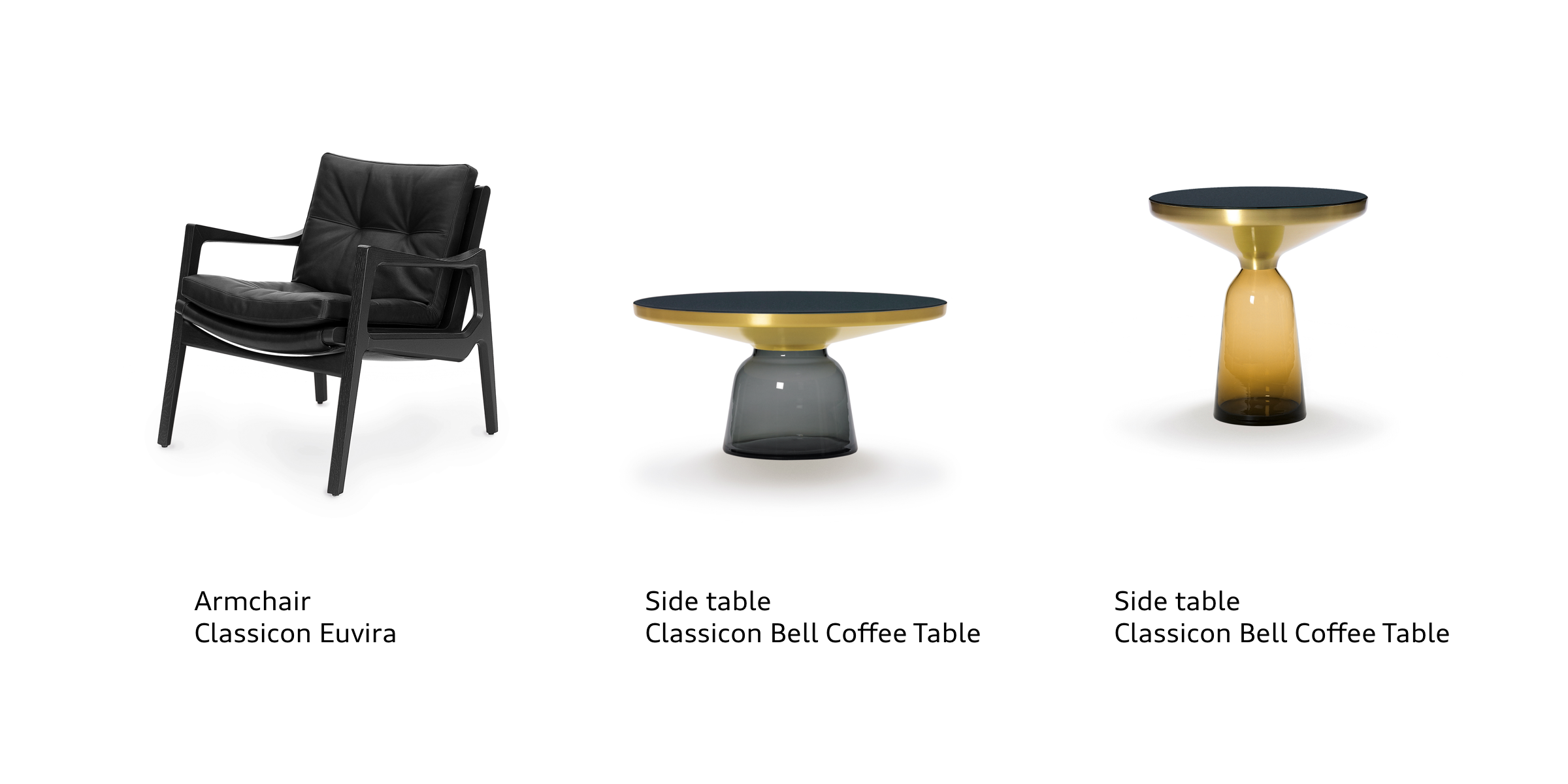
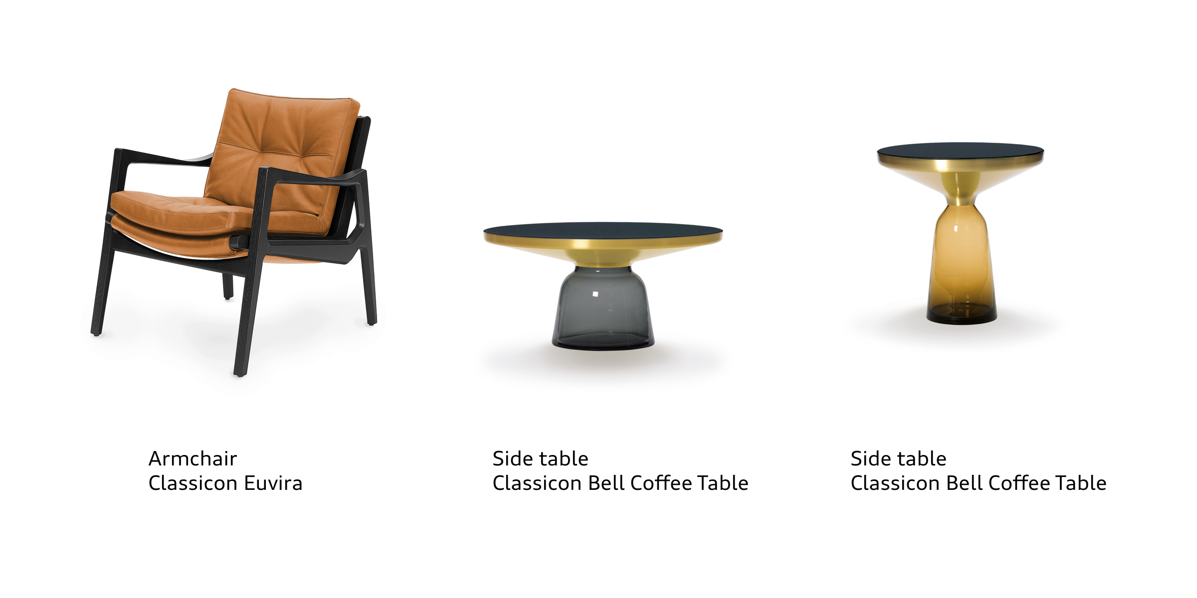
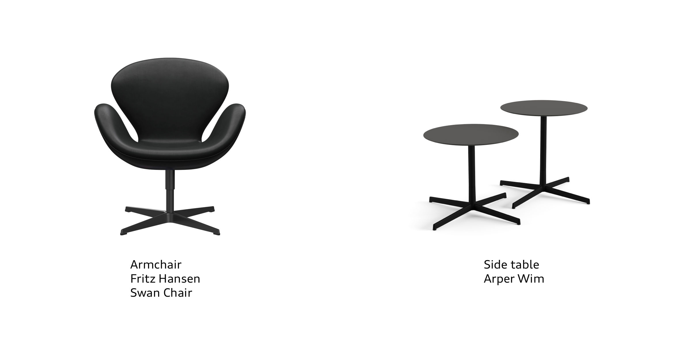
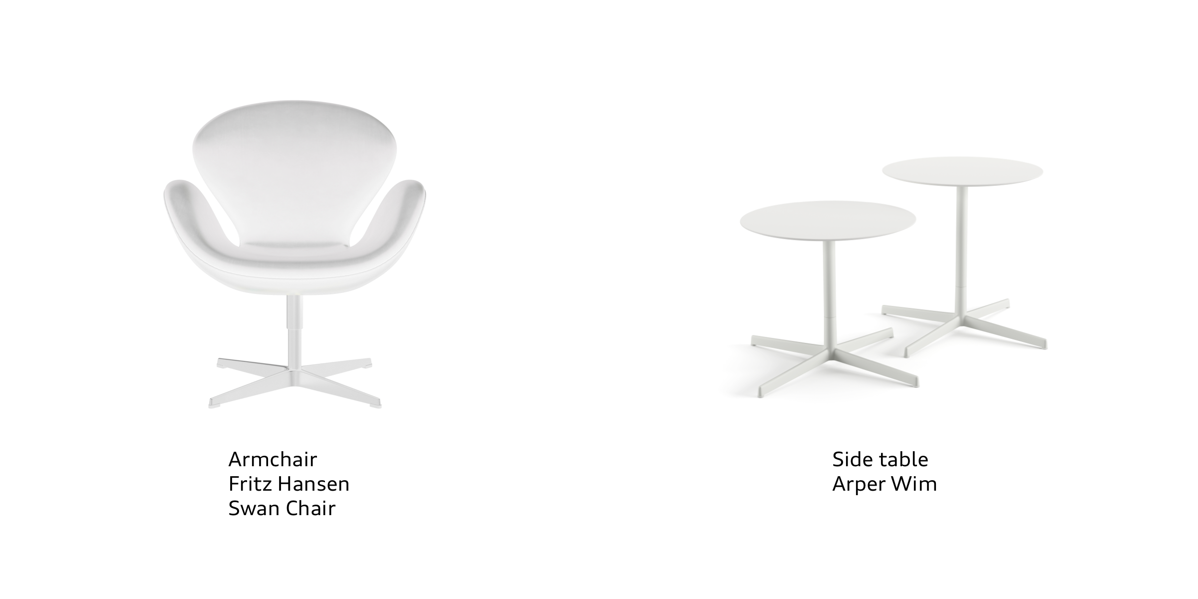
Lounges
The selection of lounge furniture is defined by its high-quality classic style, good seating comfort and follows a clear design language – refined in detail.
The colour scheme is in shades of brown or grey, with brass and cognac accents. Originals and not copies are to be used. Furniture combinations should not be mixed.


Every detail counts: So, when it comes to table decorations, we reduce everything down to the essentials, let the objects make an impact and choose every display element carefully. Accessories are simple, stylish, timeless and have a pure, minimalist form. They emphasise the respective theme or occasion of the event.