Buttons
Adopting Core Components
We have added new React components to the Audi CI to ensure a uniform appearance on the web. All existing React components can be found in the Audi React Library. Audi will continue to develop and add to this library.
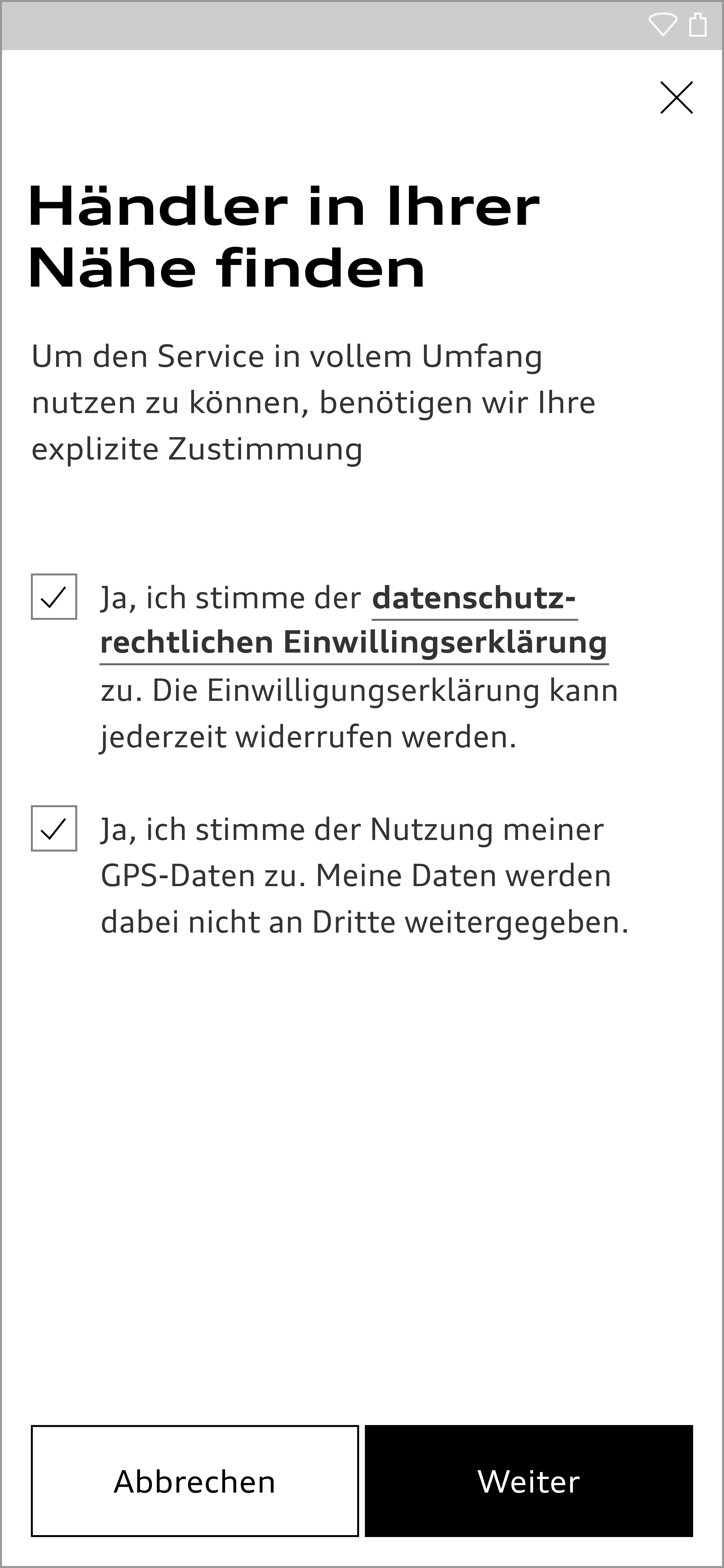
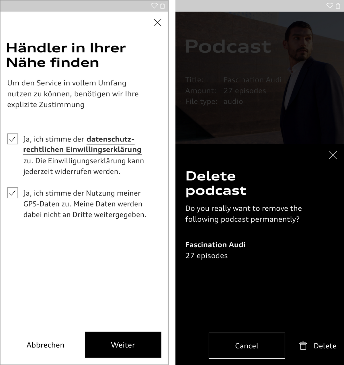
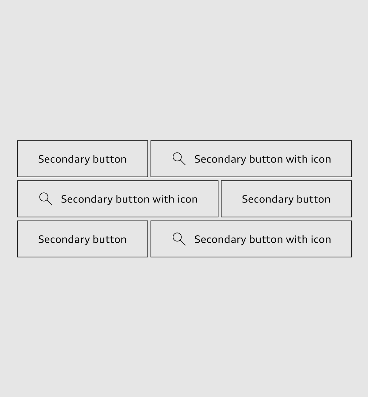
Buttons can be used to show the user’s choice of options for actions and assign these to a clear hierarchy. The target page to be accessed or the action to be triggered is shown on the buttons by means of a label in Audi Type Wide Normal or else by an icon, or by a combination of the two. Good button labels are formulated in a way that is brief and precise. They tell the user exactly what action will be taken when the button is clicked. Buttons provide visual feedback when clicked or tapped, in the form of a response effect, providing that the buttons are not deactivated.
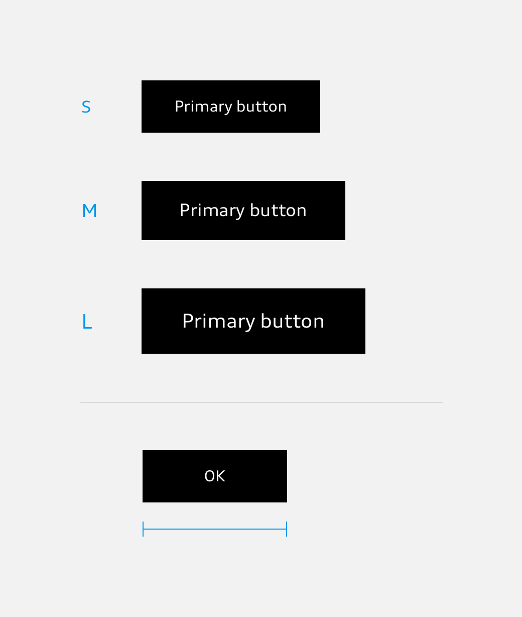
The size of buttons depends on the base font size used which can be adapted to the viewport width.
- Small button at a base font size of 16 px, e.g. in a smartphone app.
- Medium sized button at a base font size of 18 px, e.g. in a tablet app.
- Large button at a base font size of 20 px, e.g. on a website which is rendered in a wide viewport.
The minimum width of primary and secondary buttons is defined as nine times the base font size. Thus, with a base font size of 16 px, the minimum button width is 9 × 16 px = 144 px.
For small viewports, the font size and padding for the label can be adjusted on the left and right.
Text Button
The text button is applied as a subtle call to action. The standard variant is a combination of text and arrow. It is possible to combine a text button with an icon, but then without an arrow. For selected purposes, the arrow can be omitted from the standard variant.
The text is typeset in Audi Type Wide.
System Icon Button
System icon buttons are used to trigger classic system interactions (e.g. save, print or download ...) They contain a system icon and can be used in the two sizes available. The system icon button is transparent and should preferably be used without a label.
<div>
	<button class="aui-js-response aui-button aui-button--icon aui-button--icon--large audiicon--large aui-button--round">
		<svg class="audiicon audiicon-large">
			<use xlink:href="#aui-icon-system-favorites-large"></use>
		</svg>
	</button>
</div>
<div class="icon-sprite">
	<?xml version="1.0" encoding="utf-8"?><svg xmlns="http://www.w3.org/2000/svg" xmlns:xlink="http://www.w3.org/1999/xlink">
		<symbol xmlns="http://www.w3.org/2000/svg" viewBox="0 0 48 48" id="aui-icon-system-favorites-large"><title>system-favorites-large</title><g stroke="currentColor" fill="none" fill-rule="evenodd"><path d="M23.5 15.3l2.3 4.7 5.2.8-3.8 3.7.9 5.2-4.7-2.5-4.7 2.5.9-5.2-3.8-3.7L21 20z"></path><circle cx="23.5" cy="23.5" r="22"></circle></g></symbol>
		<symbol xmlns="http://www.w3.org/2000/svg" viewBox="0 0 24 24" id="aui-icon-system-favorites-small"><title>system-favorites-small</title><g stroke="currentColor" fill="none" fill-rule="evenodd"><path d="M11.5 5.7l1.7 3.5 3.9.6-2.8 2.7.7 3.8-3.4-1.8-3.4 1.8.7-3.8-3-2.8 3.9-.6z"></path><circle cx="11.5" cy="11.5" r="11"></circle></g></symbol>
	</svg>
</div>
<style media="screen">
body {
	background-color: #f2f2f2;
	padding: 50px;
}
.icon-sprite {
	display: none;
}
</style>
Floating Button
The floating button is used for any action if it is to be highlighted in a level above the layout. It has a fixed position in the viewport. Depending on the context it can be hidden or shown, either automatically or through user interaction.
<div>
	<button class="aui-button aui-button--floating audiicon--large aui-js-response">
		<svg class="audiicon audiicon-large">
			<use xmlns:xlink="http://www.w3.org/1999/xlink" xlink:href="#aui-icon-list-large"></use>
		</svg>
	</button>
</div>
<div class="icon-sprite">
	<?xml version="1.0" encoding="utf-8"?><svg xmlns="http://www.w3.org/2000/svg" xmlns:xlink="http://www.w3.org/1999/xlink">
		<symbol xmlns="http://www.w3.org/2000/svg" viewBox="0 0 48 48" id="aui-icon-list-large"><title>list-large</title><path d="M16 30.5h5m-9 0h2m2-6h12m-16 0h2m2-6h18m-22 0h2" stroke="currentColor" fill="none"></path></symbol>
		<symbol xmlns="http://www.w3.org/2000/svg" viewBox="0 0 24 24" id="aui-icon-list-small"><title>list-small</title><path d="M7 15.5h5m-9 0h2m2-4h9m-13 0h2m2-4h14m-18 0h2" stroke="currentColor" fill="none"></path></symbol>
	</svg>
</div>

<style media="screen">
  body {
    background-color: #f2f2f2;
    padding: 50px;
  }
  .icon-sprite {
    display: none;
  }
</style>
Stretched and Sticky Primary Button
For small viewports with a maximum width of 767 px (Breakpoint S), the stretched and sticky primary button can be used like the primary button for the most important function of a page or view. In contrast to the primary button, the stretched and sticky primary button is permanently placed at the lower edge of a viewport and runs across the entire width of the viewport. This option is used with native mobile apps, for example.
Button Group
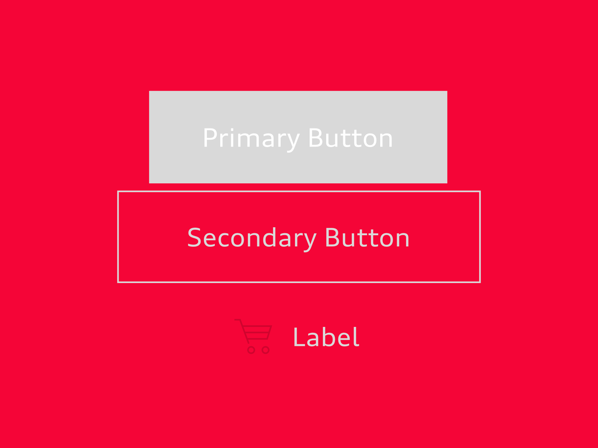
Buttons can be grouped so as to offer several actions alongside each other. The number of buttons should be easy for the user to grasp. A single, important action can be emphasised as the primary button in order to guide the user.
Primary and secondary button group
The primary button emphasises a more important action as compared to the secondary button. Only one primary button is used per view, but this can be combined with several secondary buttons. The gap between the buttons is small (recommendation: 0.25 rem, i.e. one quarter of the basic type size).
Text button group
Text buttons can likewise be grouped directly adjacently to one another. However, they are not mixed in a button group with primary or secondary buttons that are immediately adjacent.
<div class="aui-button-group aui-button-group--texts">
	<button class="aui-js-response aui-button aui-button--text" type="button">
		<span class="aui-button__text">Text button</span>
	</button>
	<button class="aui-js-response aui-button aui-button--text" type="button">
		<span class="aui-button__text">Text button</span>
	</button>
</div>
System icon button group
Equivalent system actions can be indicated by the combination of system icon buttons.
<div>
	<button class="aui-js-response aui-button aui-button--icon aui-button--icon--large audiicon--large aui-button--round">
		<svg class="audiicon audiicon-large">
			<use xlink:href="#aui-icon-system-favorites-large"></use>
		</svg>
	</button>
	<button class="aui-js-response aui-button aui-button--icon aui-button--icon--large audiicon--large aui-button--round">
		<svg class="audiicon audiicon-large">
			<use xlink:href="#aui-icon-system-download-large"></use>
		</svg>
	</button>
	<button class="aui-js-response aui-button aui-button--icon aui-button--icon--large audiicon--large aui-button--round">
		<svg class="audiicon audiicon-large">
			<use xlink:href="#aui-icon-system-help-large"></use>
		</svg>
	</button>
</div>
<div class="icon-sprite">
	<?xml version="1.0" encoding="utf-8"?><svg xmlns="http://www.w3.org/2000/svg" xmlns:xlink="http://www.w3.org/1999/xlink">
		<symbol xmlns="http://www.w3.org/2000/svg" viewBox="0 0 48 48" id="aui-icon-system-favorites-large"><title>system-favorites-large</title><g stroke="currentColor" fill="none" fill-rule="evenodd"><path d="M23.5 15.3l2.3 4.7 5.2.8-3.8 3.7.9 5.2-4.7-2.5-4.7 2.5.9-5.2-3.8-3.7L21 20z"></path><circle cx="23.5" cy="23.5" r="22"></circle></g></symbol>
		<symbol xmlns="http://www.w3.org/2000/svg" viewBox="0 0 24 24" id="aui-icon-system-favorites-small"><title>system-favorites-small</title><g stroke="currentColor" fill="none" fill-rule="evenodd"><path d="M11.5 5.7l1.7 3.5 3.9.6-2.8 2.7.7 3.8-3.4-1.8-3.4 1.8.7-3.8-3-2.8 3.9-.6z"></path><circle cx="11.5" cy="11.5" r="11"></circle></g></symbol>
		<symbol xmlns="http://www.w3.org/2000/svg" viewBox="0 0 48 48" id="aui-icon-system-download-large"><title>system-download-large</title><g stroke="currentColor" fill="none" fill-rule="evenodd"><path d="M17 30.5h13M23.5 16v11m4.4-4.4L23.5 27l-4.4-4.4"></path><circle cx="23.5" cy="23.5" r="22"></circle></g></symbol>
		<symbol xmlns="http://www.w3.org/2000/svg" viewBox="0 0 24 24" id="aui-icon-system-download-small"><title>system-download-small</title><g stroke="currentColor" fill="none" fill-rule="evenodd"><path d="M15 15.5H8M11.5 7v6.4m-3.2-3.2l3.2 3.2 3.2-3.2"></path><circle cx="11.5" cy="11.5" r="11"></circle></g></symbol>
		<symbol xmlns="http://www.w3.org/2000/svg" viewBox="0 0 48 48" id="aui-icon-system-help-large"><title>system-help-large</title><g stroke="currentColor" fill="none" fill-rule="evenodd"><path d="M22.5 29v2M20 17.4s5.9-2.4 6.7 1.5c.5 2.7-4.2 6.1-4.2 6.1v2"></path><circle cx="23.5" cy="23.5" r="22"></circle></g></symbol>
		<symbol xmlns="http://www.w3.org/2000/svg" viewBox="0 0 24 24" id="aui-icon-system-help-small"><title>system-help-small</title><g stroke="currentColor" fill="none" fill-rule="evenodd"><path d="M11.5 15v1M9.9 7.5s4.1-1.6 4.6 1c.4 1.9-3 4.2-3 4.2V14"></path><circle cx="11.5" cy="11.5" r="11"></circle></g></symbol>
	</svg>
</div>
<style media="screen">
body {
	background-color: #f2f2f2;
	padding: 50px;
}
.icon-sprite {
	display: none;
}
</style>
Audi UI Kit – Integration into Sketch library
(supported until 30.06.2023)
To ensure designers are using the most up-to-date components and icons in their products, the Audi UI Kit was created as a sketch library. Integrate these UI Kits to get the latest Audi Sketch Libraries. Updates will be made regularly and users will be informed when new versions of the Librarys are available.
Audi UI Kit for Figma
To enable as many designers as possible to work with the Audi user interface components the UI Kit and icons is also offered for Figma. Updates are made regularly and all changes are documented for users in the changelog.
We strongly recommend to join the Audi Figma Workspace for being always up-to-date and to collaborate with others.The Audi Design Kits are already included into the Figma teams in the Audi Workspace. To get access to a team or project please reach out to us here.
In case you are not working directly in the Audi Figma workspace you find the latest version as download below.


