Selection controls
Adopting Core Components
We have added new React components to the Audi CI to ensure a uniform appearance on the web. All existing React components can be found in the Audi React Library. Audi will continue to develop and add to this library.
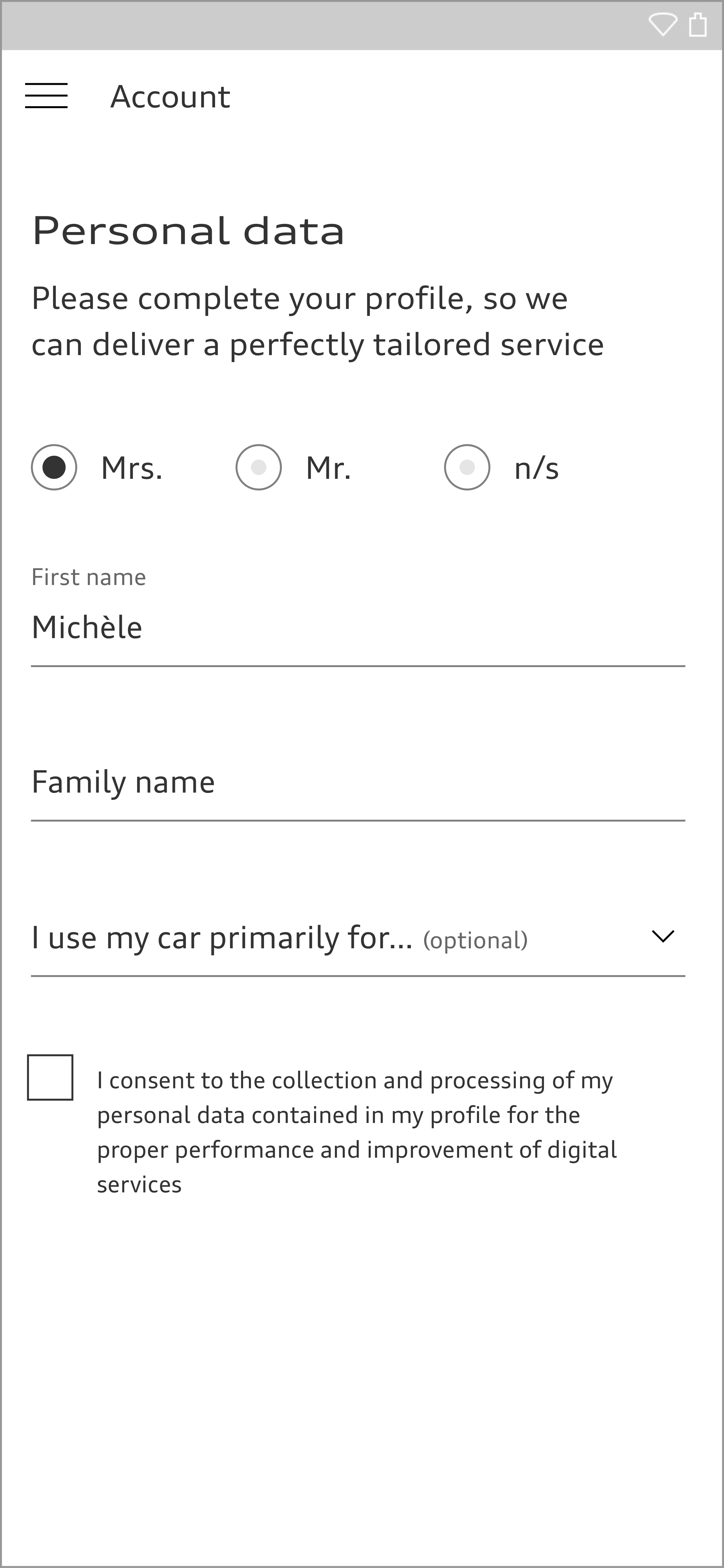
Selection controls such as radio buttons, checkboxes and switches allow users to control all kinds of options, settings and situations. The size of the selection controls depends on the base font size used in each case, which can be adjusted depending on the particular viewport width. The selection controls are available in black and white.
Checkbox
Checkboxes allow the choice of one option, no option or several options. There is no interdependence between checkboxes in a group. Each checkbox is given a label.
<label class="aui-checkbox aui-js-checkbox">
  <input class="aui-checkbox__input" type="checkbox">
  <span class="aui-checkbox__label">Text <span class="aui-checkbox__label--optional">(optional)</span></span>
</label>
<label class="aui-checkbox aui-js-checkbox">
  <input class="aui-checkbox__input" type="checkbox">
  <span class="aui-checkbox__label">Text <span class="aui-checkbox__label--optional">(optional)</span></span>>
</label>
Radio Button
Radio buttons allow at least one of two options to be selected. The activation of a radio button therefore prevents the activation of other radio buttons in the same group. Each radio button is given a label.
<label class="aui-radio aui-js-radio">
  <input class="aui-radio__input" type="radio" name="sample-radio">
  <span class="aui-radio__label">Text</span>
  <span class="aui-radio__hint">Optional Description</span>
</label>
<label class="aui-radio aui-js-radio">
  <input class="aui-radio__input" type="radio" name="sample-radio">
  <span class="aui-radio__label">Text</span>
  <span class="aui-radio__hint">Optional Description</span>
</label>

<style media="screen">
	.aui-radio {
		text-align: left;
	}
</style>
Switch
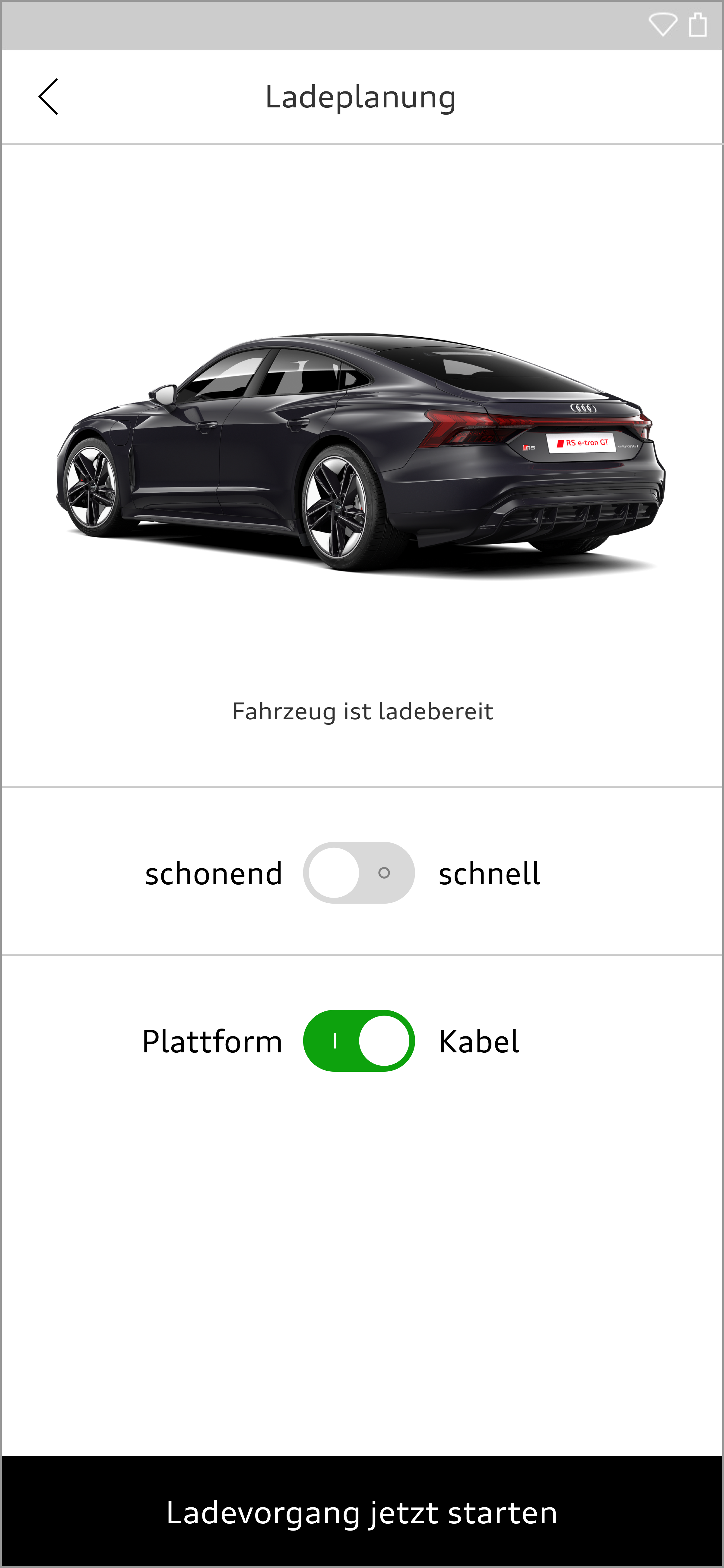
Switch controls are used for simple settings and allow the user to switch between two different states. The states available are communicated by means of a label. The label is positioned on the left or right or on both sides.
<div>
  <label class="aui-switch">
    <input type="checkbox" class="aui-switch__input" checked>
    <span class="aui-switch__text">Label</span>
    <span class="aui-switch__track" aria-hidden="true">
      <span class="aui-switch__thumb"></span>
      <div class="aui-switch__indicator aui-switch__indicator--on"></div>
      <div class="aui-switch__indicator aui-switch__indicator--off"></div>
    </span>
  </label>
</div>
Audi UI Kit – Integration into Sketch library
(supported until 30.06.2023)
To ensure designers are using the most up-to-date components and icons in their products, the Audi UI Kit was created as a sketch library. Integrate these UI Kits to get the latest Audi Sketch Libraries. Updates will be made regularly and users will be informed when new versions of the Librarys are available.
Audi UI Kit for Figma
To enable as many designers as possible to work with the Audi user interface components the UI Kit and icons is also offered for Figma. Updates are made regularly and all changes are documented for users in the changelog.
We strongly recommend to join the Audi Figma Workspace for being always up-to-date and to collaborate with others.The Audi Design Kits are already included into the Figma teams in the Audi Workspace. To get access to a team or project please reach out to us here.
In case you are not working directly in the Audi Figma workspace you find the latest version as download below.


