Slider
Adopting Core Components
We have added new React components to the Audi CI to ensure a uniform appearance on the web. All existing React components can be found in the Audi React Library. Audi will continue to develop and add to this library.
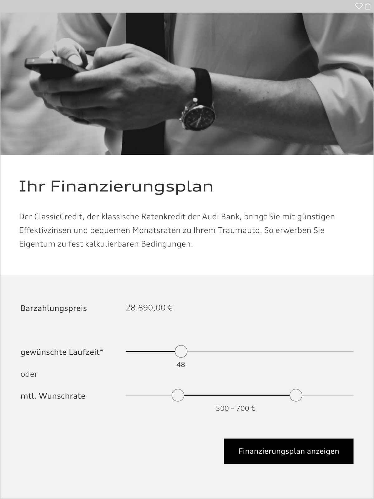
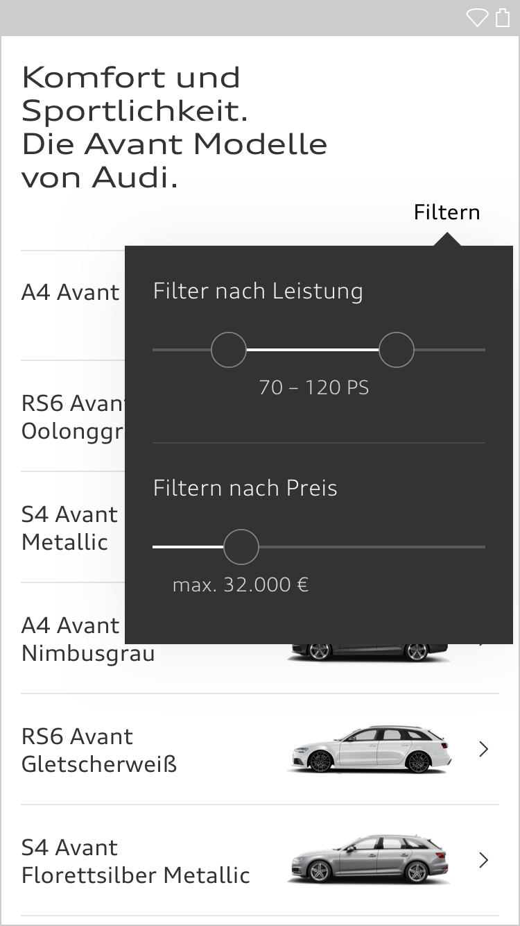
Sliders allow the selection of a value or a value range on a given scale. The scale can contain steps or allow continuously variable selection. Values for selection on the scale can be communicated numerically or else by means of a text label.
The size of the slider depends on the basic type size used, which can adapt to the viewport width in question. As such, the size of the sliders is flexible. Sliders are available in black and white.
<div class="aui-slider aui-js-slider aui-slider--single aui-slider--output" data-min="0" data-max="100">
  <span class="aui-slider__label">Slider label</span>
  <input type="hidden" class="aui-slider__hidden-field" value="50.00">
  <output class="aui-slider__output"></output>
  <div class="aui-slider__range">
    <div class="aui-slider__range-min">min</div><div class="aui-slider__range-max">max</div>
  </div>
</div>
Audi UI Kit – Integration into Sketch library
(supported until 30.06.2023)
To ensure designers are using the most up-to-date components and icons in their products, the Audi UI Kit was created as a sketch library. Integrate these UI Kits to get the latest Audi Sketch Libraries. Updates will be made regularly and users will be informed when new versions of the Librarys are available.
Audi UI Kit for Figma
To enable as many designers as possible to work with the Audi user interface components the UI Kit and icons is also offered for Figma. Updates are made regularly and all changes are documented for users in the changelog.
We strongly recommend to join the Audi Figma Workspace for being always up-to-date and to collaborate with others.The Audi Design Kits are already included into the Figma teams in the Audi Workspace. To get access to a team or project please reach out to us here.
In case you are not working directly in the Audi Figma workspace you find the latest version as download below.
