Slideshow
Slideshow
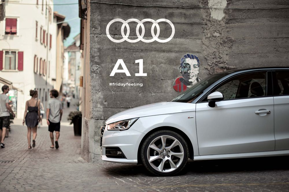
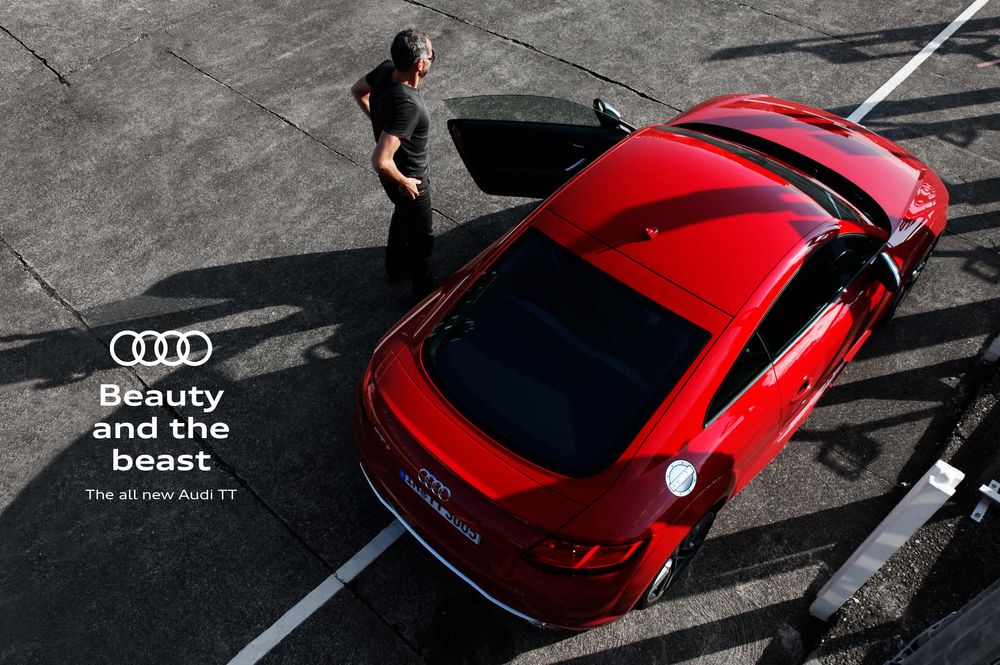
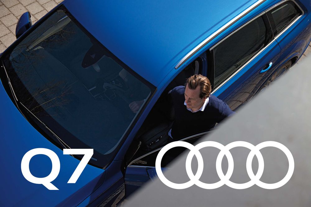
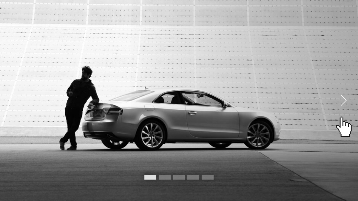
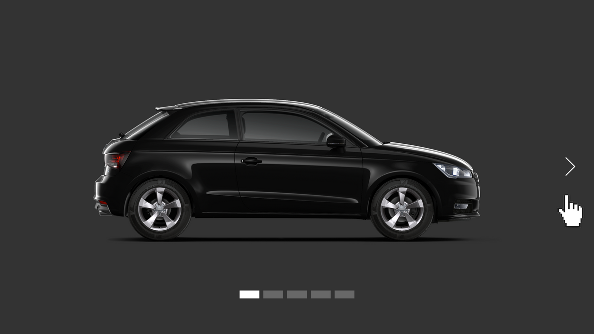
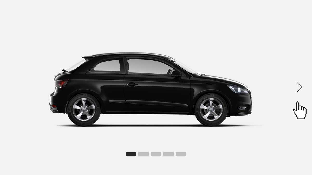
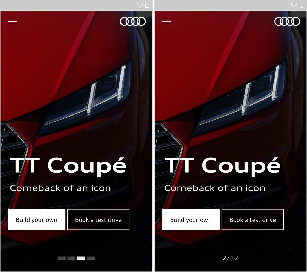
A slideshow presents any number of items. Each item consists of a background visual or video and can be optionally expanded to include elements such as text and buttons. If elements are placed against the background, the latter can be darkened with up to 30% black. The content items of the slideshow are presented in linear fashion. Pagination in the lower area provides orientation.
The user can control the slideshow by means of swipe gestures, arrows or mini-pagination. The white arrows only appear on mouseover. For improved visibility, a dark gradient can be added on top of the background. Arrow control is not used on touch devices – mini-pagination indicates the other slides available.
When changing from one slide to the next, the new slide moves into the slideshow canvas with a push movement from the right. If the slide contains text or other elements, these do not appear until the slide is fully visible.

<div class="abp-gallery abp-js-gallery abp-gallery--slider abp-gallery--autoplay is-animated">
	<div class="abp-gallery__container">
		<div class="abp-gallery__wrapper">
			<div class="abp-gallery__item">
				<a class="abp-gallery__action" href="https://www.audi.com/content/dam/ci/Fundamentals/Basics/Rings/02_Anwendungsbeispiele/04_Audi_Brandplattform_Ringe_Beispiele.jpg?downsize=1000px:*&imwidth=1000">
					<div class="abp-gallery__image-wrapper">
						<div class="abp-gallery__image-container">
							<img class="abp-gallery__image" src="https://www.audi.com/content/dam/ci/Fundamentals/Basics/Rings/02_Anwendungsbeispiele/04_Audi_Brandplattform_Ringe_Beispiele.jpg?downsize=1000px:*&imwidth=1000" />
						</div>
						<div class="abp-gallery__caption">Lorem ipsum dolor sit amet, consectetur adipisicing elit.</div>
					</div>
				</a>
			</div>
			<div class="abp-gallery__item">
				<a class="abp-gallery__action" href="https://www.audi.com/content/dam/ci/Fundamentals/Basics/Rings/02_Anwendungsbeispiele/02_Audi_Brandplattform_Ringe_Beispiele.jpg?downsize=1000px:*&imwidth=1000">
					<div class="abp-gallery__image-wrapper">
						<div class="abp-gallery__image-container">
							<img class="abp-gallery__image" src="https://www.audi.com/content/dam/ci/Fundamentals/Basics/Rings/02_Anwendungsbeispiele/02_Audi_Brandplattform_Ringe_Beispiele.jpg?downsize=1000px:*&imwidth=1000" />
						</div>
						<div class="abp-gallery__caption"></div>
					</div>
				</a>
			</div>
			<div class="abp-gallery__item">
				<a class="abp-gallery__action" href="https://www.audi.com/content/dam/ci/Fundamentals/Basics/Rings/02_Anwendungsbeispiele/03_Audi_Brandplattform_Ringe_Beispiele_.jpg?downsize=1000px:*&imwidth=1000">
					<div class="abp-gallery__image-wrapper">
						<div class="abp-gallery__image-container">
							<img class="abp-gallery__image" src="https://www.audi.com/content/dam/ci/Fundamentals/Basics/Rings/02_Anwendungsbeispiele/03_Audi_Brandplattform_Ringe_Beispiele_.jpg?downsize=1000px:*&imwidth=1000" />
						</div>
						<div class="abp-gallery__caption">Lorem ipsum dolor sit amet, consectetur adipisicing elit.</div>
					</div>
				</a>
			</div>
			<div class="abp-gallery__item">
				<a class="abp-gallery__action" href="https://www.audi.com/content/dam/ci/Fundamentals/Basics/Rings/02_Anwendungsbeispiele/01_Audi_Brandplattform_Ringe_Beispiele.jpg?downsize=1000px:*&imwidth=1000">
					<div class="abp-gallery__image-wrapper">
						<div class="abp-gallery__image-container">
							<img class="abp-gallery__image" src="https://www.audi.com/content/dam/ci/Fundamentals/Basics/Rings/02_Anwendungsbeispiele/01_Audi_Brandplattform_Ringe_Beispiele.jpg?downsize=1000px:*&imwidth=1000" />
						</div>
						<div class="abp-gallery__caption">Lorem ipsum dolor sit amet, consectetur adipisicing elit.</div>
					</div>
				</a>
			</div>
		</div>
	</div>
</div>
<style media="screen">
	body {
		background-color: #f2f2f2;
		padding: 50px 30%;
	}
</style>
Audi UI Kit – Integration into Sketch library
(supported until 30.06.2023)
To ensure designers are using the most up-to-date components and icons in their products, the Audi UI Kit was created as a sketch library. Integrate these UI Kits to get the latest Audi Sketch Libraries. Updates will be made regularly and users will be informed when new versions of the Librarys are available.
Audi UI Kit for Figma
To enable as many designers as possible to work with the Audi user interface components the UI Kit and icons is also offered for Figma. Updates are made regularly and all changes are documented for users in the changelog.
We strongly recommend to join the Audi Figma Workspace for being always up-to-date and to collaborate with others.The Audi Design Kits are already included into the Figma teams in the Audi Workspace. To get access to a team or project please reach out to us here.
In case you are not working directly in the Audi Figma workspace you find the latest version as download below.
