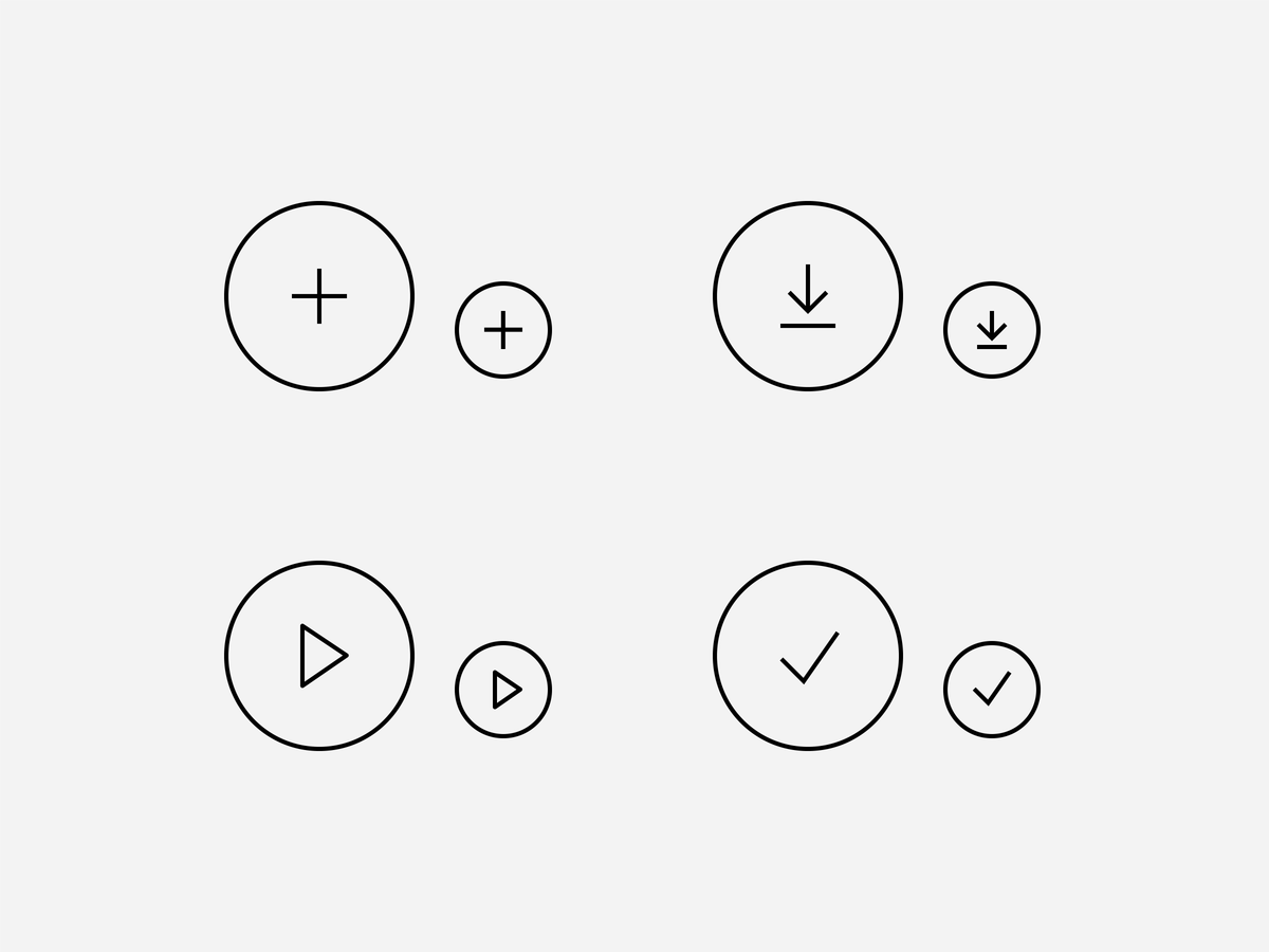
Technical-style Icons

Audi icons indicate information and interactions in a simple, direct manner. Their style is derived from technical drawings. Learn how to use them, how they behave and how they are made here or find and download approved icons in the user interface guideline:

Style and Structure

Icons are made up of as few elements as possible. The constructed style is created by means of a fine, constant contour thickness of one pixel and the avoidance of filled-in blocks. Right angles alternate with rounded corners. Icons are generally applied in black and white.

Usage

Each icon is assigned to a term and is only used in the context of this term. 

Content icons represent things and facts, e.g. vehicle, mobile phone use, output and interior.
System icons represent system interactions and commands, e.g. save, add, download and play. All system icons have a circular peripheral line.

Here, content icons refer to the Audi social media channel of the platform in question. The system icons represent a function: sharing Audi content on the platform in question. By way of an exception, the logos and icons of the platforms are shown as filled-in images.

Reference to the Audi channel on the platform in question.
Sharing content on a platform.

Separate icons are available for different operating systems. The "share" icon is for general use and is also used on iOS. Exclusively for native Android applications, only the "share-android" icon is used.

Size

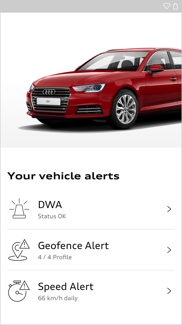
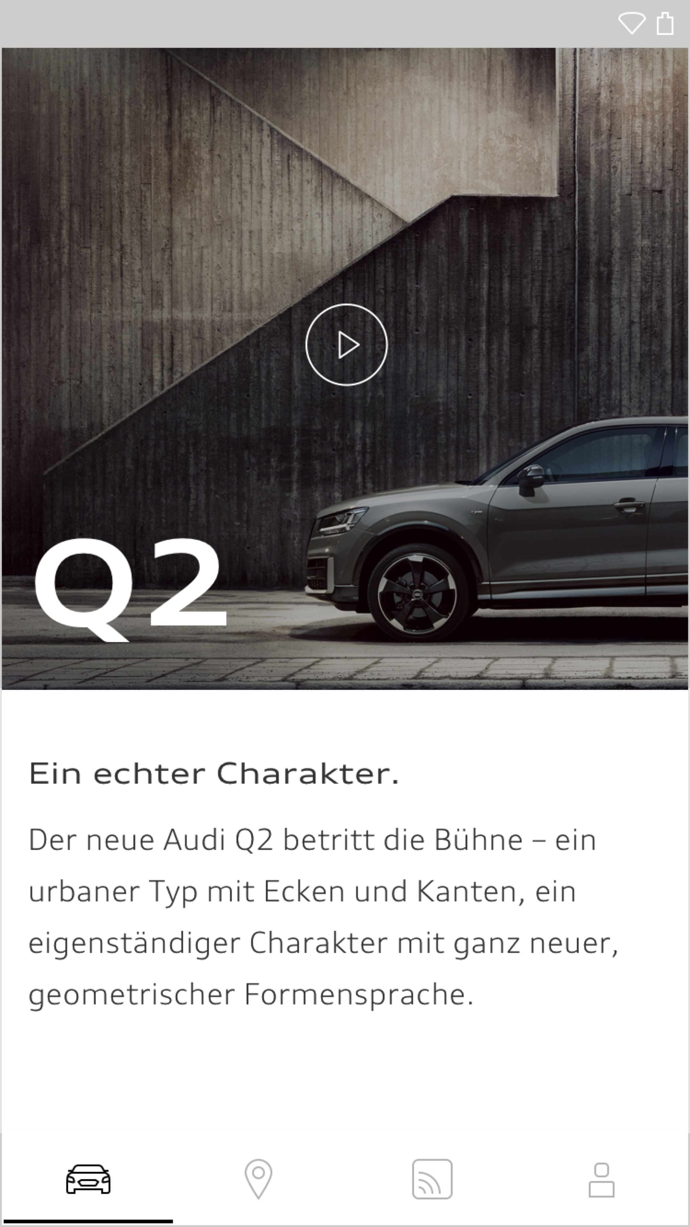
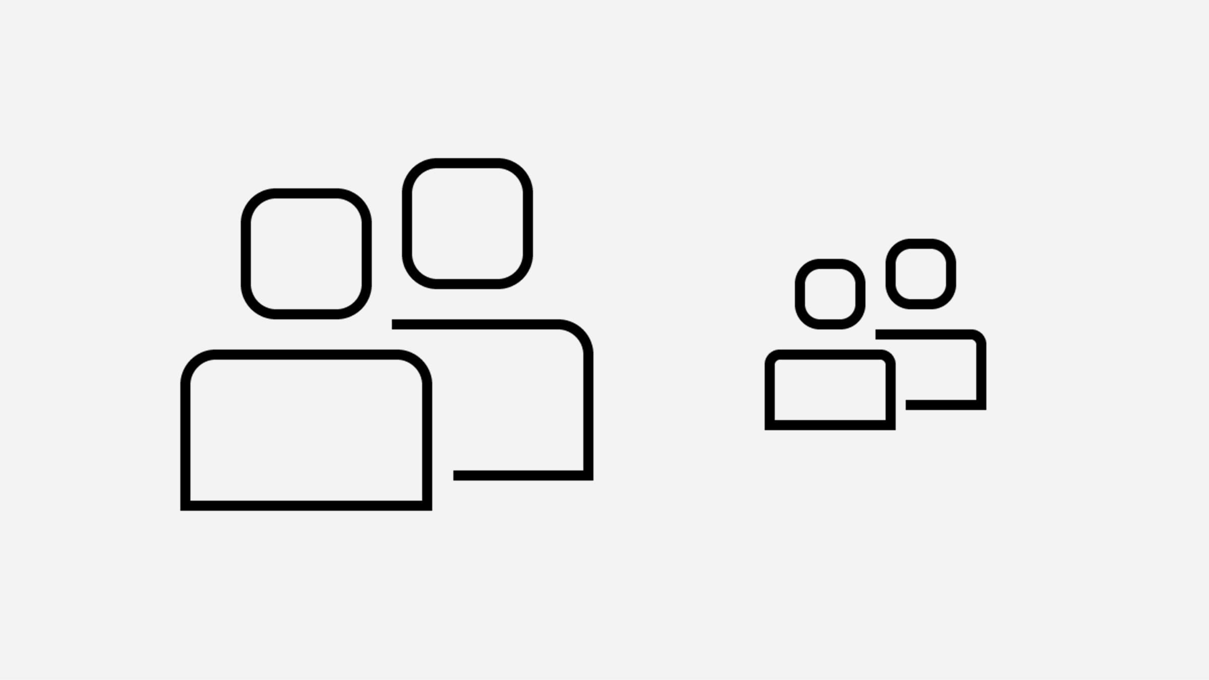
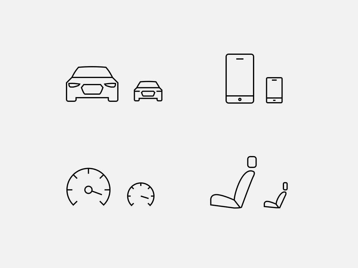
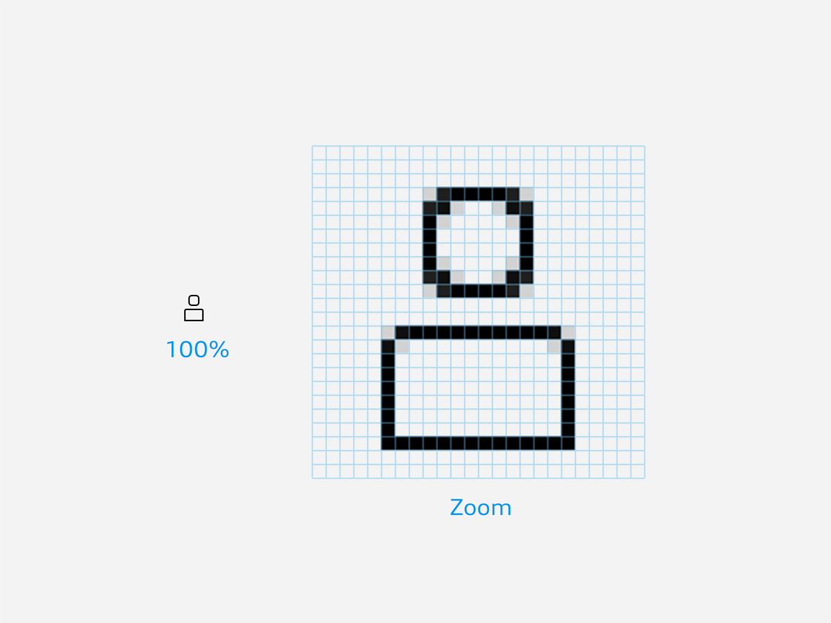
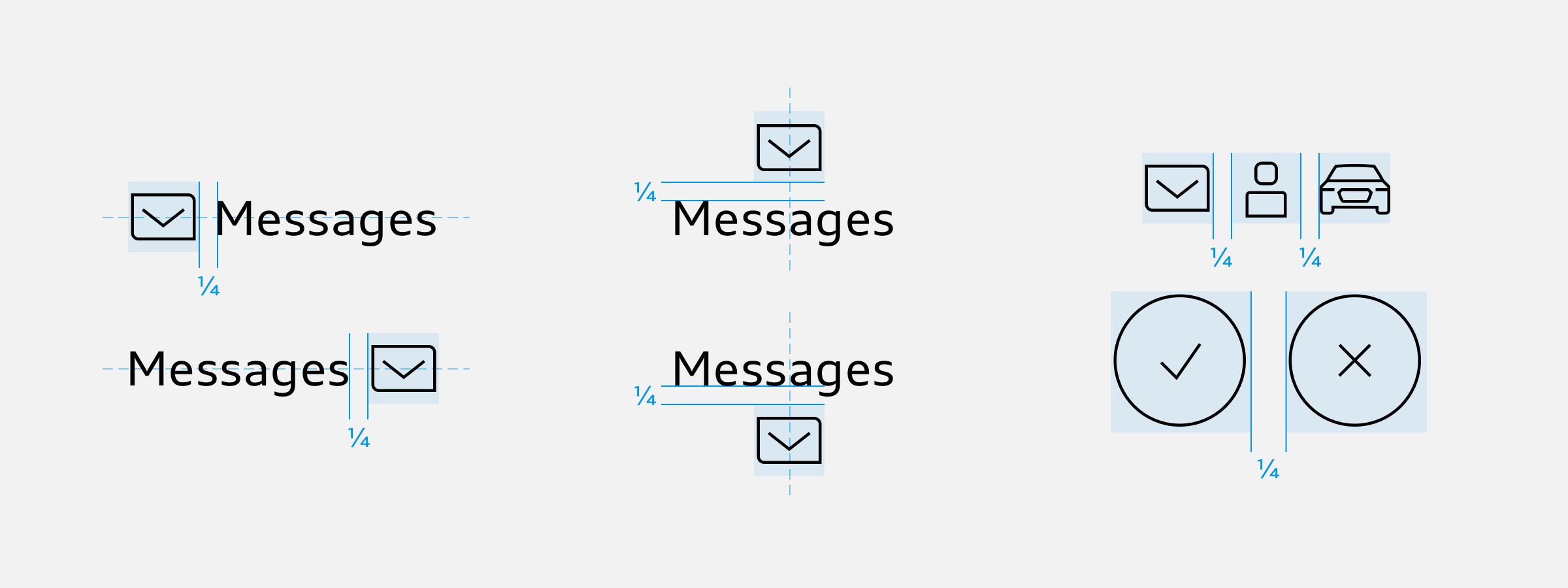
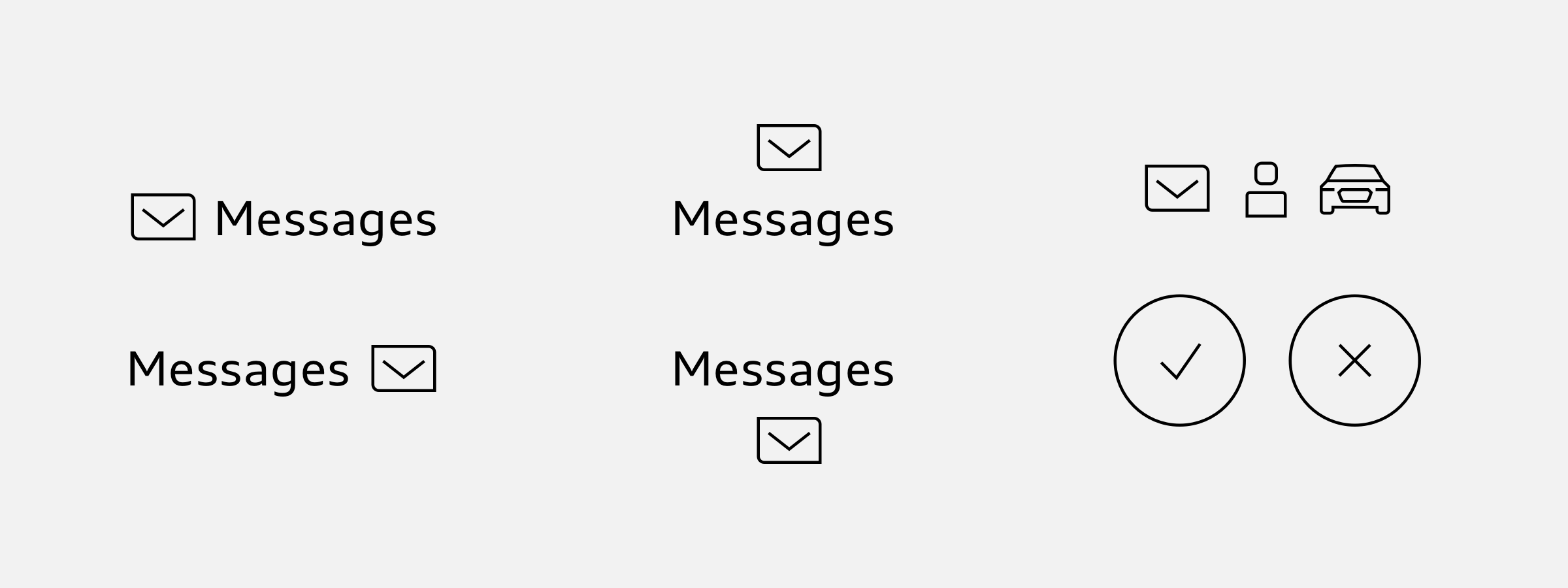
All icons are placed inside an invisible square basic area. This defines the size of each icon and helps with positioning and orientation.

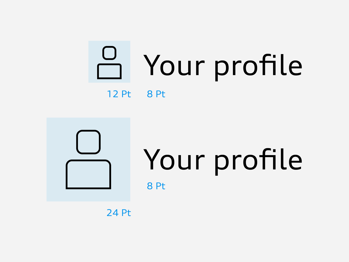
The important thing is to achieve a fine, precise effect of the icons within the layout as a whole. For this reason, they are applied in original size in screen media and are depicted crisply with pixel accuracy. In other contexts apart from screen media, the size is based on the text size used. Small icons should be 1.5 times the size of the text in pt, large icons should be three times the size of text in pt.

The icons are shown in original size on screens with pixel accuracy.
An example of the ideal ratio of text size to icon: body copy text size is 8 pt, the small icon is therefore 12 pt and the large icon 24 pt.

Placement and Spacing

Icons should preferably appear to the left or right of the associated text. They are centred. The minimum spacing from the text is ¼ of the basic area. If several icons are placed alongside each other, the minimum spacing in this case is ¼ of the basic area.

States & Animation

In digital interfaces icons can be animated, take different shapes or morph to a different icon to signal a certain state. The transitions between these states is described as microinteractions. Some states and microinteractions are delivered as part of the icon library.

Generate interest by simple or repeated animation of elements

Structure of icon elements, e.g. as feedback on an interaction

Animated transition between two icons

Don'ts

No use of incorrect icon variants (size / level of detail / filling).
No Off-brand icons (wrong style).
Icons are not used as a decorative design element.
Your CI-Support
May we help you?