Rings
A new freedom
Plain and simple. No effects. And – depending on the background – simply black or white. The rings are a world-famous symbol and represent the brand.
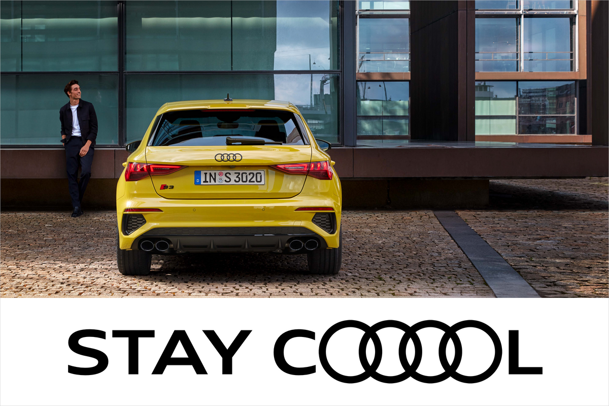
For the first time it is now possible to vary the line thickness of the rings in communication. This means the rings can reflect the message and context of the application in a more striking manner. Whether finely wrought or thick, reduced or self-assured – the rings can act as amplifiers and drivers of the message. The variable rings are used exclusively in communication media.


The variable rings can be used as a logo font and are also available in three different thicknesses as a file package. For communication purposes the line thickness of the rings can be varied. They enable the intended message of the design to be reinforced by means of individual combination of the various basic elements. Ring thicknesses are not assigned to specific vehicle models/categories or business areas.
In terms of design, various factors influence the line thickness of the rings: typography, background, requirements in terms of long-distance effect and overall impact. It is important for the rings to be clearly perceived in interaction with other elements such as typography at all times and not dominated by other design components.

The Audi rings appear in black or white and stand out clearly against the background. Elements with a similar line thickness or colouring may not be placed behind the rings. The “Audi Rings Standard” serve as the point of departure for design. This line thickness is preferred and is used in all office applications, stationery, brand flags and corporate branding applications, for example.
When using the thin rings, care should be taken to ensure a calm background without additional graphic elements or dominating structures. If the design is to be viewed from a great distance, ring thicknesses such as “Audi Rings Medium” to “Audi Rings Standard” are suitable. A distortion of the rings or a combination with other elements is ruled out.
Competing logos (e.g. for events, departments, but also logos of other group brands) and sub-brands for subsidiaries and products are excluded from the Audi corporate design.
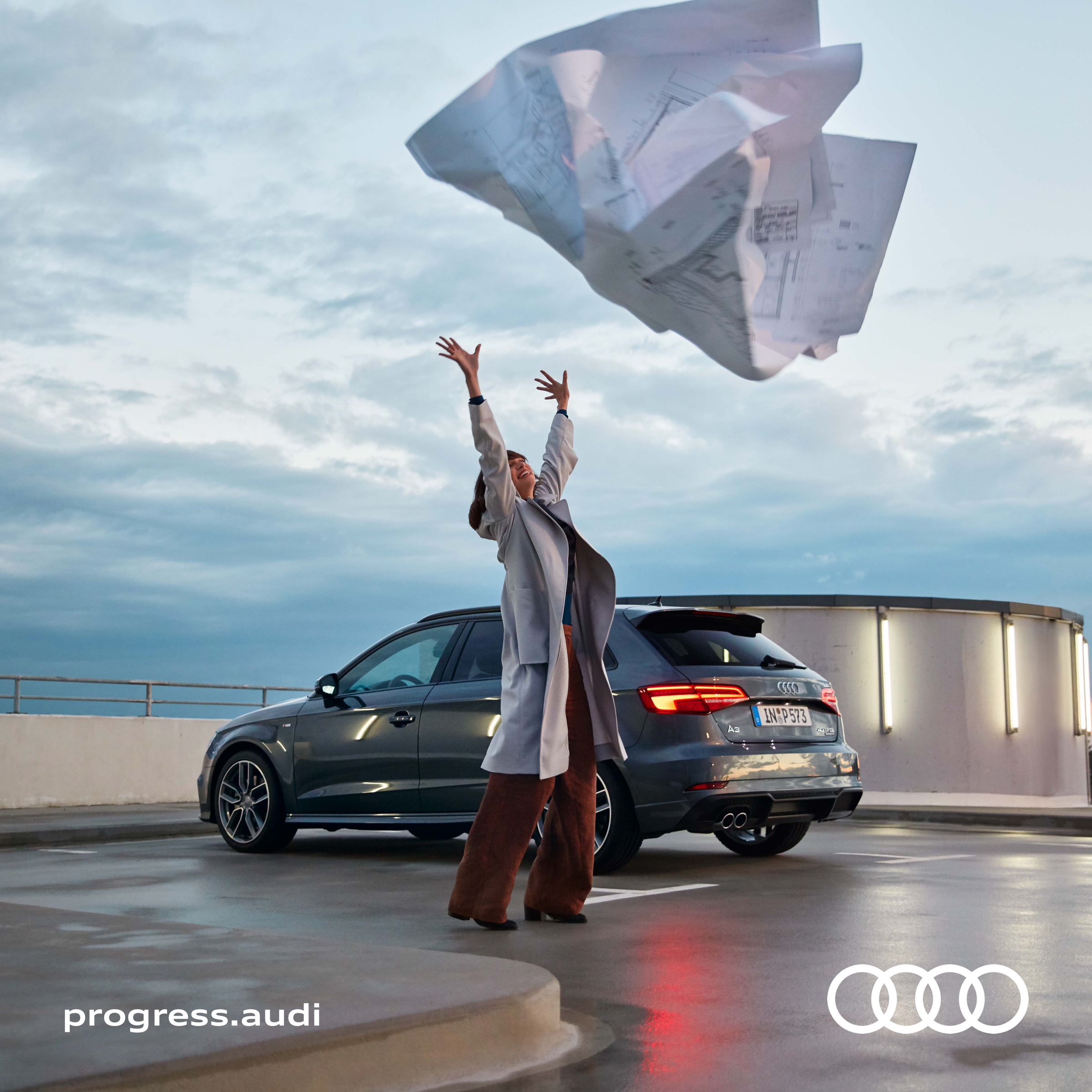
For the purpose of sponsorship, cooperation and reference, the rings are used in combination with the Audi wordmark.
The Audi Service logo is available to Audi Service partners who advertise several brands.

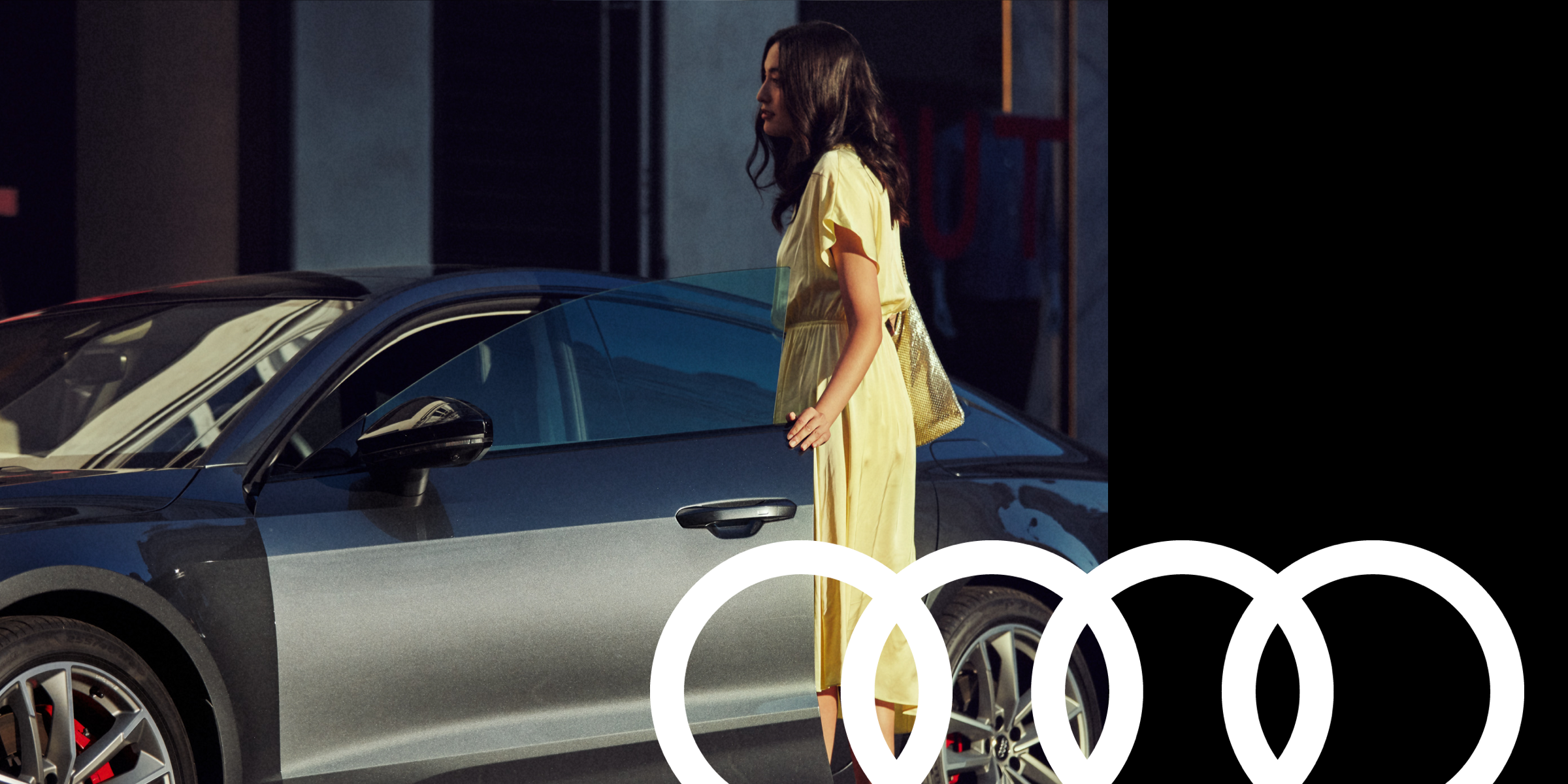
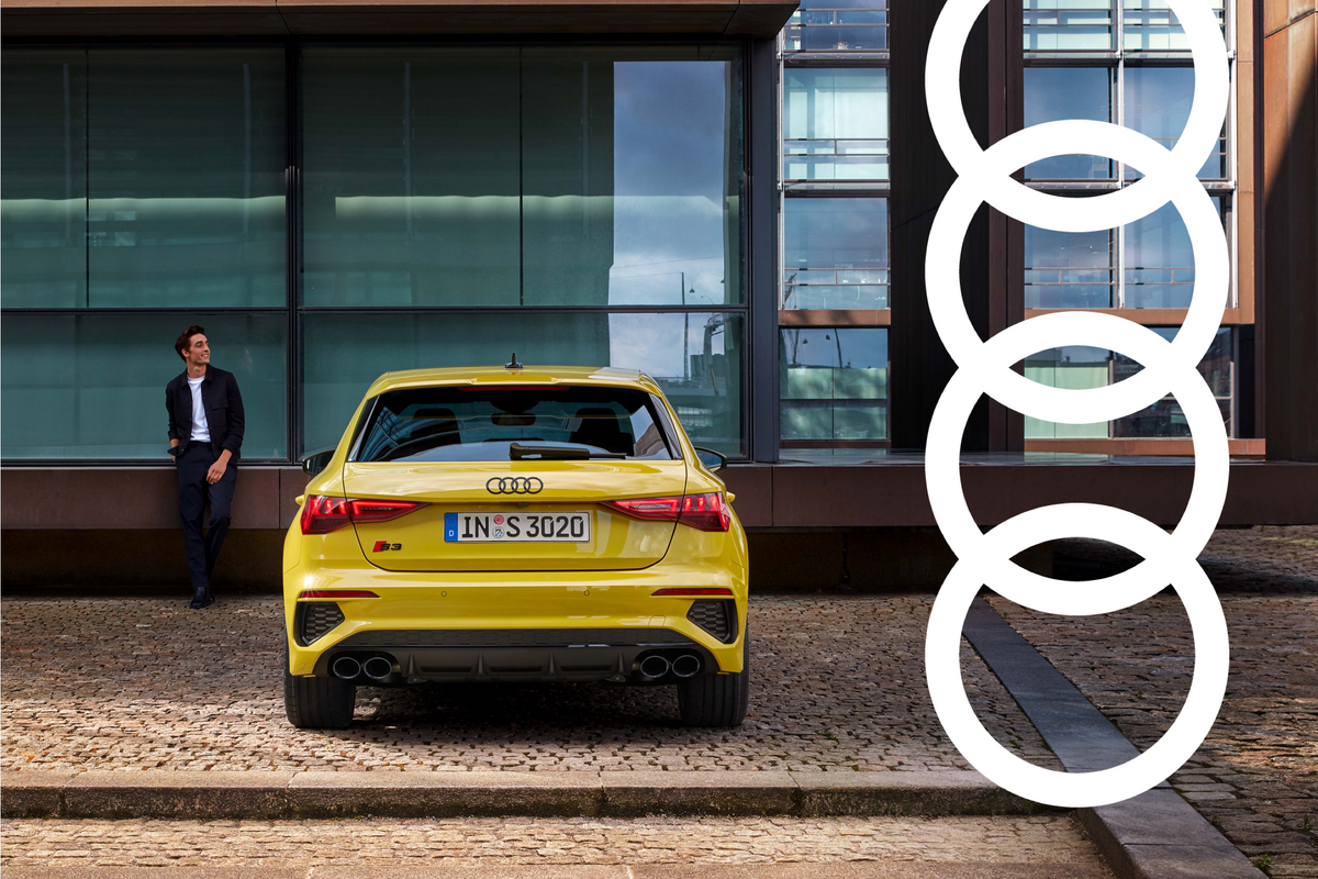
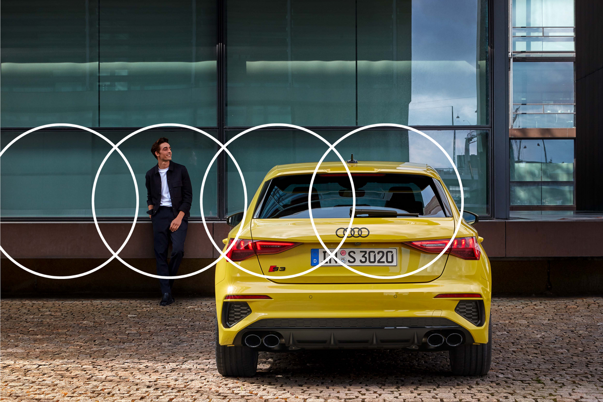
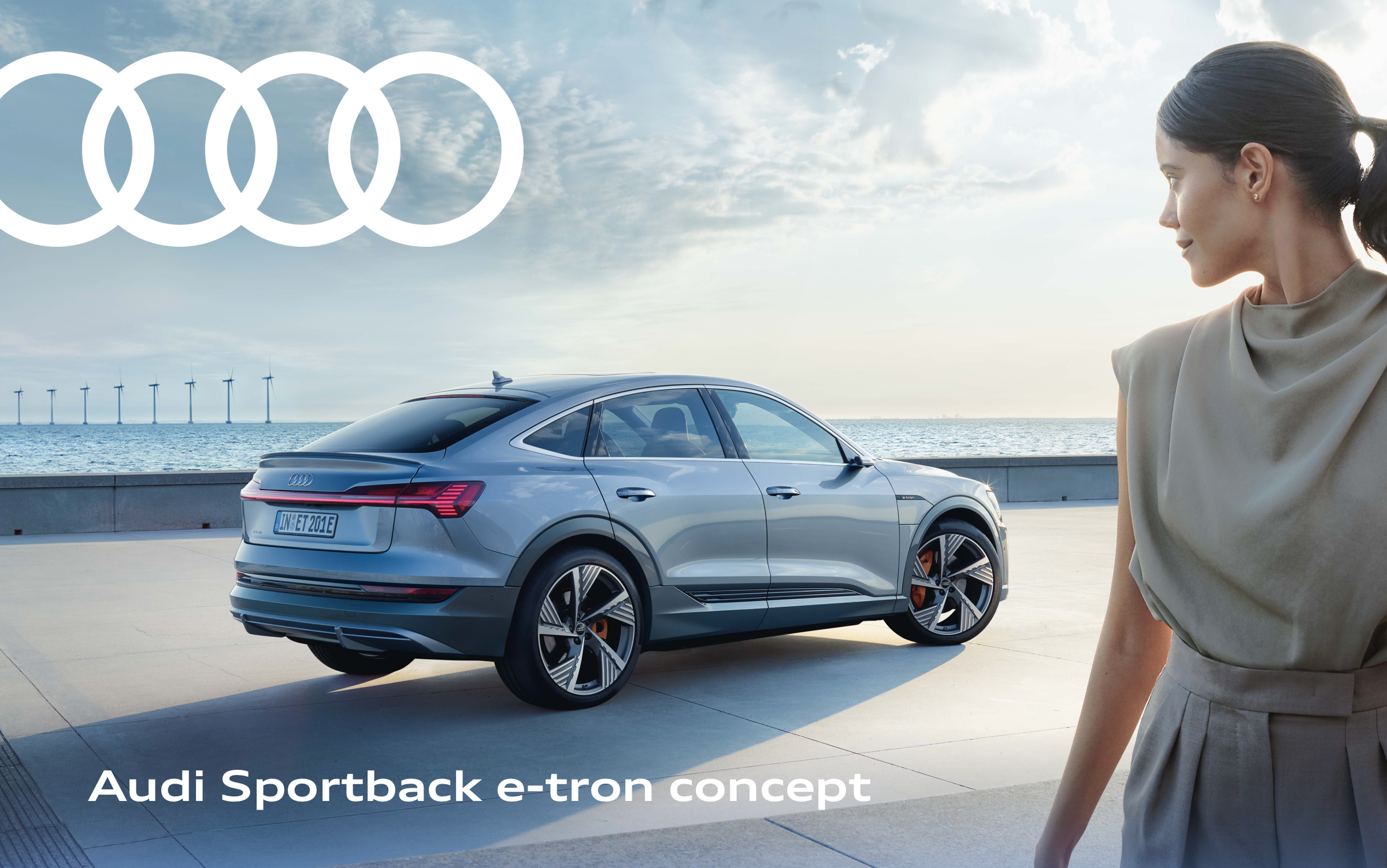
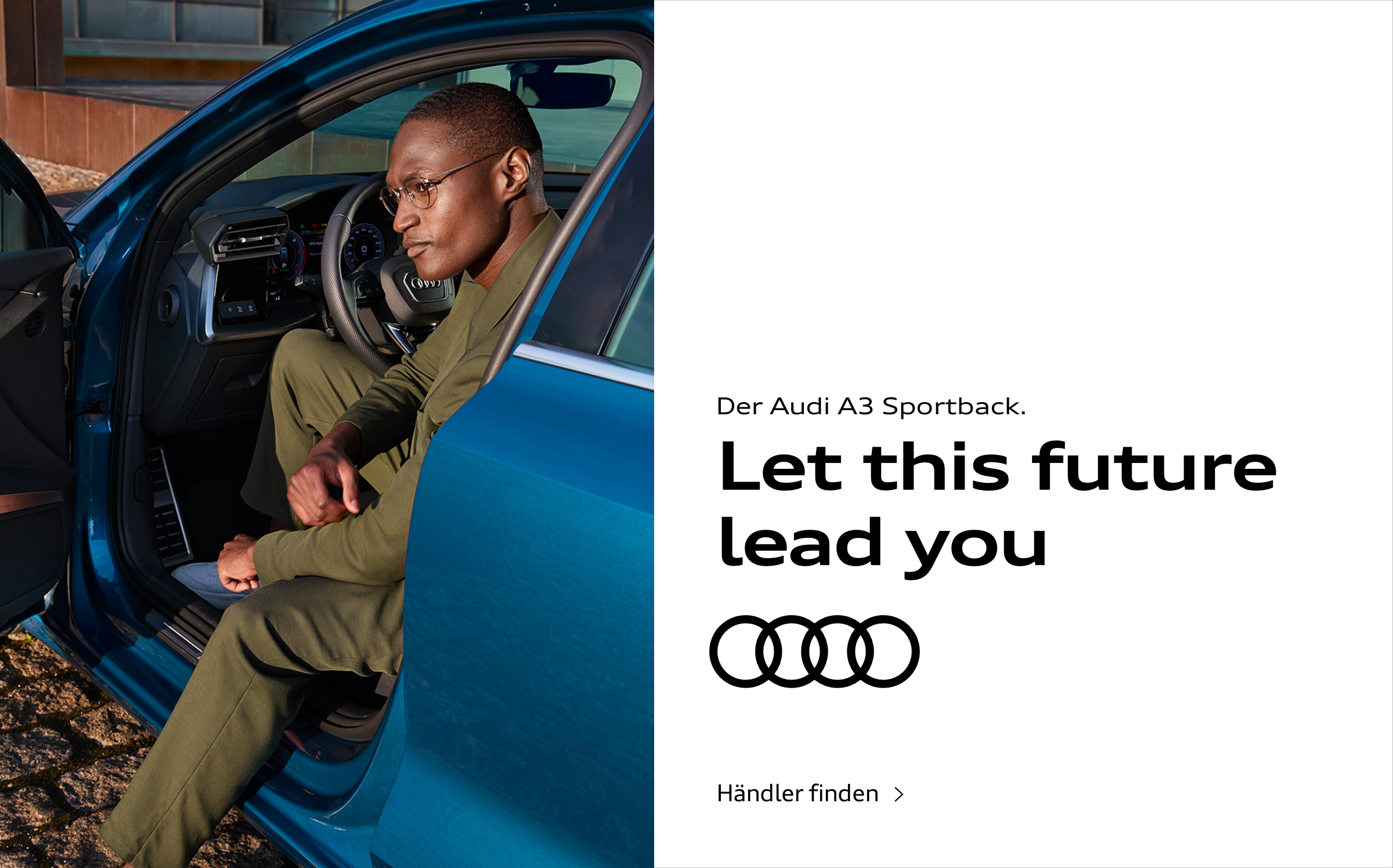
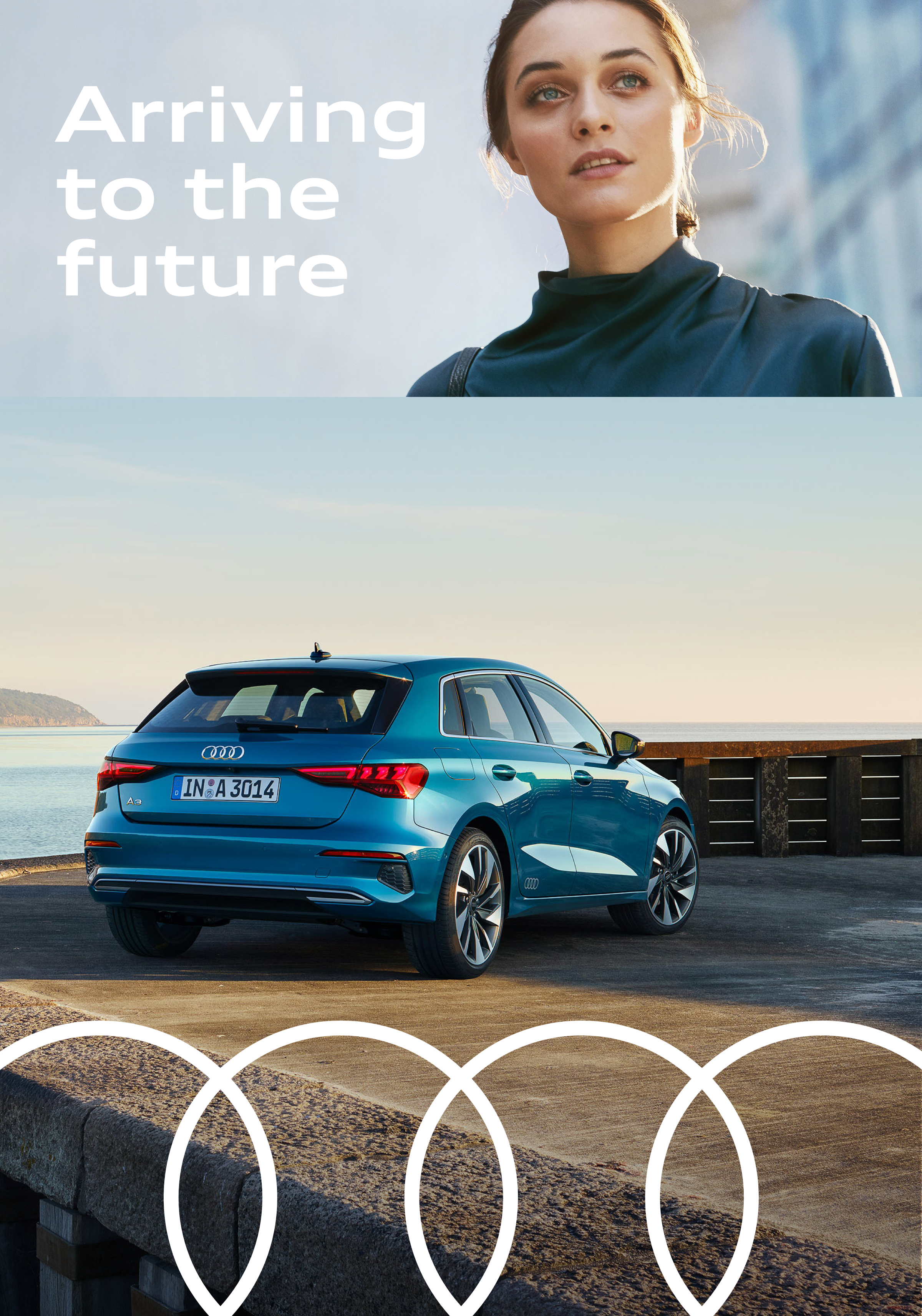
The rings can be placed in any position and size within the layout – whether as a classic sender in the layout or broadly across the entire application. They can overlay spaces and images or be placed over other elements. However the rings are used, they should always be perceived clearly and distinctly. Important information must not be covered by the rings. No other elements – such as typography – may be placed on top of the rings.
Care must be taken to ensure that the rings are not placed on top of the product or people's faces and cover them. Similarly, the rings should not be placed over other rings, such as the front or rear view of the vehicle.
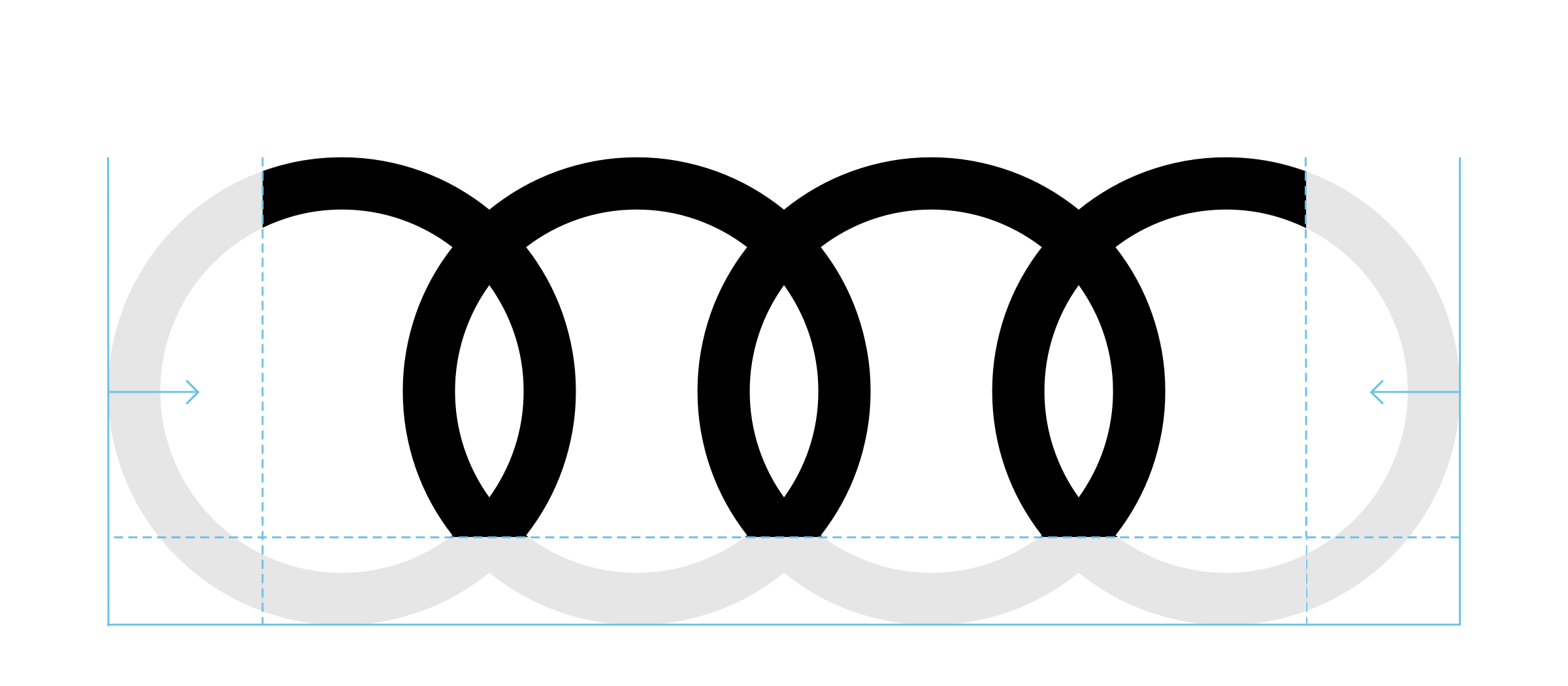
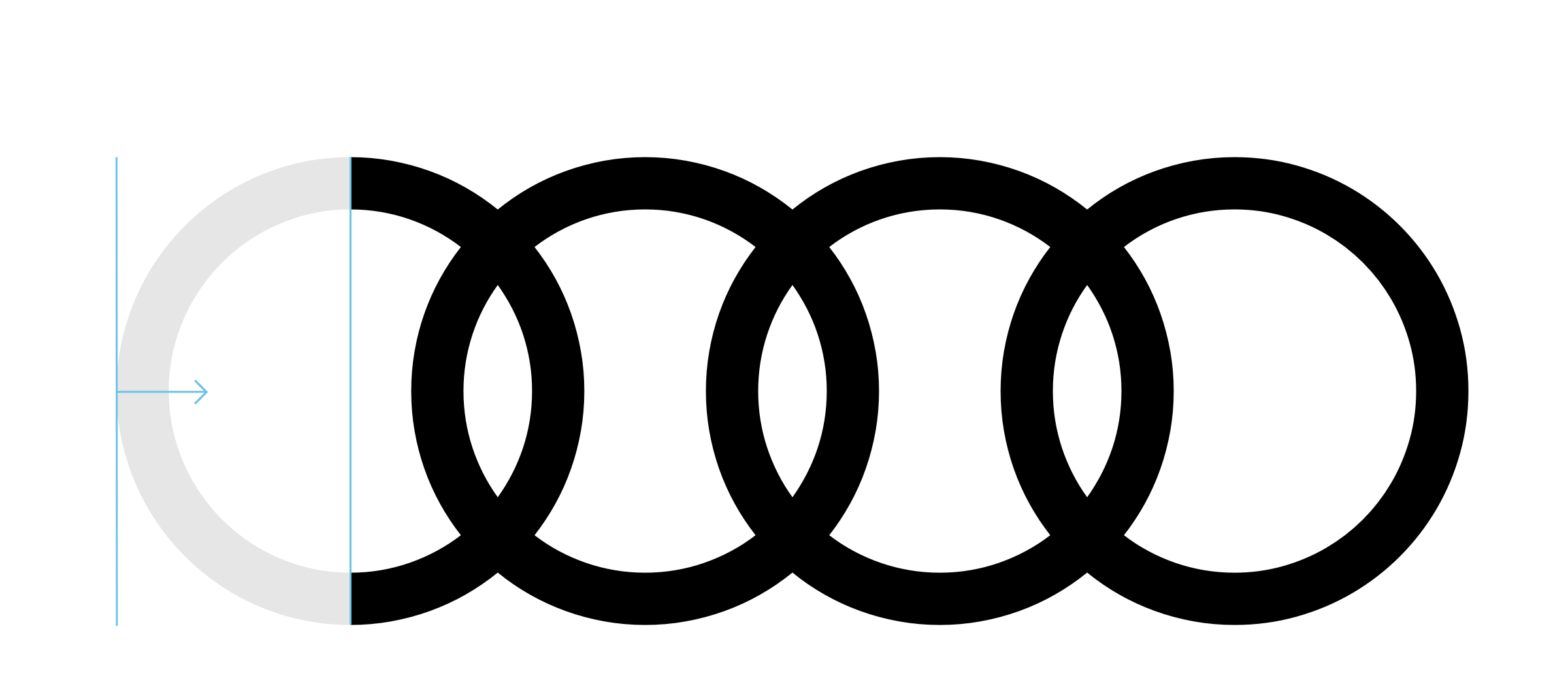
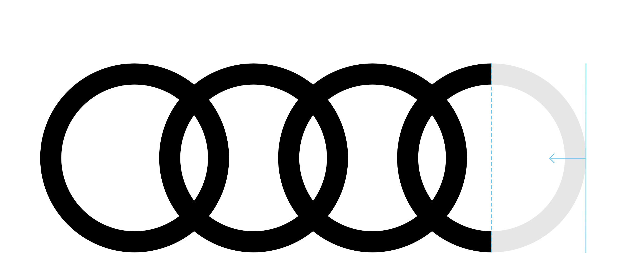
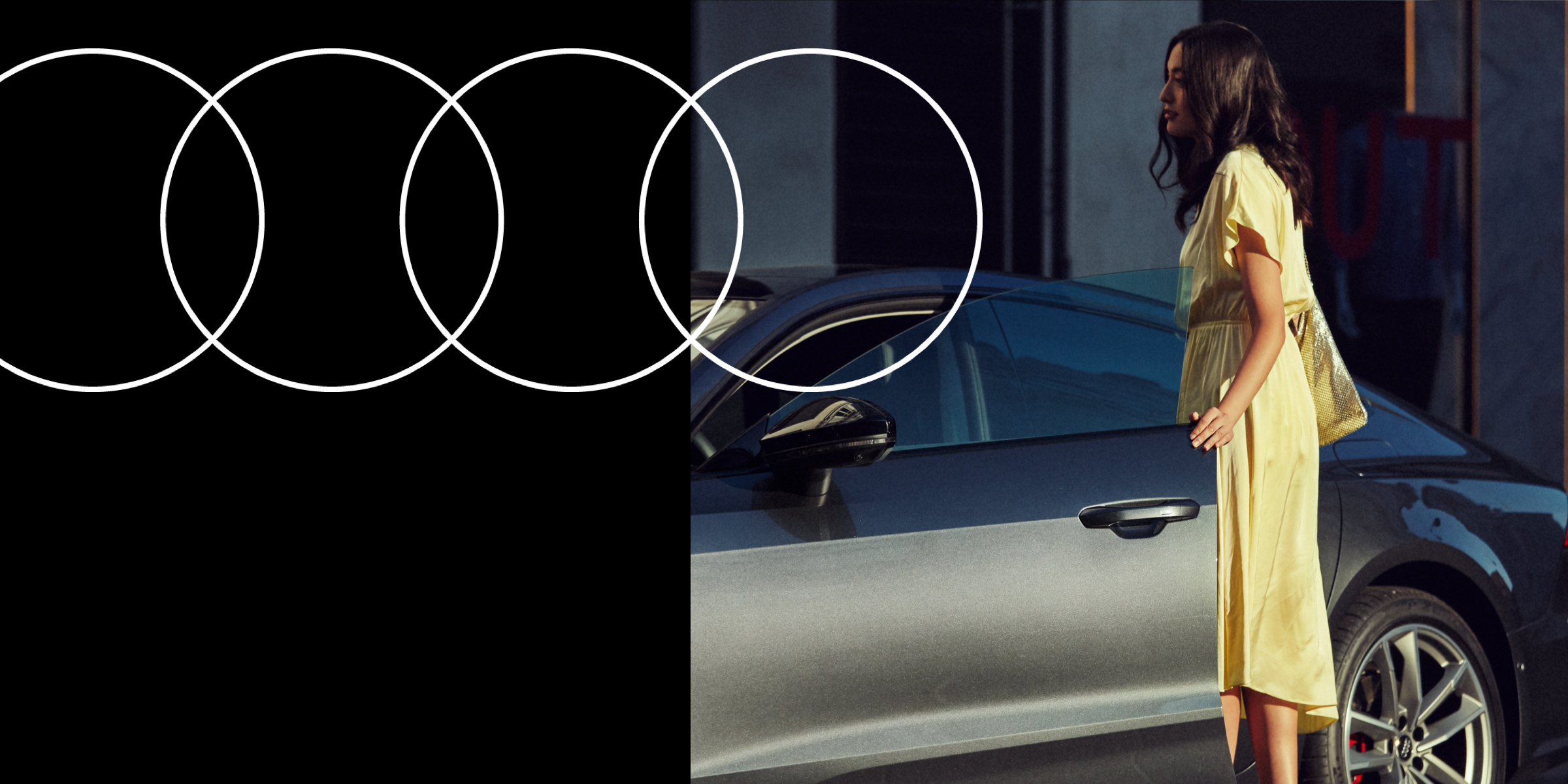
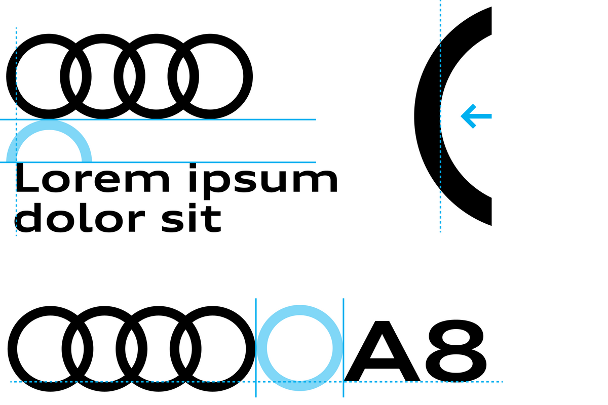
The Audi rings can be trimmed horizontally from below and/or vertically. The following applies to each trimming: the geometrical shape of the trademark must be clearly recognisable. The rings may not be trimmed from the top. Rings may not be trimmed by adjacent images and/or spaces – unless it is a functional interactive space.
Vertically, the Audi rings may only be trimmed on one side as far as half of one outer ring at the most. If they are trimmed on both sides, no more than one third of the outer rings may disappear. Horizontally, the rings may only be trimmed from below up to no further than the first intersection of the superimposed rings.
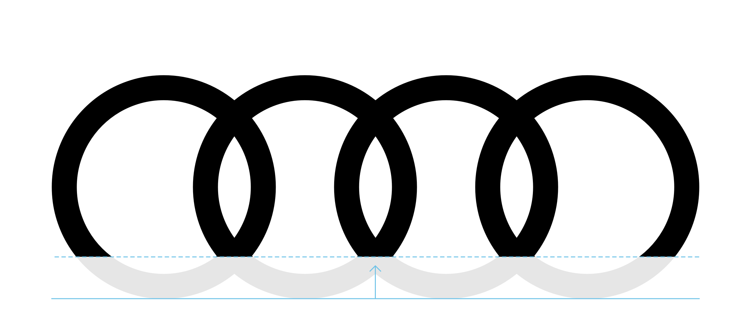
Irrespective of the ring thickness, care must be taken to ensure an optimum appearance of the rings in every size. The minimum ring height is 24 px for digital applications and 5 mm positive and 10 mm negative in analogue applications.
Only the “Audi Rings Standard” are used in applications where the height of the rings is less than this.

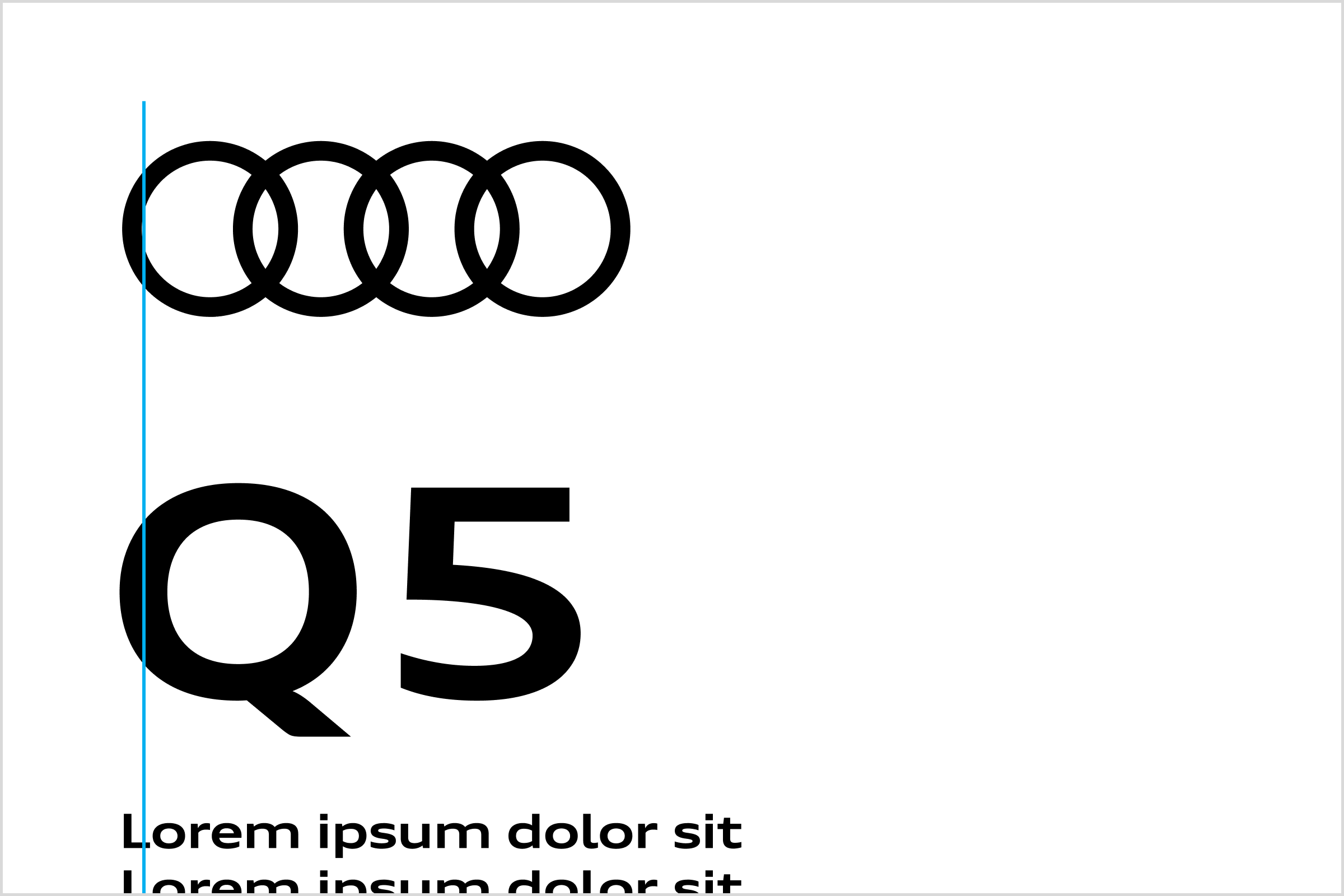
The spacing between rings and typography can be freely selected in order to ensure a superior, unconstrained appearance of the rings. For orientation purposes, however, half a ring height above and below the Audi rings can be used as the minimum spacing. On the left and/or right edge of the Audi rings, the minimum spacing is one full ring height. Text is horizontally or vertically aligned with the inner edge of the Rings.
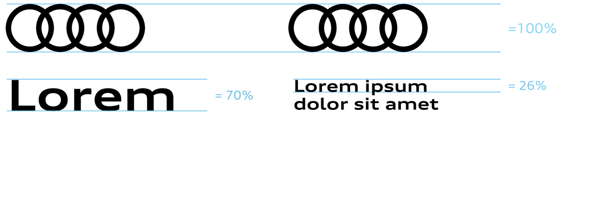
The ratio between rings and typography can be freely selected. The rings have a particularly harmonious effect in combination with the typography if the cap height is 70% of the outer ring height. Other ratios (26% and 11.5%) can be derived from this (see figure). However, this figure is provided for orientation purposes only.