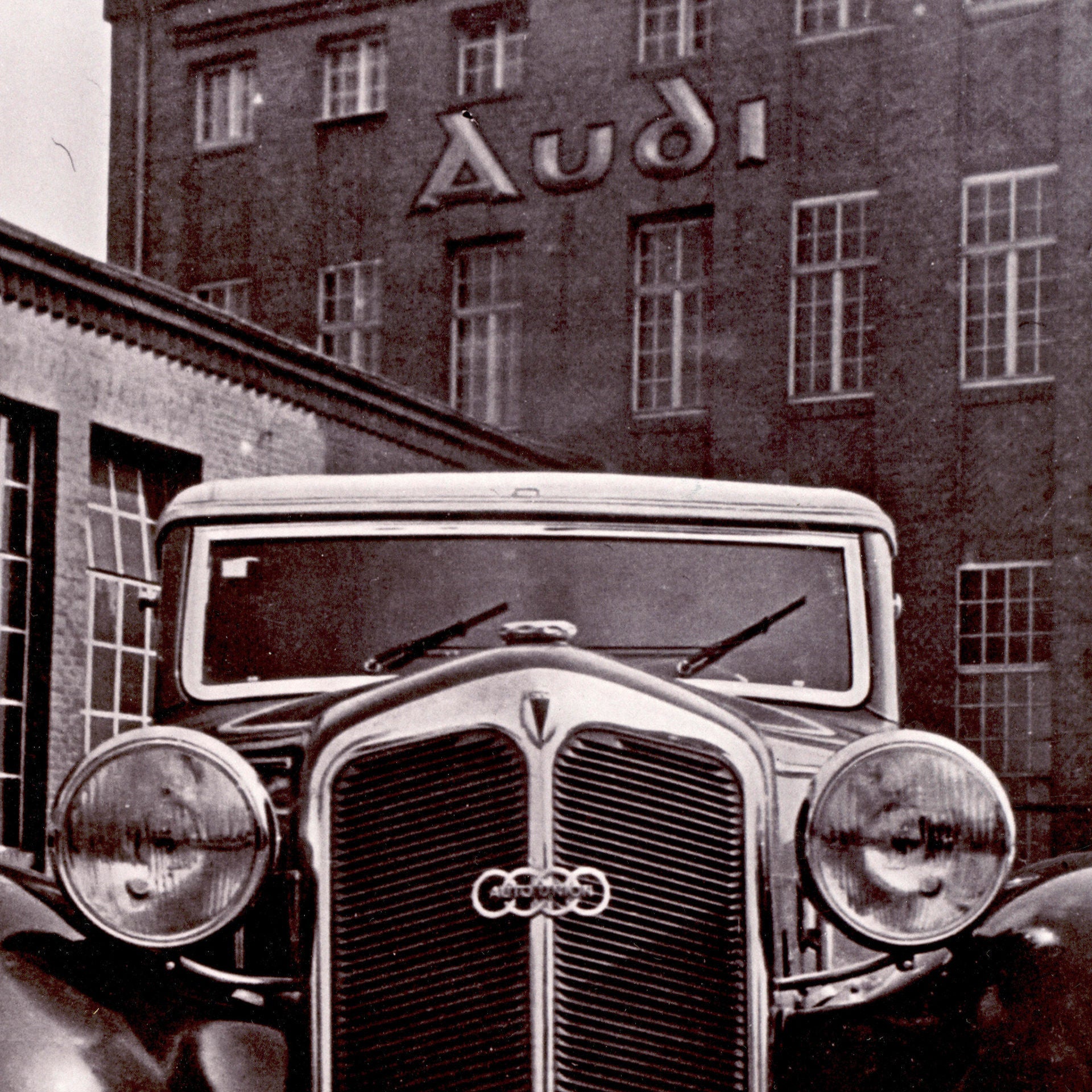
Why does the Audi logo have four rings?

Logo? Of course! That’s what the Auto Union AG thought when it was founded nearly 90 years ago, too. How four companies became four rings — and, ultimately, the global brand AUDI AG. And why sand painting is so important in the process of logo design:

04/06/2020 Reading Time: 3 min

“A good logo is one that can be scratched in the sand with your big toe.” Those are the words of the famous graphic designer and typographer Kurt Weidemann (1922–2011). Straightforward and simple, but still memorable and ingenious — based on his words, that could well have been the instructions given to the designers nearly 90 years ago. That’s when, in 1932, the four companies Audi, DKW, Horch and Wanderer joined together to form Auto Union AG, which would later become AUDI AG. And the company needed a new logo. The four interlocking rings were born.

Four become one: the history of the four rings

Let’s go all the way back to the beginning: the history of the Audi brand already began in the 19th century with August Horch. In 1899, the mechanical engineer founded his own business: August Horch & Cie. He initially built two-cylinder and, later, four-cylinder cars. In 1909, after a difference of opinions with the board of directors, he left the company.

Consequently, Horch founded a new car company in the same year. Since the name Horch was already taken, and he was prohibited from using it, he translated his family name into Latin: “Audi”. In 1910, the new brand’s first car entered the market. Audi garnered attention with its three consecutive victories at the International Austrian Alpine Rally between 1912 and 1914 — one of the most challenging rallies of its time.

Four rings – four brands

History Tradition

Four rings – four brands

Four interlocking rings symbolised the merger of four automobile manufacturers based in the German state of Saxony: Audi, DKW, Horch and Wanderer became Auto Union AG. Here are brief details of the roots of today’s AUDI AG.

Read more

The company Wanderer originated as a bicycle repair shop. Later on, they started building bicycles, then motorcycles. In 1913, the company produced its first small car, which was known as “Puppchen” — roughly translated as “moppet” in English.

The fourth company was DKW, one of the largest motorcycle manufacturers of its time. The Danish founder, Jörgen Skafte Rasmussen, began experimenting with a steam-powered automobile (Dampfkraftwagen - DKW) in 1916. His attempts were fruitless, however, and Rasmussen began developing two-stroke engines. A few years later, DKW was one of the most important motorcycle manufacturers of the pre-war years. DKW started building automobiles in 1928.

The global recession forms ties that bind: the Audi logo is created

Due to the global recession in 1929, demand plummeted. The four car companies, who had been successful up until that point, ran into financial difficulties. The solution was the union of the four brands, which was initiated by the state bank of Saxony. The Auto Union AG was born — the second-largest car manufacturer in Germany, according to the number of vehicles produced. And from Auto Union AG, the predecessor of today’s AUDI AG came into existence.

When it was founded, the Auto Union was the second largest car manufacturer in Germany.

How has the Audi logo changed over the years?

Audi logo rewound: This is what the first logo with four rings looked like in detail.

Audi logo rewound: This is what the first logo with four rings looked like in detail.

When the Auto Union was formed, the four rings appeared as a symbol for the first time. Later, the brand name Audi took center stage: first in brown, then in red. Starting in 1978, a black oval with white lettering characterized the brand identity. Since 1985, the company and its product have once again shared the same name: Audi. In the 90s, the Ingolstadt company once again concentrated on the rings, this time with a three-dimensional look.

And recently, the designers have had a new challenge: the logo needs to look good not only on paper, but online as well. So the trend is towards simplicity. That’s why, in 2016, the four rings became two-dimensional.

A logo should be memorable and easily recognizable. And Audi has achieved that with the most famous rings in the world — aside from the Olympic rings (designed in 1913) of course. And, as a side note, any child really could draw them in the sand — either two or three-dimensionally.

The history of the Audi logo in a short film

You might also be interested in

Close

Audi worldwide

Models, products and services – switch to your country / sales region website and discover the regional diversity of Audi.

    Close

    Close

    You are using an unsupported browser to access this website. To get the best User-Experience while visiting the website, please use the latest versions of Chrome, Firefox, Safari or Edge.

    Thank you very much for your visit.
    Your Audi Team

    The international Audi website

    Discover Audi as a brand, company and employer on our international website. Experience our vision of mobility and let yourself be inspired.

    Audi of America: models, products and services

    Explore the full lineup of SUVs, sedans, e-tron models & more. Build your own, search inventory and explore current special offers.

    Switch to audiusa.com

    Error report

    The feedback form is currently unavailable.
    Please try again later.

    You may deactivate your ad blocker to view the feedback form.