Communication

Communication

Rings


»Sophisticated, inspiring and confident, the Audi brand identity has been carefully put together – down to the last detail. The rings are characterised by their precision and graphic appeal and are only used in the most prominent places.«

Our strong identity creates brand recognition in space. In order to ensure the Audi rings are used optimally, their size and construction should be based on the environment around them. It is important to note that the rings are subject to strictly specified corporate identity guidelines that must be adhered to.

Use

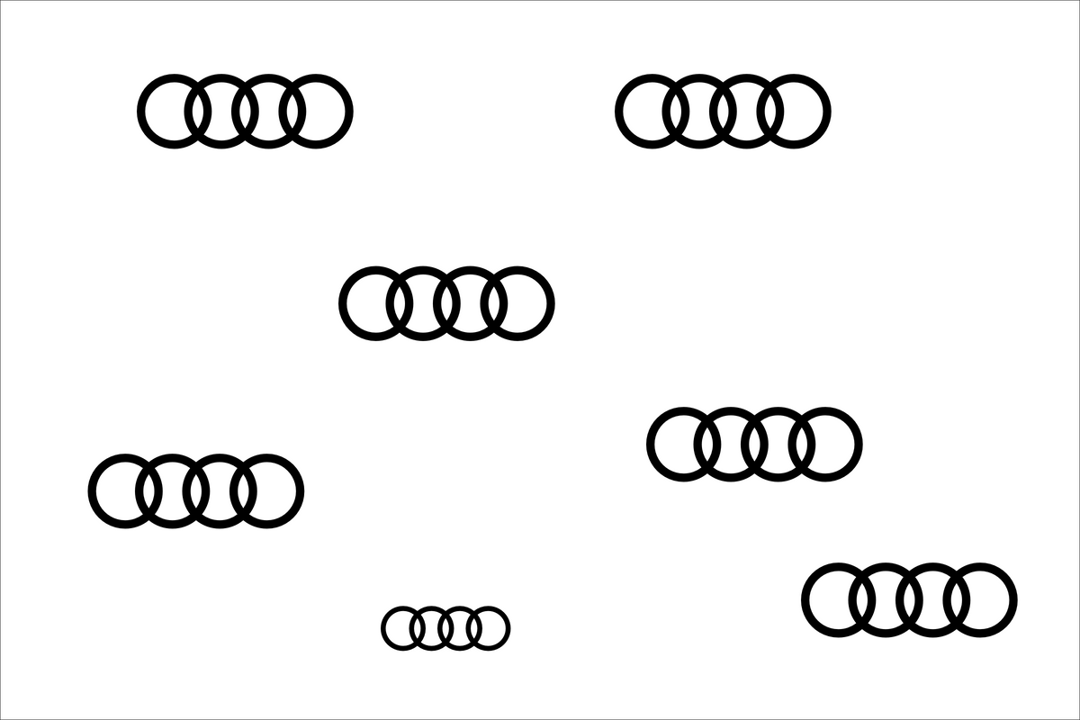
The Audi rings are always presented in a reduced form and tailored to their setting. They define the brand in space, provide orientation and attract attention.
The rings can serve both as signage and as part of the content itself. In either case, attention must be paid to ensuring the ring’s composition, precision and high-end qualities are exquisitely preserved. Overbranding through the use of multiple logos is to be avoided.
The use of the rings is subject to general corporate identity guidelines: Basics > the rings
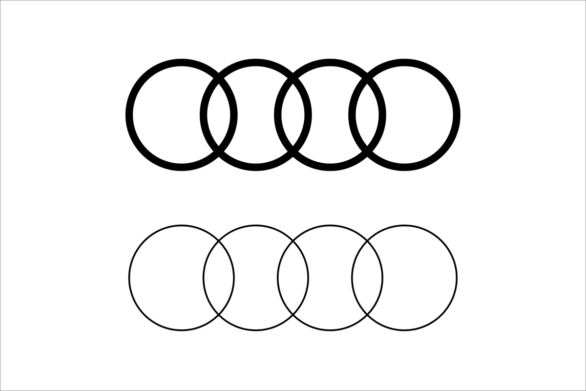
Versions

When using the rings as signage, they should always be applied in the standard version. They have firmly defined proportions and are implemented two dimensionally in space. Depending on the background, they are executed in black or white − with maximum contrast.

The structural application of the rings may take the form of mounting, foil cuts, inlays and hanging.

Materials and surfaces are strictly defined in order to ensure a uniform brand appearance. The following materials can be used:


Positioning externally

When placing the rings on exterior walls, they should be clearly visible from all main lines of approach. On both exterior and interior walls, make sure they are placed on homogeneous substrates.


Positioning internally

When entering a space, the rings should be clearly visible. In that area, they should be positioned so that they can be seen from the most important visual axes. This prevents using the logo on multiple occasions.


Spacing

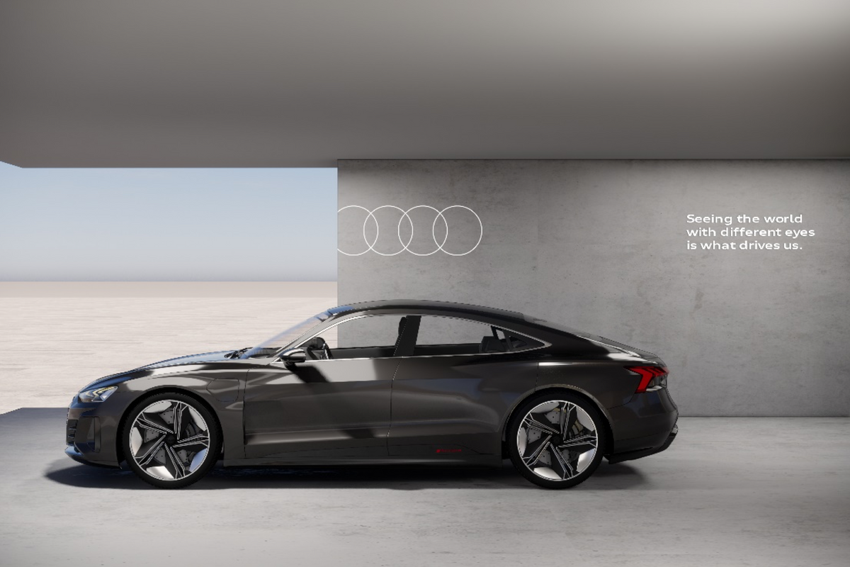
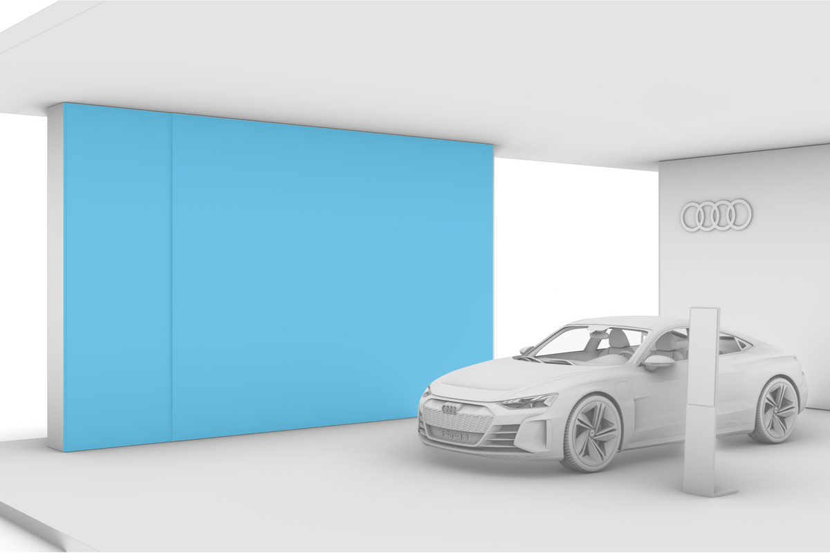
When the rings are used as signage, standard spacing must always be observed: 1.5 ring heights to the top and 1 ring height to the right and left. They should be placed in the upper right or upper left area.
The maximum height of the accompanying text should be aligned to the inner ring of the logo. Here, general corporate identity guidelines apply.
Basics > the rings, typography


Visibility (interior)

When positioning the rings internally, the placement should correspond to the product. The rings must be placed on a visible axis free from obstruction.


Uniform sizing

Where the rings are used as signage, uniform sizing is defined for interior and exterior areas.
For bigger booths, a larger size can be selected for the rings in the exterior area than in the interior area.


Scale

The rings are scaled proportionately to the architecture and space.
The proportions depend on the wall, height and distance. Spacing must always be taken into account.
Including the appropriate spacing, the rings may only be scaled up to a maximum of 50% of the wall width.


Versions

The ‘Medium’ and ‘Light’ versions are used exclusively as design elements. They should not be used for signage. Furthermore, the ‘Light’ version is never used for long-distance effects.


Use on graphics

‘Cut off’ rings are found only in graphic and media applications.


Further information

The use of the rings spatially is subject to general corporate identity. Current information can be found on the CI portal:
Basics > the Rings

Don´ts

When using the rIngs as signage, standard spacing must always be taken into account.
A luminous logo should always be self-illuminating. The rings should never be backlit or spotlit.
Logos with varying thickness should only be used in graphic applications.
Avoid logo repetition.
Physically in space, the rings should always be used in their standard line width and never cropped.
When integrated into a graphic, the rings can be cropped, but they must be placed at eye level or above. Visual axes in the area must be taken into account.

Graphics & Media

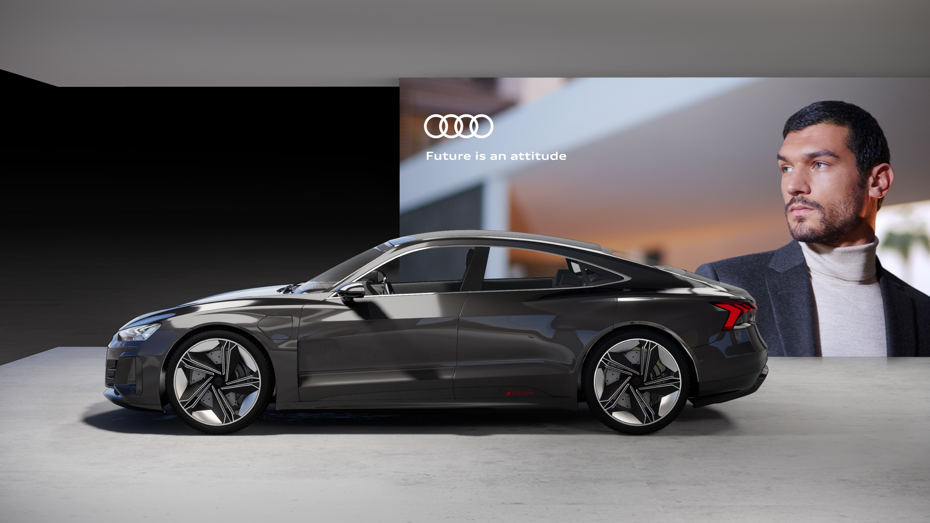
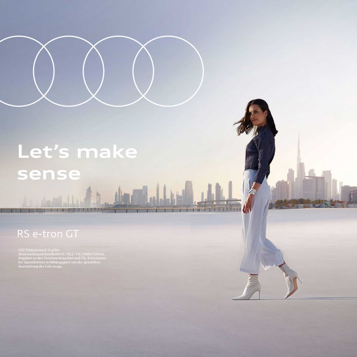
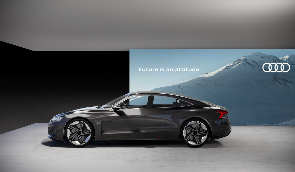
»Graphics and media support the progressive appearance of the Audi brand. They are emotional, calm and sophisticated − and build the connection between form and content.«

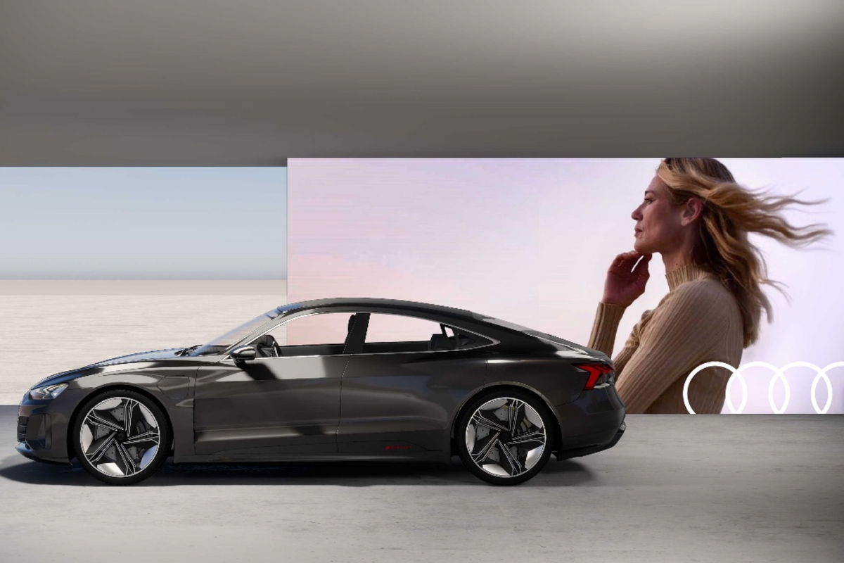
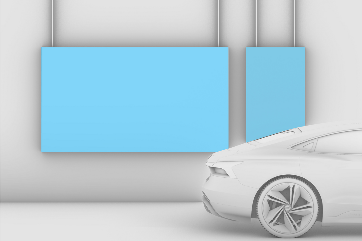
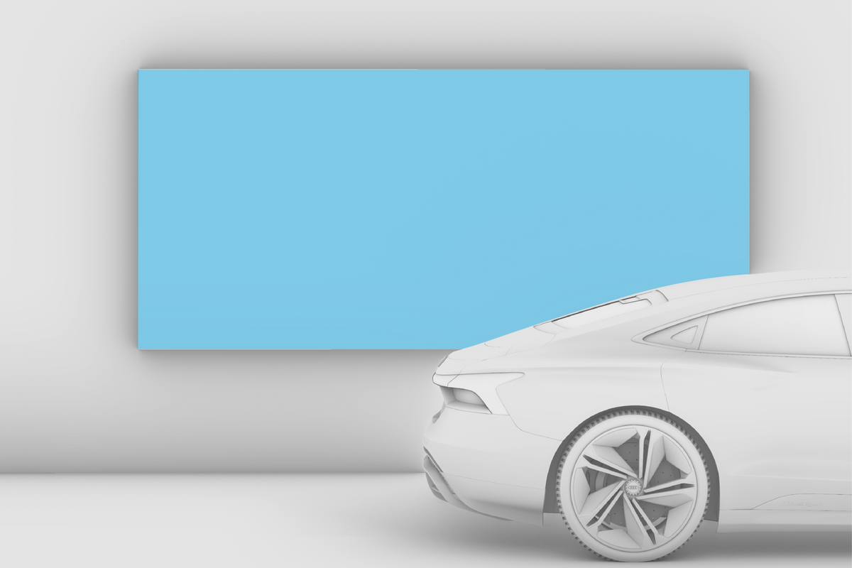
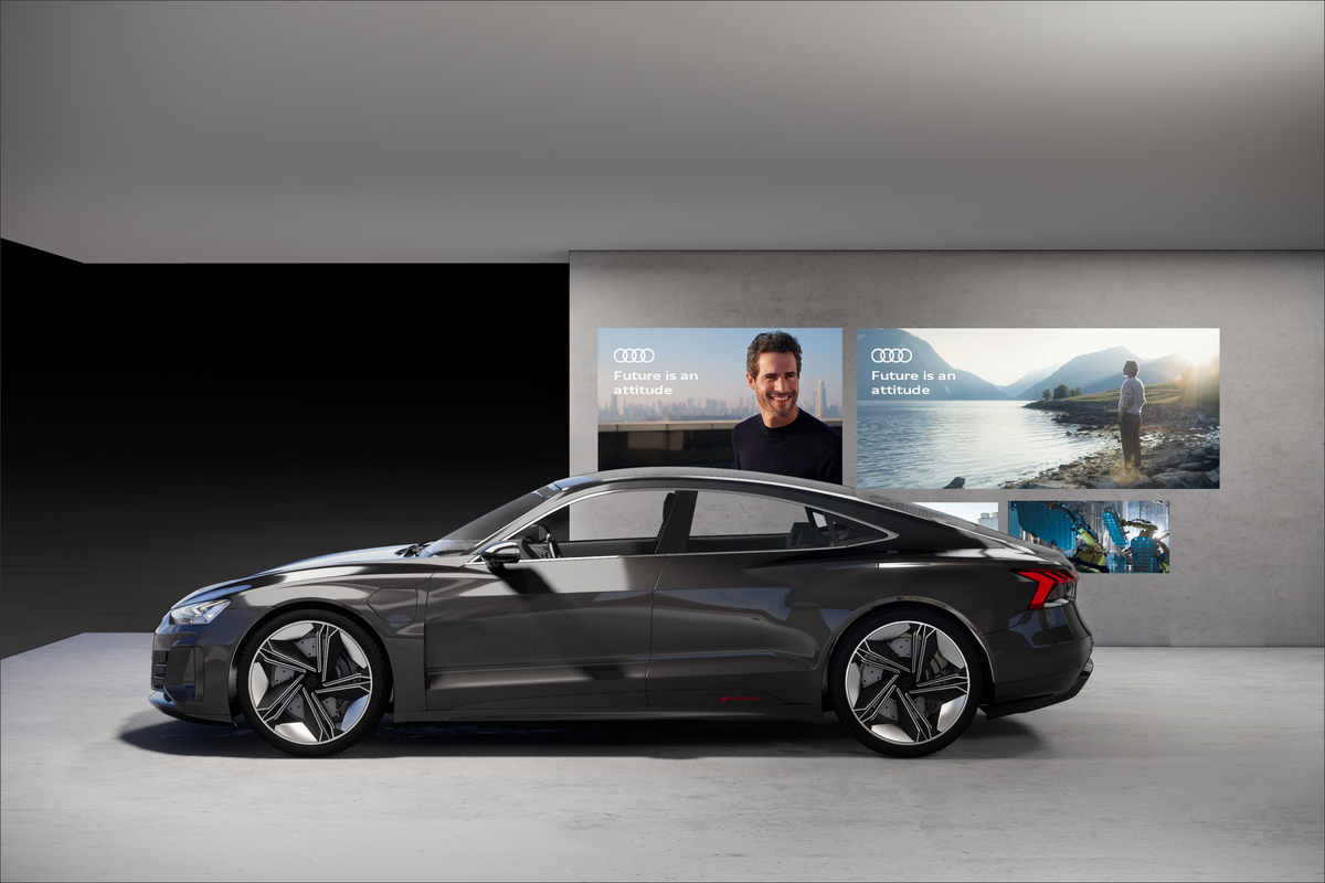
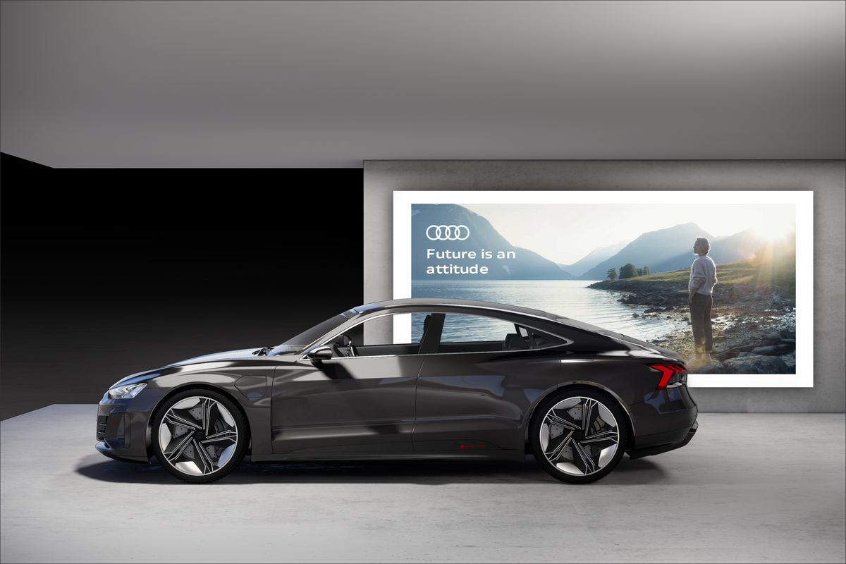
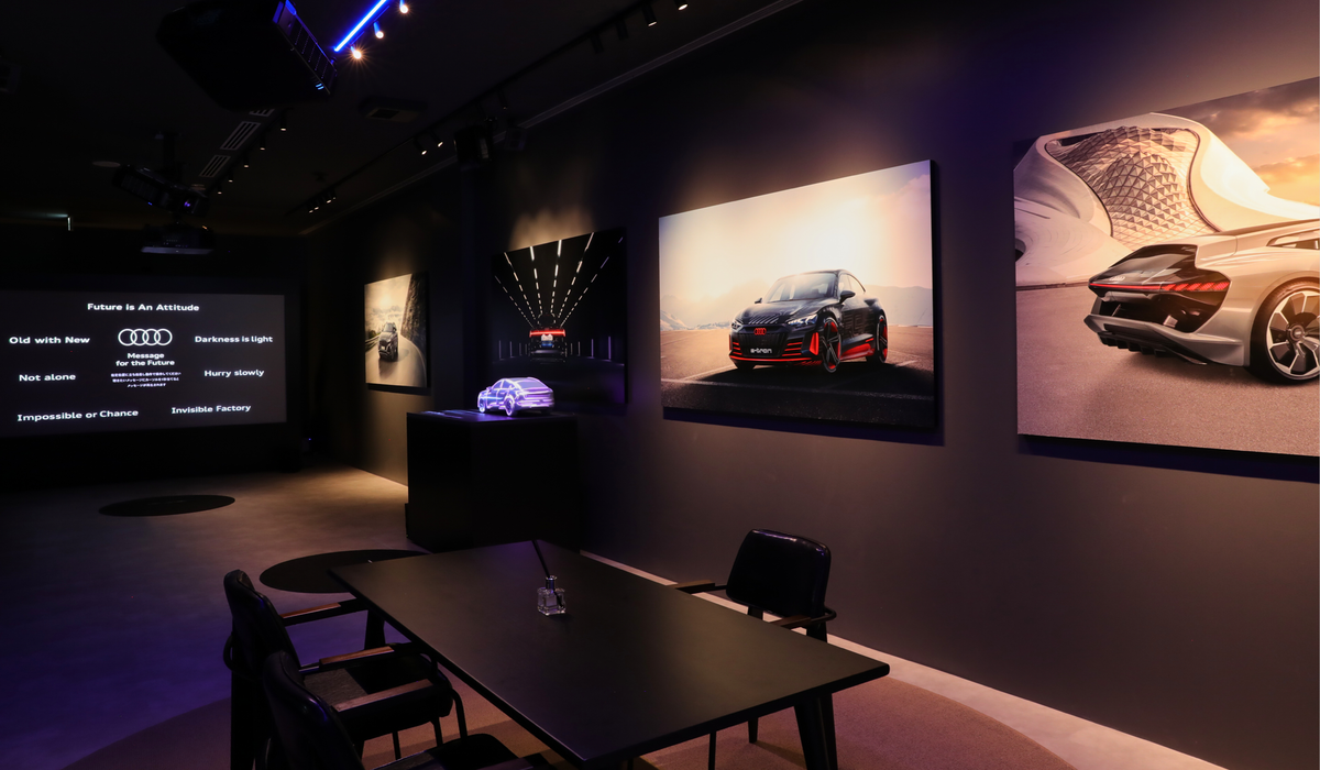
Sophisticated visual worlds mirror the real lives of those touched by the Audi brand. They tell stories and convey our messages and attitude in an emotional way. They are applied in large formats, covering entire surfaces, and create a generous atmosphere that reflects the character of the exhibition.


Full-surface

Whenever possible, media and graphics should always cover full surfaces.


Suspended

As an alternative to full surface insertion, graphics and media can also be suspended. In this case, care should be taken to ensure that the construction and framing are as invisible as possible.


Mounted

If suspension is not possible, media can, in these cases, be mounted in large format.

Don´ts

Small-scale – not full.
No visible border.
No visible monitor stand.

Reduced, focused and clear

Spatially, focus should be placed on the overall composition of the imagery. Images should be well coordinated, clear, reduced and used sparingly. Vehicles are not shown at all or only in a cropped version, if they are already on display in the exhibition.
Motif selection is subject to our corporate design guidelines concerning visual language: Basics > Image style

Image motif portal:
find.content.audi

Wall graphics portal:
CI Portal > Dealer Facility
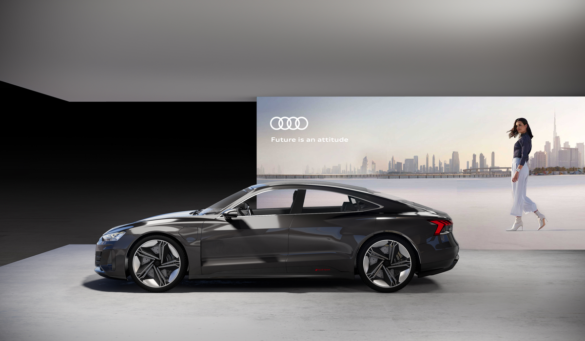
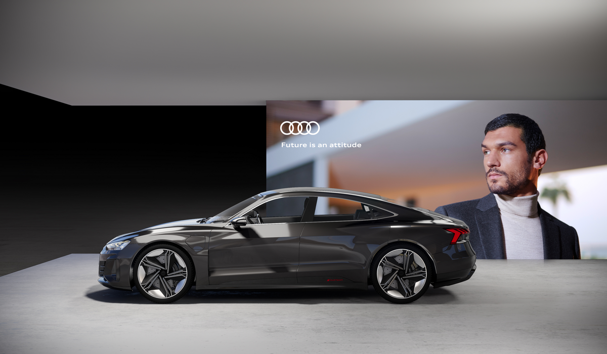
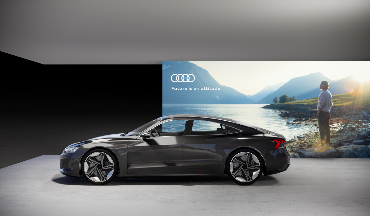
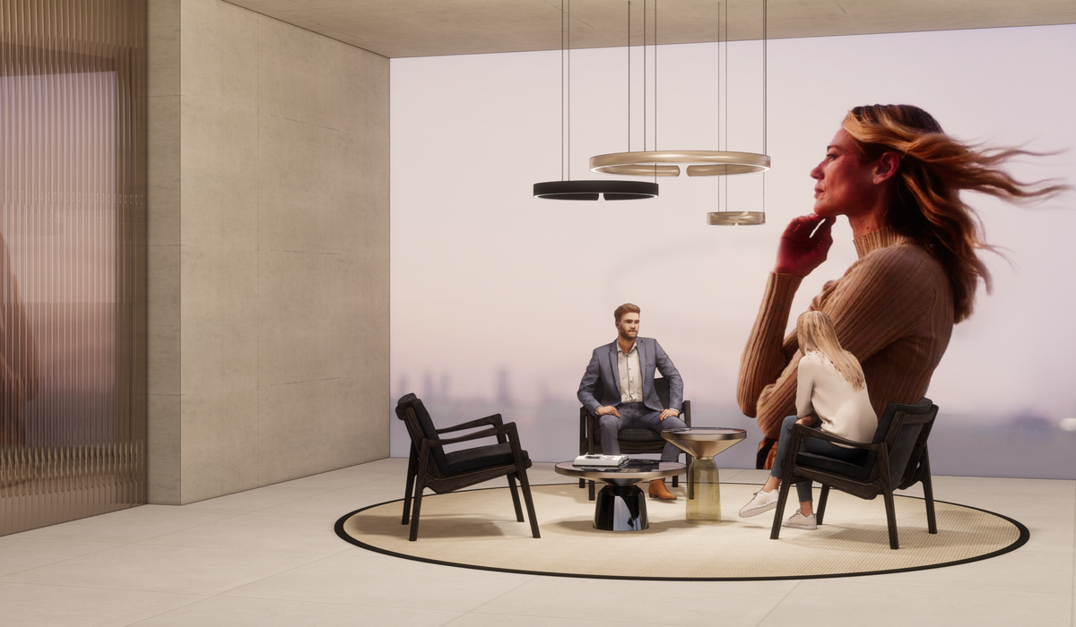
 

Campaign

Scenery, messaging and atmosphere all support a campaign. The vehicle can be positioned in scenery associated with a specific campaign using our motifs.
Always choose images where no vehicle is shown.


People

Images featuring people are positioned so that the protagonists' gaze is always directed at the vehicle.
Image crops are chosen so that the people do not appear too oversized in the space.


Atmosphere

Atmospheric images that fit to the product’s content, target group or the respective Brand Agenda Topic should be selected.
These images show expansive, expressive motifs. Small elements are avoided.


Atmospheric motifs

Brand Agenda Topics are supported by emotional imagery that match their respective Atmosphere.


Product motifs

In areas without vehicles, motifs with vehicles can be used.


Positioning and visibility

When using typography, care must be taken to ensure good visibility and readability. To ensure uniform sizing, a long-distance and short-distance size guide should be defined. For long-distance typography, this should be aligned corresponding to the size of the rings.


Further information

When designing, the brand elements (ringsbrand claimcolourstypographyimage stylelayout structure and icons) are used as described in the Basics chapter. 

Don´ts

Vehicle motifs should not be used in tandem with real vehicles.
Calm, atmospheric images should be chosen. Avoid busy and overly detailed images.
Messages should be displayed clearly. They must not be obscured by the vehicle.

Exhibits & Experiences

»Inspire, excite, understand: our exhibits convey complex content simply and intuitively. We focus on a curated experience that activates all the senses.«

The simple communication of our content is top priority: We use spatial, technical and sensory tools to make the core of our message as emotionally tangible as possible.


Clear communication

We prioritise focused communication. For us, good design is reflected in a touchpoint that creates a direct sense of understanding and enables intuitive interaction. The core message must be clear immediately.


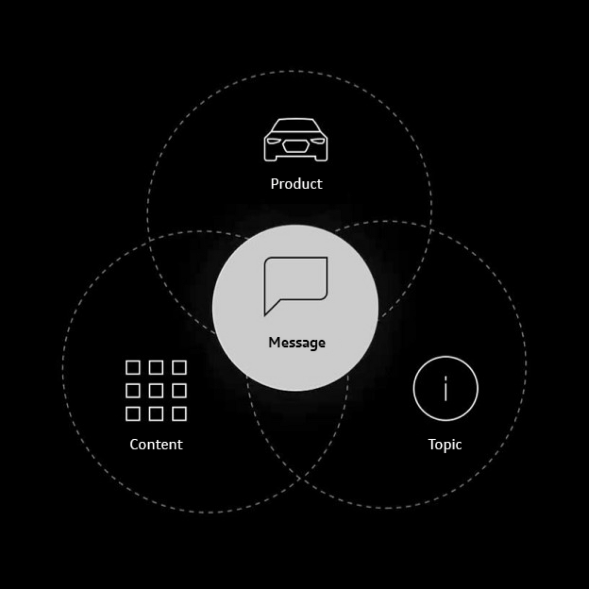
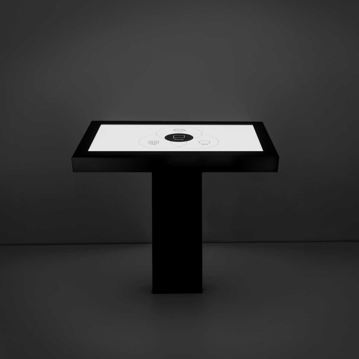
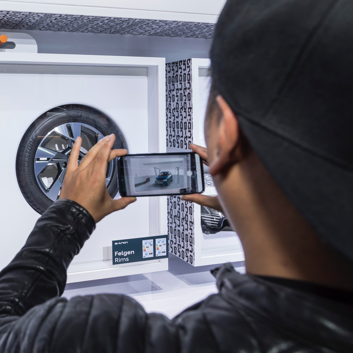
Intuitive interaction

Ways in which the user can interact are presented easily and clearly. Here, the goal is to make the interaction for our customers so simple and positive that this experience becomes associated with the brand – creating a lasting connection. The core message must be clear immediately. Essential details appear in the body text or the interaction.


Reduced narrative depth

The content of the message should be conveyed in max. 3 minutes.


Content first

Media and technical interactions are used purposefully to support content delivery.


Intuitive and sensory

Clearly structured and easy interactions are just as distinctive to our brand as our emotionally charged content.


Shareable

Interactions should always be shareable on social media channels.

The exhibit corpus is designed according to our reduced construction approach and is subject to the guidelines on Design Language.

Materials are adapted to the respective design of the room. Highlights in the materials are used consciously, and additional materials are avoided where possible.
Detailed descriptions of the Audi materials are available for download in the Form chapter.

If screens are used for interaction, they are subject to our UI design guidelines: User Interface > UI Introduction


Your CI-Support
May we help you?